Background
Nowadays social media gets more and more attention, and news on social media, such as Twitter and Facebook, has been incorporated in various data science research. People from all over the world share their opinions and stories on social media in a timely manner (to catch the trend), and it gives us a comprehensive source of information. People found that news and sentiment both are important factors to influence stock market. Many research have already indicated the possibility of predicting the market by using the news (especially from certain import political leader in the world) as a signal to a coming movement with an acceptable accuracy percentage.
We want to predict market by using the news, therefore we try to use tweets from Twitter to predict the index price of S&P 500. We want to predict S&P 500 in that it contains many famous companies which are very typical and can help us to know the market better. There are three reasons why we use Twitter to collect tweets. Firstly, more than 60% of Twitter’s users would like to get the news on the site. Secondly, using Twitter as our news source can help us to get the most up to date news. Thirdly, we can get tweets from Twitter easily by using packages such as tweepy and twint.
Data collection
We used the package Twint to collect tweets from Twitter. In order to increase the accuracy of predicting index price, we collect as much data as we can to train the model. We collect all the tweets containing keyword SP500 from January 1st 2017 to February, 18th 2021.
1
2
3
4
5
6
7
8
9
10
11
12
13
14
15
16
# scrap data from twitter (this step works better on colab)
import twint
import nest_asyncio

nest_asyncio.apply()
# Configure
# %%
c = twint.Config()
c.Search = "#sp500"
c.Since = '2020-01-01'
c.Until = '2021-01-01'
c.Output = "tweets2020.csv"

c.Store_csv = True
# Run
twint.run.Search©
We found approximately 562,866 tweets in total. We only keep the 286,129 tweets which are written in English.
The daily number of tweets we collected is plotted:

An interesting result we found is that: people post more tweets about “SP500” on weekdays than on weekend. In fact, the average number of tweets on weekdays is 255 and the average number of tweets on weekend is 101.
Then, we use pandas_datareader to gather the S&P 500 historical close prices. S&P500 does show negative autocorrelation and significant Volatility Clustering, which implies that the return or volatility might be predictable with the historical information, in our case for example, what people talked about SP500 in twitter.
SP500 shows negative autocorrelation and significant Volatility Clustering:

1
2
3
4
5
6
7
8
9
10
11
12
13
14
15
16
17
18
19
20
21
22
23
24
25
26
27
28
29
30
31
32
33
34
35
36
37
import matplotlib.pyplot as plt
import numpy as np
from arch import arch_model
from statsmodels.graphics.tsaplots import plot_acf, plot_pacf
import pandas as pd
import scipy.stats as stats
import datetime as dt
import statsmodels.api as sm


from pandas_datareader import data as web
df = web.DataReader('^GSPC', 'yahoo')
df.to_pickle('sp500.pkl')
# df.to_excel('sp500.xlsx')
df = pd.read_pickle('sp500.pkl')

# Plot - Historical S&P500 Close Prices
plt.style.use('ggplot')
df['Adj Close'].plot(figsize=(8, 4))
plt.title("Historical S&P500 Close Prices")


# Table - Daily Return
df.apply(np.log).diff()

# Check AR
plt.figure(figsize=(16, 8))
plt.style.use('ggplot')
fig1 = plot_pacf(df['Adj Close'].apply(np.log).diff().dropna())
plt.title('Autocorrelation')
plt.legend(['Partial Autocorrelation of r'])

# Check Volatility Clustering
fig2 = plot_pacf(df['Adj Close'].apply(np.log).diff().dropna().abs())
plt.title('Volatility Clustering')
plt.legend(['Partial Autocorrelation of Abs®'])
Data Preprocessing
Data Merge and Cleaning
For the part of sentiment analysis and supervised learning, the DataFrame of tweets are grouped by date, with the sentiment score been averaged. We also use ‘pd.merge’ to join the tweets and SP500 index prices together.
For the unsupervised learning part, we also have to add ‘PCA’ components and ‘T-SNE’ components to our original tweets matrix for the purpose of dimension reduction.
Besides, we also apply standard normalization process in the analysis of relationship between different factors.
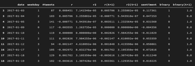
For example, the final daily data for sentiment analysis looks like this:
1
2
3
4
5
6
7
8
9
10
11
12
13
14
15
16
17
18
19
20
21
22
23
24
25
26
27
28
29
30
31
32
33
34
35
36
37
38
39
40
41
42
43
44
45
46
47
48
49
50
51
52
53
54
55
56
57
58
59
60
61
62
63
64
65
66
67
68
69
70
71
72
73
74
75
76
77


# Data Preprocessing
tw2017 = pd.read_csv("tweets2017.csv")
tw2017 = tw2017[['date', 'tweet', 'replies_count', 'retweets_count',
                 'likes_count', 'language', 'hashtags', 'cashtags']]
tw2017 = tw2017[tw2017['language'] == 'en']
tw2017.date = pd.to_datetime(tw2017.date)
tw2017 = tw2017.sort_values(by='date')
tw2017.reset_index(drop=True, inplace=True)


# Add sentiment socre for each tweet
from nltk.sentiment.vader import SentimentIntensityAnalyzer
sid = SentimentIntensityAnalyzer()
tw2017['sentiment'] = [sid.polarity_scores(
    t).get('compound') for t in tw2017['tweet']]


# check how the replies_count retweets_count, likes_count dirstibuted
plt.style.use('ggplot')
fig, axes = plt.subplots(nrows=3, ncols=1)
axes_flat = axes.flatten()
for i, item in enumerate(['replies_count', 'retweets_count', 'likes_count']):
    axes[i].hist(tw2017[item].value_counts())
    axes[i].set_title(item)
fig.tight_layout()
plt.show()


# how the sentiments distrubited
fig = plt.hist(tw2017['sentiment'])

# how many tweets each day
plt.style.use('ggplot')
plt.plot(tw2017['date'].value_counts().sort_index(), 'o-')


# number of tweets about 'SP500' on weekday is higher than thoes on weekends
tw2017['weekday'] = [dt.date.weekday(t) for t in tw2017['date']]
tw2017_daily_group = tw2017[['date', 'weekday', 'tweet']].groupby(
    ['date', 'weekday']).count().reset_index()
weekday_mean = tw2017_daily_group[tw2017_daily_group['weekday'] < 5].mean()[
    'tweet']
weekend_mean = tw2017_daily_group[tw2017_daily_group['weekday'] >= 5].mean()[
    'tweet']
print("Average Tweets on weekdays: {:.0f} \nAverage Tweets on weekends: {:.0f}".format(
    weekday_mean, weekend_mean))

# read the spx prices
spx = pd.read_pickle('sp500.pkl')
spx['Close'].plot()

# plot the daily return
spxr = spx[['Close']].apply(np.log).diff().dropna()
spxr.index.name = 'date'
spxr.columns = ['Daily_Return']
spxr.plot()

# Join these two dataset
tw2017_daily_group = tw2017_daily_group.join(spxr, on='date')

# add return-squared as indicator for volatility
tw2017_daily_group['Return_squared'] = tw2017_daily_group['Daily_Return']**2
# Check the correlation matrix
tw2017_daily_group[['tweet', 'Daily_Return', 'Return_squared']].dropna().corr()

# Add the information from next day for later use
tw2017_daily_group['r(t+1)'] = tw2017_daily_group['Daily_Return'].shift(-1)
tw2017_daily_group['r2(t+1)'] = tw2017_daily_group['Return_squared'].shift(-1)


tw2017_daily_group.rename(columns={
                          'tweet': "#tweets", 'Daily_Return': 'r', 'Return_squared': 'r2'}, inplace=True)
tw2017_daily_group.head(10)

tw2017_daily_group.iloc[:, 2:].corr()
Bag of Words
In our project, we choose to use Sklearn.feature_extraction.text.CountVectorize to transform the tweets text corpus into a numerical matrix. More specifically, we fist create a Bag-of-Words from the tweets data we collected.
1
2
3
4
5
# cp is the text corpus
cp = list(tw2017['tweet'][:].values)
from sklearn.feature_extraction.text import CountVectorizer
v = CountVectorizer(stop_words='english')  # Vectorizer.
bow = v.fit_transform(cp)
The the resulting matrix has a DTM (Document-Term Matrix) structure, with the shape equals to (286129,287749).
Sentiment Analysis
Number of tweets
The first result we find is the relationship among number of tweets, daily return and volatility of SP500 index prices.
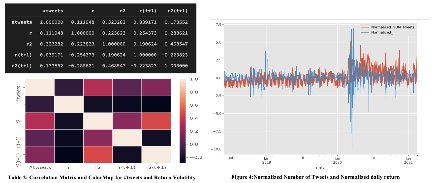
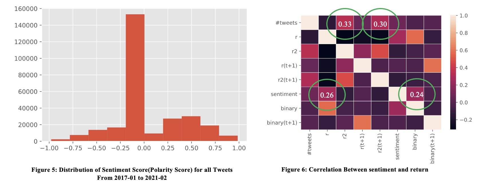
From the correlation matrix and heatmap above, we find that the correlation between #tweet and r is -0.11, but the correlation with volatility (denoted as r-square) is 0.3233, r-sqaure (t+1) is approximately 0.1736.
In the figure 4, we can see that Normalized Number of Tweets and SP500 volatility does have some correlation. Especially in March 2020, when the covid-10 began to become a big problem for the world.
Averaged Sentiment Score
We now use nltk.sentiment.vader package to give each tweet a sentiment score. For better accuracy, we might use more sophisticated sentiment analysis package like ‘Finbert’.
1
2
3
4
5
# Add sentiment socre for each tweet
from nltk.sentiment.vader import SentimentIntensityAnalyzer
sid = SentimentIntensityAnalyzer()
tw2017['sentiment'] = [sid.polarity_scores(
    t).get('compound') for t in tw2017['tweet']]
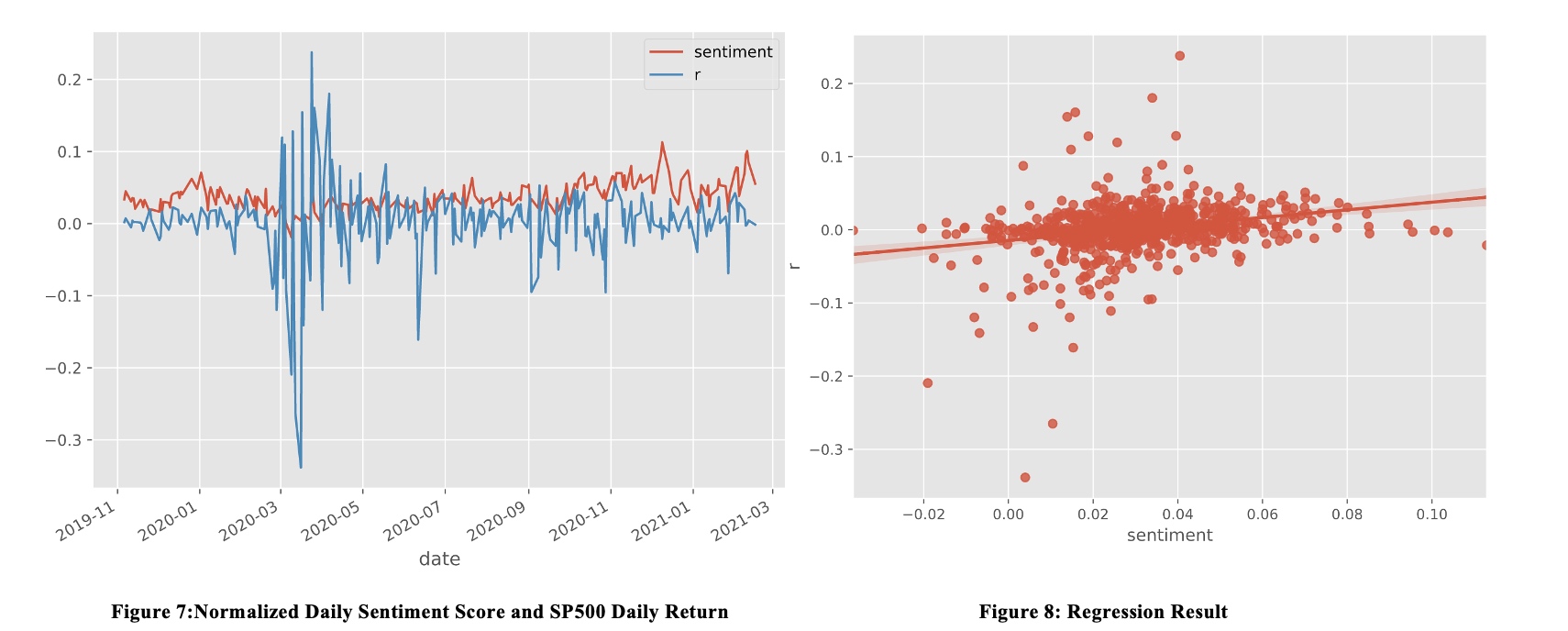
 We also apply linear regression on sentiment score and the daily return. We get the following result:
Intercept: -0.0055, beta:0.0799, R-Square:0.067, t_beta 7.637, P-value: 0.000
1
2
3
4
5
6
7
8
9
10
11
12
13
14
15
16
17
18
19
20
21
22
23
24
25
26
27
28
29
30
31
32
33
34
35
36
37
38
39
40
41
42
43
44
45
46
47
48
49
50
51
52
53
54
55
56
57
58
59
60
61
62
63
64
65
66
67
ax = sns.heatmap(tw2017_daily_group.iloc[:, 2:].corr(), linewidths=.5,)


# Instead of regression, we try to just do a classification by sentiment score

temp_sentiment = tw2017[['date', 'sentiment']].groupby('date').mean()
tw2017_daily_group = tw2017_daily_group.join(temp_sentiment, on='date')

# for add binary return for each day


def mybinary(t):
    if t > 0:
        return 1
    if t == np.nan:
        return np.nan
    else:
        return 0


tw2017_daily_group['binary'] = tw2017_daily_group['r'].apply(mybinary)
tw2017_daily_group['binary(t+1)'] = tw2017_daily_group['binary'].shift(-1)


tw2017_daily_group.iloc[:, 2:].dropna().corr()

# Linear regression
import statsmodels.formula.api as smf
ols = smf.ols(formula='binary~tweets', data=tw2017_daily_group.iloc[:, 2:].dropna(
).assign(tweets=lambda x: x['#tweets'])).fit()
print(ols.summary())
# The number of tweets has no explaining power on stock change


ols = smf.ols(formula='binary~sentiment',
              data=tw2017_daily_group.iloc[:, 2:].dropna()).fit()
print(ols.summary())
# there seems to be correlation between binary and sentiment


ols = smf.ols(formula='r~sentiment',
              data=tw2017_daily_group.iloc[:, 2:].dropna()).fit()
print(ols.summary())
# there seems to be correlation between return and sentiment

# heat map
sns.heatmap(tw2017_daily_group.iloc[:, 2:].dropna().corr(), linewidths=.5,)


# Nomarlized Plot of r-sentiment
from sklearn.preprocessing import normalize
tempdf = tw2017_daily_group.set_index('date').dropna().iloc[:, 1:]
normalized_df = pd.DataFrame(
    normalize(tempdf.values, axis=0), index=tempdf.index, columns=tempdf.columns)
normalized_df.plot(y=['sentiment', 'r'])

# regression plot
import seaborn as sns
import matplotlib.pyplot as plt
import matplotlib as mpl
mpl.style.use(['ggplot'])  # optional: for ggplot-like style
sns.regplot(x='sentiment', y='r', data=normalized_df)

# save the result
tw2017[['sentiment', 'tweet']].sort_values(
    by='sentiment', ascending=False).head(15).to_excel("temp.xlsx")
Result for sentiment analysis
In terms of correlation:
- Number of tweets is correlated with volatility, but has minimal correlation with return.
- Sentiment score is correlated with daily return, but has minimal correlation with volatility.
In terms of predicting power:
- Number of tweets has some predicting power for volatility, but this could be a natural result of volatility clustering.
- Sentiment score has no predicting power in our case.
More to find out:
- What is the relationship indeed? We still don’t know wether number of tweets and sentiment score lead the stock change or vice versa?
- Can we make better predictions or find stronger correlations by the following techniques:
- Regress on #tweets and sentiment Score simultaneously, or
- Add features like
dispersion in sentiment,change in number of tweetsandchange in sentiment score;
Unsupervised Learning
K-means
Firstly, we try find the topics or type of each tweeter. So we apply k-means to group tweets data into three clusters.
1
2
3
4
5
6
7
8
9
10
11
12
13
14
15


# K-means
from sklearn.cluster import KMeans
X = bow
# Perform k-means clustering of the data into two clusters.
kmeans = KMeans(n_clusters=3, random_state=0).fit(X)
kmeans.cluster_centers_

# label infos
group_label = kmeans.labels_

# how many tweets for each group?
group_label = pd.Series(group_label)
group_label.value_counts()
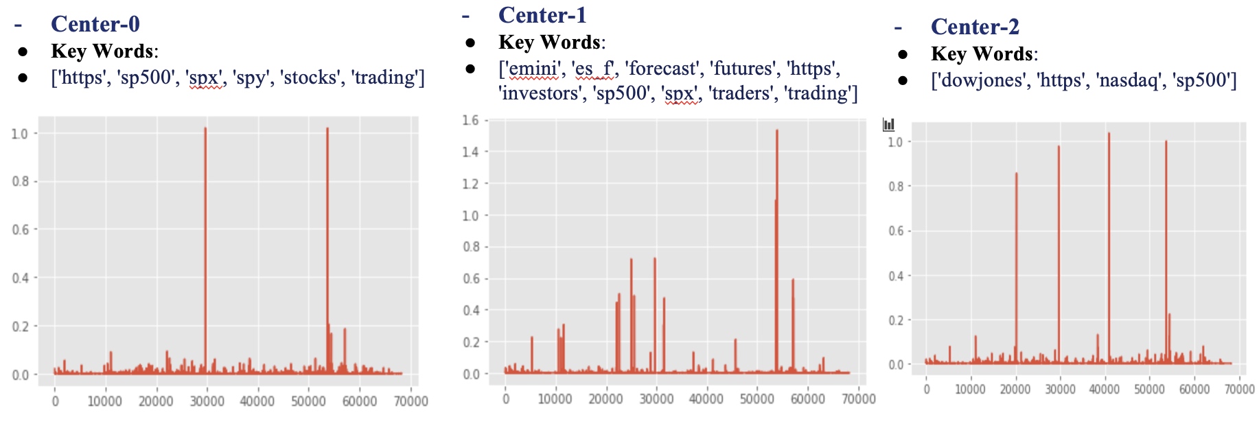
Number of Tweets assigned for each Cluster is: [0:29535, 1: 3419, 2: 24100]. The key words and BoW vector is given below:
1
2
3
4
5
6
7
8
9
10
11
12
13
14
15
16
17
18
19
20
21
22
23
24
# What are these kmeans.cluster_centers_
# for cluster_center 1:
plt.plot(kmeans.cluster_centers_[0])
feature_names = v.get_feature_names()
center1 = [feature_names[i]
           for i in np.where(kmeans.cluster_centers_[0] > 0.1)[0].tolist()]
center1


# What are these kmeans.cluster_centers_
# for cluster_center 2:
plt.plot(kmeans.cluster_centers_[1])
# feature_names=v.get_feature_names()
center2 = [feature_names[i]
           for i in np.where(kmeans.cluster_centers_[1] > 0.4)[0].tolist()]
center2

# What are these kmeans.cluster_centers_
# for cluster_center 3:
plt.plot(kmeans.cluster_centers_[2])
# feature_names=v.get_feature_names()
center3 = [feature_names[i]
           for i in np.where(kmeans.cluster_centers_[2] > 0.4)[0].tolist()]
center3
Next, we manually identify these clusters and find the following result:
Cluster_0: Contains many real users, who express some opinion about SP500. Typical Tweet: (See temp_kmeans0.xlsx)
‘Exciting #trading year. Dropped my long #SP500 futures contracts from 2079, back long on #ZB and #ZN #BondNotes #finance #stocksandbonds 📈’
Cluster_1: Contains a lot web robots, who always give the same text repeatedly, which tends to bring little useful information. Typical Tweet: (See temp_kmeans1.xlsx)
‘Monday 02/01 - AI Forecast of S&P 500 for investors and traders #sp500, #spx, #forecast’
Cluster_2 Also contains a lot web robots, but these robots seem to summarize the recent performance. Typical Tweet: (See temp_kmeans2.xlsx)
‘Trend Update: $VTI, #SP400, #SP600, #NASDAQ, #DJIA #DOW, #SP500, #RUSSELL2000, continue to be Bullish, mid term.
| Cluster 0 (Real User) | Cluster 1 (Useless Robot) | Cluster 2 (Useful Robot) | |
|---|---|---|---|
| sentiment | 1 | 1 | 1 |
| r | 0.147306 | 0.011468 | 0.414756 |
| r-squred | 0.050687 | 0.057768 | -0.047024 |
| r(t+1) | -0.072556 | 0.064234 | -0.010021 |
| r-squred(t+1) | -0.116040 | -0.010351 | -0.174967 |
The result is in line with our manual Identification before:
- Cluster 2 Contain many useful web robot: Their sentiment has high correlation with Stock Return
- Cluster 1 Contain many useless web robot: Their sentiment has little correlation with Stock Return
- Cluster 0 Contain many real users: their own opinion: Their sentiment has some correlation with Stock Return
1
2
3
4
5
6
7
8
9
10
11
12
13
14
15
16
17
18
19
20
21
22
23
24
25
26
27
28
29
30
31
32
33
34
35
36
37
38
39
40
41
42
43
44
45

# add the kmeans-Center to the dataframe
tw2017['Kmeans-Center'] = group_label


# save the grouped tweets for manual idendification later
tw2017[['tweet', 'Kmeans-Center']][tw2017['Kmeans-Center']
                                   == 2].to_excel('temp_kmeans2.xlsx')
tw2017[['tweet', 'Kmeans-Center']][tw2017['Kmeans-Center']
                                   == 1].to_excel('temp_kmeans1.xlsx')
tw2017[['tweet', 'Kmeans-Center']][tw2017['Kmeans-Center']
                                   == 0].to_excel('temp_kmeans0.xlsx')


tw2017[['tweet', 'Kmeans-Center']]


# Within each gourp, check the relationship between sentiment and return/volatility

g_kmeans = tw2017[['date', 'sentiment', 'Kmeans-Center']
                  ].groupby(['date', 'Kmeans-Center']).mean().reset_index()
tw2017_daily_group
# ggg[ggg['Kmeans-Center']==2].join(tw2017_daily_group[['date','r','r2','r(t+1)','r2(t+1)','binary','binary(t+1)']],on='date',how='left')
g_kmeans = g_kmeans.merge(tw2017_daily_group[[
                          'date', 'r', 'r2', 'r(t+1)', 'r2(t+1)', 'binary', 'binary(t+1)']], on='date')
g_kmeans


# useless robots (ads)
g_kmeans[g_kmeans['Kmeans-Center'] ==
         1].dropna().iloc[:, 2:].corr()['sentiment']

# useful robots (summaryize the daily performance)
g_kmeans[g_kmeans['Kmeans-Center'] ==
         2].dropna().iloc[:, 2:].corr()['sentiment']


# normal people
g_kmeans[g_kmeans['Kmeans-Center'] ==
         0].dropna().iloc[:, 2:].corr()['sentiment']


# For comparison, when they are mixed
tw2017_daily_group.iloc[:, 2:].dropna().corr()
PCA and T-SNE for Dimension Reduction
We use SVD to reduce the dimension of the DTM:
- Perform TruncatedSVD to get the first 50 components of the original BoW
- Total Explained variation by the first 50 components:
34%
1
2
3
4
5
6
7
8
9
10
11
12
13
14
15
16
17
18
19
20
21
22
23
24
25
26
27
28
29
30
31
32
33
34
35
36
37
38
39
40
41
42
43
44
45
46
47
48
49
50
51
52
53
54
55
56
57

# PCA
from sklearn.decomposition import PCA
pca = PCA(n_components=3)
pca_result = pca.fit_transform(bow.A)
df['pca-one'] = pca_result[:, 0]
df['pca-two'] = pca_result[:, 1]
df['pca-three'] = pca_result[:, 2]
print('Explained variation per principal component: {}'.format(
    pca.explained_variance_ratio_))

# Failed! The the PCA algorithm is not suitable for this sparse matrix form Bow.

# Insetad we use sklearn.decomposition.TruncatedSVD

# TruncatedSVD
from sklearn.decomposition import TruncatedSVD
svd = TruncatedSVD(n_components=50, n_iter=7, random_state=42)
svd_result = svd.fit_transform(bow)
print("Explained variation per principal component: \n {}".format(
    svd.explained_variance_ratio_))
print("Total Explained variation by the first {} components: \n{}".format(
    50, svd.explained_variance_ratio_.sum()))


# plot the first 3 component
plt.plot(svd.components_[0, :])
plt.plot(svd.components_[1, :])
plt.plot(svd.components_[2, :])


# plot the data with first 2 SVD component
plt.figure(figsize=(16, 10))
sns.scatterplot(
    x="PCA-one", y="PCA-two",
    hue="Kmeans-Center",
    palette=sns.color_palette("hls", 3),
    data=tw2017,
    legend="full",
    alpha=0.3
)


# For a 3d-version of the same plot
ax = plt.figure(figsize=(16, 10)).gca(projection='3d')
ax.scatter(
    xs=tw2017["PCA-one"],
    ys=tw2017["PCA-two"],
    zs=tw2017["PCA-three"],
    c=tw2017["Kmeans-Center"],
    cmap='tab10'
)
ax.set_xlabel('pca-one')
ax.set_ylabel('pca-two')
ax.set_zlabel('pca-three')
plt.show()
Now we plot the data with principal components (Labeled by Kmeans)
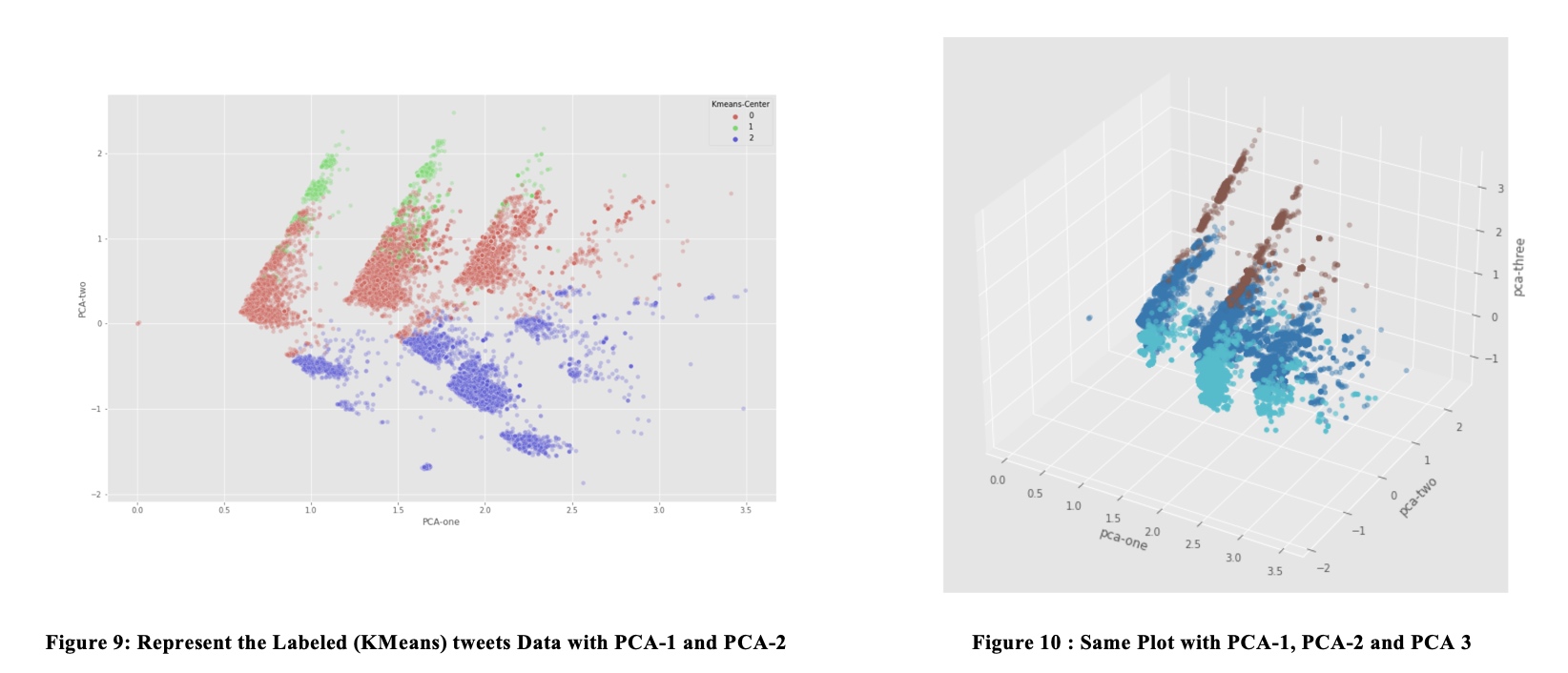
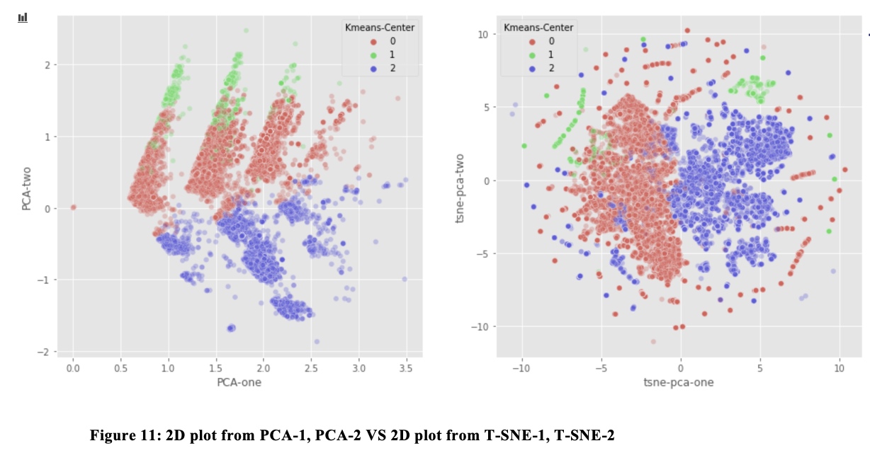
From the plot with PCA-1 and PCA-2, Class 0 and Class 1Seem to belong to the same group in PCA 2D-plot. We decide to get 2D t-SNE from the 50 principal components, and plot the data with these T-SNE transformation.
In T-SNE, we find that the Class 1 and Class 2 are indeed differentiated, which is in line with our finding that class 0 are real users, and class 1 are web robots.
1
2
3
4
5
6
7
8
9
10
11
12
13
14
15
16
17
18
19
20
21
22
23
24
25
26
27
28
29
30
31
32
33
34
35
36
37
38
39
40
41
42
43
44
45
46
47
48
49

# Try to use t-sne for the first 50 components above, and try to see if we can find some interesting result

from sklearn.manifold import TSNE
import time
time_start = time.time()
tsne = TSNE(n_components=2, verbose=1, perplexity=40, n_iter=300)
tsne_results = tsne.fit_transform(svd_result)
print('t-SNE done! Time elapsed: {} seconds'.format(time.time() - time_start))


# plot the data structure with 2 TSNE-component
tw2017['tsne-pca-one'] = tsne_results[:, 0]
tw2017['tsne-pca-two'] = tsne_results[:, 1]
plt.figure(figsize=(16, 10))
sns.scatterplot(
    x="tsne-pca-one", y="tsne-pca-two",
    hue="Kmeans-Center",
    palette=sns.color_palette("hls", 3),
    data=tw2017,
    legend="full",
    alpha=0.3
)


# for comparison

plt.figure(figsize=(16, 7))
ax1 = plt.subplot(1, 2, 1)
sns.scatterplot(
    x="PCA-one", y="PCA-two",
    hue="Kmeans-Center",
    palette=sns.color_palette("hls", 3),
    data=tw2017,
    legend="full",
    alpha=0.3,
    ax=ax1
)
ax2 = plt.subplot(1, 2, 2)
sns.scatterplot(
    x="tsne-pca-one", y="tsne-pca-two",
    hue="Kmeans-Center",
    palette=sns.color_palette("hls", 3),
    data=tw2017,
    legend="full",
    alpha=0.3,
    ax=ax2
)
Supervised Learning
In this part, we try to find out whether information on twitter has predicting power over SP500 return on next trading day. We mainly use Ensembled Decision Tree Model – LightGBM for this purpose.
We train LightGBM model on the past rolling 240 days and predict the sign of return of next day. The result is not satisfactory with a accuracy score of 0.495:

We tried different BoW package and hyperparameters, but the model still performs badly.
1
2
3
4
5
6
7
8
9
10
11
12
13
14
15
16
17
18
19
20
21
22
23
24
25
26
27
28
29
30
31
32
33
34
35
36
37
38
39
40
41
42
43
44
45
46
47
48
49
50
51
52
53
54
55
56
57
58
59
60
61
62
63
64
65
66
67
68
69
70
71
72
73
74
75
76
77
78
79
80
81
82
83
84
85
86
87
88
89
90
91
92
93
94
95
96
97
98
99
100
101
102
103
104
105
106
107
108
109
110
# Supervised Learning


years = ['2017', '2018', '2019', '2020']
corpus_daily_collections = []
for year in years:
    data = pd.read_csv(r"tweets" + year + ".csv", encoding='latin-1')
    data = data[data['language'] == 'en']
    data = data.dropna(how='all', axis=1)
    dates = data['date'].unique()
    corpus_daily = []
    for date in dates:
        tweets = data[data['date'] == date]['tweet']
        text_date = ''
        for tweet in tweets:
            text_date += tweet
        corpus_daily.append(text_date)
    corpus_daily = pd.Series(corpus_daily, index=dates)
    corpus_daily = corpus_daily.sort_index()
    corpus_daily_collections.append(corpus_daily)
corpus_daily_collections = pd.concat(corpus_daily_collections)
corpus_daily_collections.index = pd.to_datetime(corpus_daily_collections.index)
corpus_daily = corpus_daily_collections.sort_index()
corpus_daily.to_hdf(r"corpus_daily.h5", 'Ying', mode='w')


from sklearn.feature_extraction.text import CountVectorizer

years = ['2017', '2018', '2019', '2020']
corpus_daily_collections = []
for year in years:
    data = pd.read_csv(r"tweets" + year + ".csv", encoding='latin-1')
    data = data[data['language'] == 'en']
    data = data.dropna(how='all', axis=1)
    dates = data['date'].unique()
    corpus_daily = []
    for date in dates:
        tweets = data[data['date'] == date]['tweet']
        text_date = ''
        for tweet in tweets:
            text_date += tweet
        corpus_daily.append(text_date)
    corpus_daily = pd.Series(corpus_daily, index=dates)
    corpus_daily = corpus_daily.sort_index()
    corpus_daily_collections.append(corpus_daily)
corpus_daily_collections = pd.concat(corpus_daily_collections)
corpus_daily_collections.index = pd.to_datetime(corpus_daily_collections.index)
corpus_daily = corpus_daily_collections.sort_index()
corpus_daily.to_hdf(r"corpus_daily.h5", 'Ying', mode='w')


corpus = pd.read_hdf(r"corpus_daily.h5")
sp500 = pd.read_excel(r"sp500.xlsx")

# get y
sp500_close = sp500['Adj Close']
sp500_close.index = sp500['Date']
return_one_day_later = (sp500_close.shift(-1) / sp500_close - 1).dropna()
sign_one_day_later = pd.Series(
    [e >= 0 for e in return_one_day_later], index=return_one_day_later.index).astype(float)
sign_one_day_later = sign_one_day_later.loc["2017-01-01":'2021-02-17']

# turn days in corpus into trading days
corpus_by_trading_days = []
dates = sign_one_day_later.index.tolist()
for date in dates[1:]:
    last_day = dates[dates.index(date) - 1]
    corpus_date = corpus.loc[last_day:date].iloc[1:]
    if len(corpus_date) > 1:
        string = ''
        for e in corpus_date.values:
            string += e
    else:
        string = corpus_date.iloc[0]
    corpus_by_trading_days.append(string)
corpus_by_trading_days = [
    corpus.iloc[0] + corpus.iloc[1] + corpus.iloc[2]] + corpus_by_trading_days
corpus_by_trading_days = pd.Series(corpus_by_trading_days, index=dates)

# create vocabulary
cv = CountVectorizer()
cv.fit(corpus_by_trading_days)

# modeling
import lightgbm as lgb
rolling_period = 240
dates = corpus_by_trading_days.index
predictions = []
for date_to_predict in dates[rolling_period:]:
    print(date_to_predict)
    start_date = dates[dates.tolist().index(date_to_predict) - rolling_period]
    end_date = dates[dates.tolist().index(date_to_predict) - 1]
    text_look_back = corpus_by_trading_days.loc[start_date:date_to_predict]
    bow = cv.transform(text_look_back).toarray()
    # divide by row sum
    X = bow / bow.sum(axis=1)[:, None]
    X_train = X[:-1]
    X_to_predict = X[-1].reshape(1, -1)
    label_train = sign_one_day_later.loc[start_date:end_date]
    lgb_classifier = lgb.LGBMClassifier(num_leaves=50)
    lgb_classifier.fit(X_train, label_train)
    y_predicted = lgb_classifier.predict(X_to_predict)[0]
    predictions.append(y_predicted)
predictions = pd.Series(predictions, index=dates[rolling_period:])
predictions.to_csv(r"predictions.csv")

# calculate accuracy
from sklearn.metrics import accuracy_score
print(accuracy_score(sign_one_day_later.reindex(predictions.index), predictions))
Conclusion
We find some correlation among number of tweets, sentiment score, daily return and volatility of SP500. Only the number of tweets have some predicting power for volatility, but it could be a natural result of volatility clustering of stock returns.
With unsupervised learning program, we find that the tweets about SP500 can be broadly classified into three groups: useful Robots, useless Robots, real users. Different group’s sentiment has different correlation with the daily return.
We try to predict the return by text analytics and LightGBM algorithm, but the accuracy is not satisfactory. Maybe the SP500 is related to too many risk factors, and therefore cannot be predicted with the informations on twitter. Also, the index is perhaps more difficult to predict compared to a single stock.
Further research may involve:
Improvements on Algorithms:
- Combine Supervised and Unsupervised Learning: Instead of just using the whole tweet corpus as an input in our supervised learning model, we classify tweets into different groups and choose the “most informative’ subset of tweets.
- Better sentiment analysis algorithm: nltk.sentiment.Vader is not specially tuned for financial topics in tweets, we might use sophisticated and finance-specialized packages (e.g. Finbert) to derive the sentiment score.
- Time Series Analysis: As we know, the return of SP500 index is autocorrelated and has volatility clustering. It indicates we might need to add time series analysis in tweets analytics, to better capture the trend and change in sentiment and topics.
Improvement on data quality:
- Collect labels made by human: Now all the labels are made by KMeans algorithm. If we have more reliable labels, we might be able to find out the most informative tweets more efficiently.
Comments