This series of Data Science posts are my notes for the IBM Data Science Professional Certificate.
Importing Datasets
Python Packages for Data Science
We have divided the Python data analysis libraries into three groups.
-
Scientific Computing Libraries
- Pandas offers data structure and tools for effective data manipulation and analysis. It is designed to provided easy indexing functionality.
- The NumPy library uses arrays for its inputs and outputs. It can be extended to objects for matrices and with minor coding changes, developers can perform fast array processing.
- SciPy includes functions for some advanced math problems as listed on this slide, as well as data visualization.
-
Visualization Libraries
-
The Matplotlib package is the most well known library for data visualization. It is great for making graphs and plots. The graphs are also highly customizable.
-
Seaborn. It is based on Matplotlib. It’s very easy to generate various plots such as heat maps, time series and violin plots.
-
-
Algorithmic Libraries
- The Scikit-learn library contains tools statistical modeling, including regression, classification, clustering, and so on. This library is built on NumPy, SciPy and Matplotib.
- Statsmodels is also a Python module that allows users to explore data, estimate statistical models, and perform statistical tests.
Importing and Exporting Data in Python
Two important properties:
- Format: csv, json, xlsx…
- File Path of Dataset:
- Computer: /User/Desktop/my.csv
- Internet: https://google.com/my.csv
1
2
3
4
5
6
7
8
9
10
11
12
13
14
15
16
import pandas as pd
# read the online file by the URL provided above, and assign it to variable "df"
path="https://archive.ics.uci.edu/ml/machine-learning-database/autos/imports-85.data"

#By default, the pd.read_csv assumes there is a header line. If no header, claim it.
df = pd.read_csv(path,header=None)
df.head(n)
df.tail(n)

#Replace the default header:
headers=['c1','c2','c3',....,'c10']
df.columns=headers

#Exporting a pandas dataframe to csv
path='c:\windows\...\my.csv'
df.to_csv(path)
Getting Started Analyzing Data in Python
| Data Formate | Read | Save |
|---|---|---|
| csv | pd.read_csv() |
df.to_csv() |
| json | pd.read_json() |
df.to_json() |
| excel | pd.read_excel() |
df.to_excel() |
| hdf | pd.read_hdf() |
df.to_hdf() |
| sql | pd.read_sql() |
df.to_sql() |
| … | … | … |
Check Data Types for two main reasons:
- Potential info and type mismatch
- Cimpatibility with python methods
In pandas, we use dataframe.dtypes to check data types
1
2
3
4
5
df.dtypes
df.describe()
# for full summary statistics
df.describe(include='all')
1
2
3
4
5
6
7
8
9
10
11
12
13
14
15
df.info()
------
<class 'pandas.core.frame.DataFrame'>
RangeIndex: 4 entries, 0 to 3
Data columns (total 2 columns):
 #   Column   Non-Null Count  Dtype
---  ------   --------------  -----
 0   Student  4 non-null      object
 1   Grade    4 non-null      int64
dtypes: int64(1), object(1)
memory usage: 192.0+ bytes

#Show the top 30 rows and the bottom 30 rows:
df.info
Accessing Databases with Python
Please check for the SQL category.
Data Pre-processing
Also known as data cleaning, or data wrangling.
Data preprocessing is a necessary step in data analysis. It is the process of converting or mapping data from
one raw form into another format to make it ready for further analysis.
Main learning objectives:
- Identify and handle missing values
- Data Formatting
- Data Normalization (centering/scaling)
- Data Binning
- Turning categorical values into numerical variables to make statistical model easier.
Dealing with missing values in Python
-
Check the data collection source
- Drop the missing values
- Drop the variable
- Drop the data entry
- Replacing the missing values
- Replace it with an average of similar points
- Replace it by frequency
- Replace it based on conditional expectations
- Leave it as missing data
How to drop missing values in Python?
1
2
3
4
5
6
7
8
9
10
11
12
13
14
15
16
17
18
19
#Check the nulls
missing_data = df.isnull()
missing_data.head(5)
# Count missing values in each column
for column in missing_data.columns.values.tolist():
    print(column)
    print (missing_datadata[column].value_counts())
    print("")
# Use dataframes.dropna()
# Set axis=0 to drop the rows, axis=1 to drop the columns
df=df.dropna(subset=['Price'],axis=0)
# Set inplace = True to allow the operation to work on the dataframe itself directly.
df.dropna(subset=['Price'],axis=0,inplace =True)
# The codes above are equivalent.

# Drop all the rows which contain missing value
df.dropna(axis=0)
# reset the index, because we droped several rows!!
df.rest_index(drop=True,inplace=True)
How to replace missing values in Python?
1
2
3
4
5
6
7
8
9
10
11
12
13
14
15
16
17
18
19
# Use dataframe.replace(missing_value,new_value)
mean=df['col1'].mean()
# Incase the data type is not correct
mean=df['col1'].astype('float').mean(axis=0)
df['col1']=df['col1'].replace(np.nan,mean)
# Alternatively, we can use inplce=Ture
df['col1'].replace(np.nan,mean,inplce=True)
# To see the counts for all the unique values in a column
df['col1'].value_counts()
# We can also use the ".idxmax()" method to calculate for us the most common type automatically:
df['col1'].value_counts().idxmax()
# After we drop some values, we may rant to reset the index
df.reset_index()
# convert the value_counts result into a dataframe

drive_wheels_counts = df['drive-wheels'].value_counts().to_frame()
drive_wheels_counts.rename(columns={'drive-wheels': 'value_counts'}, inplace=True)
drive_wheels_counts.index.name = 'drive-wheels'
drive_wheels_counts
Data Formatting in Python
Data is usually collected from different places by different people which may be stored in different formats. Data formatting means bringing data into a common standard of expression that allows users to make meaningful comparisons.
As a part of dataset cleaning, data formatting ensures the data is consistent and easily understandable.
| City | City |
|---|---|
| NY | New York |
| N.Y | New York |
| NYC | New York |
| New York | New York |
For this task, we can use dataframe.replace(old_value,new_value)
Applying calculation to an entire column:
1
2
df['col1']=100/df['col1']
df.rename(columns={'col1':'100_over_col_divided'},inplace=True)
Incorrect Data Types
To identify data types:
dataframe.dtypes
To convert data types:
dataframe.astype()
1
2
3
4
5
6
# Example: convert data type into integer
df['price']=df['price'].astype("int64")
df[["bore", "stroke"]] = df[["bore", "stroke"]].astype("float")
df[["normalized-losses"]] = df[["normalized-losses"]].astype("int")
df[["price"]] = df[["price"]].astype("float")
df[["peak-rpm"]] = df[["peak-rpm"]].astype("float")
Data Normalization in Python
Several approaches for normalization:
Min-Max: $\frac{X-mean(X)}{X_{max}-X_{min}}$
Z-score: $\frac{X-mean(X)}{Std(X)}$
1
2
3
4
5
6
7
# Min-Max:
df['col']=(df['col']-df['col'].min())/(df['col'].max()-df['col'].min())
# Z-score
df['col']=(df['col']-df['col'].mean())/df['col'].std()
# Alternatively, we can use
import numpy as np
df['Grade']=(df['Grade']-np.mean(df['Grade']))/np.std(df['Grade'])
pandas.cut()
cut(): Creates bins with fixed/equal widths (based on value ranges).qcut(): Creates bins with roughly equal counts (based on data distribution).
pandas.cut() is a function in pandas used to discretize continuous data into bins (also called binning). It divides a continuous numerical dataset into specified intervals (or “bins”) and assigns each value to the corresponding interval, converting the continuous data into categorical data. This is useful for grouping data, feature transformation, or statistical analysis.
Key Purpose
It converts continuous variables (e.g., age, income, test scores) into discrete categories (e.g., “child/teen/adult”, “low/middle/high income”). This helps simplify analysis, improve interpretability, or prepare data for models that work better with categorical features.
Basic Example
Suppose you have test scores (0-100) and want to categorize them into “Fail”, “Pass”, “Good”, and “Excellent”:
1
2
3
4
5
6
7
8
import pandas as pd

scores = pd.Series([55, 62, 78, 89, 95, 43, 71])
bins = [0, 60, 70, 85, 100]  # Define interval boundaries
labels = ["Fail", "Pass", "Good", "Excellent"]  # Labels for each bin

result = pd.cut(scores, bins=bins, labels=labels)
print(result)
Output:
1
2
3
4
5
6
7
8
9
0      Fail
1      Pass
2      Good
3    Excellent
4    Excellent
5      Fail
6      Pass
dtype: category
Categories (4, object): ['Fail' < 'Pass' < 'Good' < 'Excellent']
Key Parameters
x: The continuous data to bin (a Series or array).bins: Defines the bin boundaries. Can be:- A list of values (e.g.,
[0, 60, 100]for fixed intervals). - An integer
n(automatically createsnequal-width bins).
- A list of values (e.g.,
labels: Custom names for the bins (must match the number of bins). If omitted, returns the interval itself (e.g.,(0, 60]).right: Whether bins are closed on the right (defaultTrue, i.e.,(left, right]). Set toFalsefor[left, right).include_lowest: IfTrue, the first bin includes the minimum value of the data.
For example, price is a feature range from 0 to 1000000. We can convert to price into “low price”, “Mid Price” and “High Price”.
1
2
3
4
5
6
7
8
9
10
11
12
13
14
15
16
17
18
19
20
21
22
23
24
25
%matplotlib inline
import matplotlib as plt
from matplotlib import pyplot
plt.pyplot.hist(df["Price"])
# set x/y labels and plot title
plt.pyplot.xlabel("horsepower")
plt.pyplot.ylabel("count")
plt.pyplot.title("horsepower bins")

# say we want to divide the data into n subsets
bins=np.linspace(min(df["price"]),max(df['price']),n+1)
goup_names=[1,2,3,4,....,n]
df["price-binned"]=pd.cut(df['price'],bins,labels=group_names,include_lowest=True)
df["price-binned"].value_counts()

# Visualization
%matplotlib inline
import matplotlib as plt
from matplotlib import pyplot
pyplot.bar(group_names, df["horsepower-binned"].value_counts())

# set x/y labels and plot title
plt.pyplot.xlabel("horsepower")
plt.pyplot.ylabel("count")
plt.pyplot.title("horsepower bins")
pandas.qcut()
pandas.qcut() is a function used to discretize continuous data into bins based on quantiles. Unlike cut() (which creates bins with fixed or equal widths), qcut() divides data into intervals such that each bin contains approximately the same number of observations. This ensures balanced group sizes, making it useful for analyzing distributions or creating evenly populated categories.
Key Purpose
It splits data into groups where each group has a roughly equal number of samples, based on quantiles (e.g., quartiles, quintiles). For example, dividing income data into 4 bins where each bin contains ~25% of the population.
Basic Example
Using random income data split into 4 quantile-based bins:
1
2
3
4
5
6
7
8
9
10
11
import pandas as pd
import numpy as np

np.random.seed(42)
incomes = pd.Series(np.random.randint(10000, 100000, size=10))  # 10 random incomes

# Split into 4 bins (quartiles) with labels
result, bins = pd.qcut(incomes, q=4, labels=["Low", "Mid-Low", "Mid-High", "High"], retbins=True)

print("Binned results:\n", result)
print("\nBin boundaries:\n", bins)
Key Parameters
x: The continuous data to bin (Series or array).q: Number of quantiles (e.g.,q=4for quartiles) or a list of quantile values (e.g.,[0, 0.25, 0.5, 0.75, 1]).labels: Custom names for bins (optional; defaults to interval ranges).retbins: IfTrue, returns the computed bin boundaries (defaultFalse).duplicates: How to handle duplicate quantiles (e.g.,'drop'to remove duplicates).
one-hot encoding
To turn categorical variables into quantitative variables in Python, we use pd.get_dummies()
We encode the values by adding new features corresponding to each unique element in the original feature we would like to encode.
| Student | Grade | |
|---|---|---|
| 0 | John Smith | 80 |
| 1 | Jane Smith | 75 |
| 2 | John Doe | 65 |
| 3 | Jane Doe | 90 |
1
2
3
# use pandas.get_dummies() method to turn categorical data into dummy variables
# aka One-Hot Encoding
dm=pandas.get_dummies(df.Student)
| Jane Doe | Jane Smith | John Doe | John Smith | |
|---|---|---|---|---|
| 0 | 0 | 0 | 0 | 1 |
| 1 | 0 | 1 | 0 | 0 |
| 2 | 0 | 0 | 1 | 0 |
| 3 | 1 | 0 | 0 | 0 |
1
result=pd.concat([df,dm],axis=1).drop("Student",axis=1)
Exploratory Data Analysis (EDA)
In this module, you will learn about:
- Descriptive Statistics
- Groupby
- ANOVA
- Correlation
- Correlation - Statistics
Descriptive Statistics
describe and value_counts
Descriptive statistical analysis helps to describe basic features of a dataset and obtains a short summary about the sample and measures of the data.
1
2
df.describe(include='all')
df['column_name'].value_counts()
Box Plots
Box plots are great way to visualize numeric data, since you can visualize the various distributions of the data.
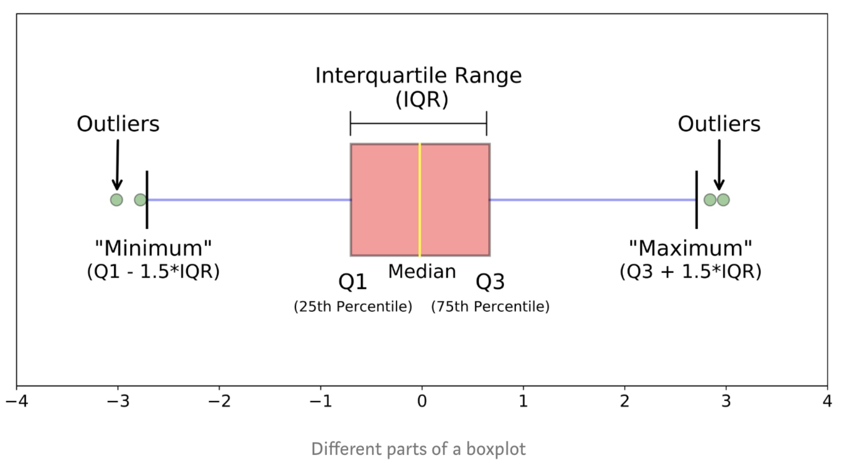

1
2
import seaborn as sns
sns.boxplot(x='Drive-wheels',y='price',data=df)

Scatter Plot
Scatter plot show the relationship between two variables
- Predictor/independent variables on x-axis
- Target/dependent variables on y-axis
1
2
3
4
5
6
import matplotlib.pyplot as plt
plt.scatter(df['size_of_house'],df['price'])
plt.title("scatter of house size Vs price")
plt.xlabel('size of house')
plt.ylabel('price')
GroupBy in Python
Groupby()
1
2
3
4
5
6
7
8
9
10
11
12
13
14
15
df['Student'].unique()

#groupby single property
gg=df.groupby(["Student",as_index=True).mean()

# Groupby Multiple Properties
gg=df.groupby(["Student","Grade"],as_index=True).mean()
gg.index

# We can set the as_index=False
gg2=df.groupby(["Student","Grade"],as_index=False).mean()

# We can only work with the columns we care about by slicing first
df[['price','body-style']].groupby(['body-style']).mean()
Pivot()
One variable as the columns and another variable as rows, the rest values are displayed in this two-dimensional panel.
1
2
3
4
5
6
df_pivot=df.pivot(index='Student',columns="NewCol")
# Use heatmap plot
import matplotlib.pyplot as plt
plt.pcolor(df_pivot,cmap="RdBu")
plt.colorbar()
plt.show()
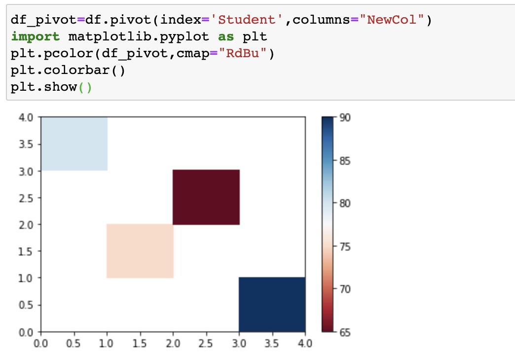
he heatmap plots the target variable (price) proportional to colour with respect to the variables ‘drive-wheel’ and ‘body-style’ in the vertical and horizontal axis respectively. This allows us to visualize how the price is related to ‘drive-wheel’ and ‘body-style’.
The default labels convey no useful information to us. Let’s change that:
1
2
3
4
5
6
7
8
9
10
11
12
13
14
15
16
17
18
19
20
fig, ax = plt.subplots()
im = ax.pcolor(grouped_pivot, cmap='RdBu')

#label names
row_labels = grouped_pivot.columns.levels[1]
col_labels = grouped_pivot.index

#move ticks and labels to the center
ax.set_xticks(np.arange(grouped_pivot.shape[1]) + 0.5, minor=False)
ax.set_yticks(np.arange(grouped_pivot.shape[0]) + 0.5, minor=False)

#insert labels
ax.set_xticklabels(row_labels, minor=False)
ax.set_yticklabels(col_labels, minor=False)

#rotate label if too long
plt.xticks(rotation=90)

fig.colorbar(im)
plt.show()
1
2
3
4
# Often, we won't have data for some of the pivot cells. We can fill these missing cells with the value 0, but any other value could potentially be used as well. It should be mentioned that missing data is quite a complex subject and is an entire course on its own.
grouped_pivot = grouped_pivot.fillna(0)
 #fill missing values with 0
grouped_pivot
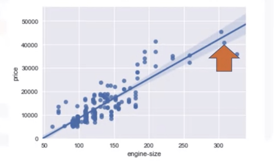
Correlation
regressin plot
1
2
3
4
import seaborn as sns
import matplotlib.pyplot as plt
sns.regplot(x='engine-size',y='Price',data=df)
plt.ylim(0,)
Pearson Correlation
P-value:
- p-value<0.001, Strong certainty in the result
- p-value<0.05, Moderate certainty in the result
- p-value<0.1, Weak certainty in the result
- p-value>0.1, No certainty in the result
1
pearson_coef, p_value=stats.pearson(df['horsepower'],df['price'])
Correlation Heatmap: It shows the correlation between any different pair of columns.
1
2
3
4
df.corr()

# say we want to know the correlations bwtween certain columns
df[["stroke","price"]].corr()

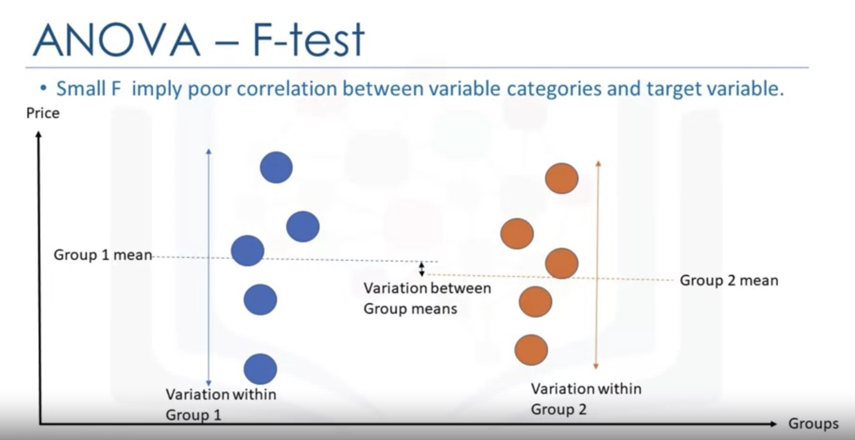
Analysis of Variance (ANOVA)
stats.f_oneway
1
2
3
4
5
# Anova between "honda" and "subaru"
df_anova=df[['make','price']]
grouped_anova=df_anova.groupby(['make'])
anova_results_1=stats.f_oneway(grouped_anova.get_group('honda')['Price'],grouped_anova.get_group('subaru')['price'])
1
2
3
4
5
6
7
8
9
10
11
12
13
14
15
16
17
18
19
20
21
22
grouped_test2=df_gptest[['drive-wheels', 'price']].groupby(['drive-wheels'])
grouped_test2.head(2)
# We can obtain the values of the method group using the method "get_group".
grouped_test2.get_group('4wd')['price']

# ANOVA: we can use the function 'f_oneway' in the module 'stats' to obtain the F-test score and P-value.
f_val, p_val = stats.f_oneway(grouped_test2.get_group('fwd')['price'], grouped_test2.get_group('rwd')['price'], grouped_test2.get_group('4wd')['price'])

print( "ANOVA results: F=", f_val, ", P =", p_val)

# This is a great result, with a large F test score showing a strong correlation and a P value of almost 0 implying almost certain statistical significance. But does this mean all three tested groups are all this highly correlated?
# Separately: fwd and rwd
f_val, p_val = stats.f_oneway(grouped_test2.get_group('fwd')['price'], grouped_test2.get_group('rwd')['price'])

print( "ANOVA results: F=", f_val, ", P =", p_val )

# 4wd and rwd
f_val, p_val = stats.f_oneway(grouped_test2.get_group('4wd')['price'], grouped_test2.get_group('rwd')['price'])

print( "ANOVA results: F=", f_val, ", P =", p_val)
About Get_group
通过对DataFrame对象调用groupby()函数返回的结果是一个DataFrameGroupBy对象,而不是一个DataFrame或者Series对象,所以,它们中的一些方法或者函数是无法直接调用的,需要按照GroupBy对象中具有的函数和方法进行调用。
1
2
3
4
grouped = df.groupby('Gender')
print(type(grouped))
print(grouped)
<class 'pandas.core.groupby.groupby.DataFrameGroupBy'>
通过调用get_group()函数可以返回一个按照分组得到的DataFrame对象,所以接下来的使用就可以按照·DataFrame·对象来使用。如果想让这个DataFrame对象的索引重新定义可以通过:
1
2
3
4
5
6
7
8
9
df = grouped.get_group('Female').reset_index()
print(df)

   index   Name  Gender  Age  Score
0      2   Cidy  Female   18     93
1      4  Ellen  Female   17     96
2      7   Hebe  Female   22     98
————————————————
这里可以总结一下,由于通过groupby()函数分组得到的是一个DataFrameGroupBy对象,而通过对这个对象调用get_group(),返回的则是一个·DataFrame·对象,所以可以将DataFrameGroupBy对象理解为是多个DataFrame组成的。 而没有调用get_group()函数之前,此时的数据结构任然是DataFrameGroupBy,此时进行对DataFrameGroupBy按照列名进行索引,同理就可以得到SeriesGroupBy对象,取多个列名,则得到的任然是DataFrameGroupBy对象,这里可以类比DataFrame和Series的关系。
F-test
An F-test is any statistical test in which the test statistic has an F-distribution under the null hypothesis. It is most often used when comparing statistical models that have been fitted to a data set, in order to identify the model that best fits the population from which the data were sampled.
Common examples
- The hypothesis that the means of a given set of normally distributed populations, all having the same standard deviation, are equal. This is perhaps the best-known F-test, and plays an important role in the analysis of variance (ANOVA).
- The hypothesis that a proposed regression model fits the data well. See Lack-of-fit sum of squares.
- The hypothesis that a data set in a regression analysis follows the simpler of two proposed linear models that are nested within each other.
One-way Analysis
The F-test in one-way analysis of variance is used to assess whether the expected values of a quantitative variable within several pre-defined groups differ from each other.
The formula for the one-way ANOVA F-test statistic is
\[{\displaystyle F={\frac {\text{explained variance}}{\text{unexplained variance}}},}\]or
\[{\displaystyle F={\frac {\text{between-group variability}}{\text{within-group variability}}}.}\]The “explained variance”, or “between-group variability” is
\[{\displaystyle \sum _{i=1}^{K}n_{i}({\bar {Y}}_{i\cdot }-{\bar {Y}})^{2}/(K-1)}\]where \({\displaystyle {\bar {Y}}_{i \cdot }}\) denotes the sample mean in the i-th group, ${ n_{i}}$ is the number of observations in the i-th group,${ {\bar {Y}}}$ denotes the overall mean of the data, and ${ K}$ denotes the number of groups. The “unexplained variance”, or “within-group variability” is
\[{\displaystyle \sum _{i=1}^{K}\sum _{j=1}^{n_{i}}\left(Y_{ij}-{\bar {Y}}_{i\cdot }\right)^{2}/(N-K),}\]where $Y_{ij}$ is the j-th observation in the i-th out of K groups and N is the overall sample size. This F-statistic follows the F-distribution with degrees of freedom ${ d_{1}=K-1}$ and ${ d_{2}=N-K}$ under the null hypothesis. The statistic will be large if the between-group variability is large relative to the within-group variability, which is unlikely to happen if the population means of the groups all have the same value.
Note that when there are only two groups for the one-way ANOVA F-test, ${F=t^{2}}$ where t is the Student’s t statistic.
Model Development
Linear Regression and Multiple Linear Regression
1
2
3
4
5
6
7
from sklearn.linear_model import LinearRegression
lm = LinearRegression()
lm.fit(X,Y)
Yhat=lm.predict(X)
# check the parameters
lm.intercept_
lm.coef_
Model Evaluation Using Visualization
Regression Plot
1
2
3
import seaborn as sns
sns.regplot(x='highway-mpg',y='price',data=df)
plt.ylim(0,)
Residual Plot
1
2
import seaborn as sns
sns.residplot(df['highway-mpg'],df['price'])


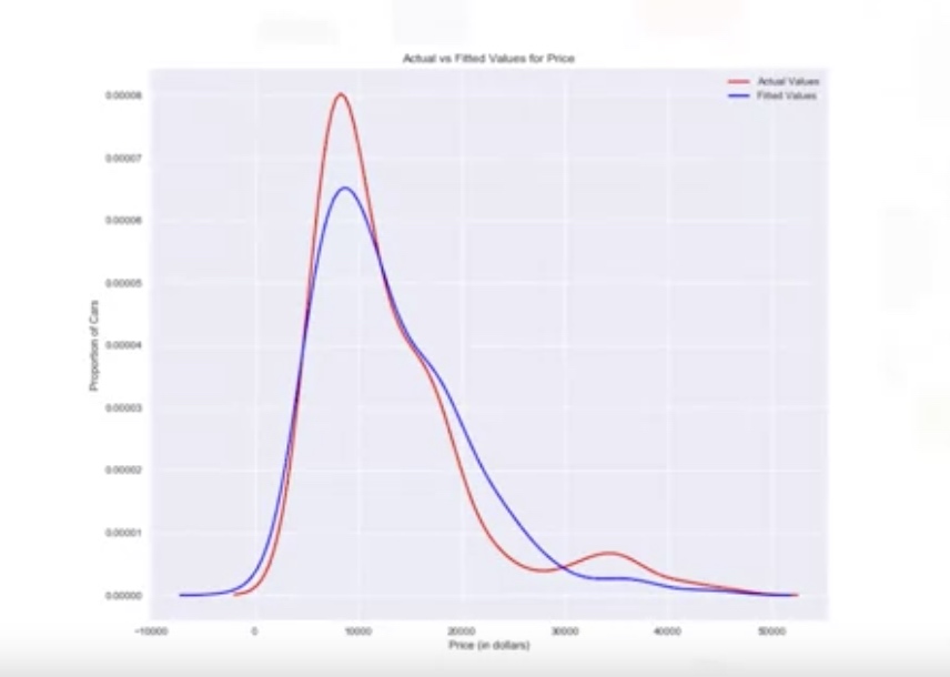
Distribution Plot Density function for the target value and predicted value.
1
2
ax1=sns.distplot(df['price'],hist=False,color='r',label='Actual Value')
sns.distplot(Yhat,hist=False,color='b',label='Fitted Values', ax=ax1)
Polinomial Regression and Pipelines
Single independent variable
1
2
3
4
5
# calculate polynomial of 3rd order
f=np.polyfit(x,y,3)
p=np.poly1d(f)
# we can print out the method
print(p)
Multiple dimensional independent variables
1
2
3
4
from sklearn.preprocessing import PolynomialFeatures
pr=PolynomialFeatures(degree=2,include_bias=False)
result_features=pr.fit_transform(X,include_bias=False)
Pre-processing
Normalize the features:
1
2
3
4
from sklearn.preprocessing import StandardScaler
SCALE=StandardScaler()
SCALE.fit(x_data[['horsepower','highway-mpg']])
x_scale=SCALE.transform(x_data[['horsepower','highway-mpg']])
Pipelines
There are many steps to getting a predction:

1
2
3
4
5
6
7
8
9
10
11
12
from sklearn.preprocessing import PolynomialFeatures
from sklearn.pipeline import Pipeline
from sklearn.preprocessing import StandardScaler
Input=[('scale',StandardScaler()), ('polynomial', PolynomialFeatures(include_bias=False)), ('model',LinearRegression())]

pipe=Pipeline(Input)
pipe

pipe.fit(Z,y)

ypipe=pipe.predict(Z)
ypipe[0:4]
Measure for In-sample Evaluation
Two important measures:
- Mean Square Error (MSE)
- R-squared
- The total sum of squares (proportional to the variance of the data):
- The regression sum of squares, also called the explained sum of squares:
- The sum of squares of residuals, also called the residual sum of squares
- The most general definition of the coefficient of determination is
1
2
3
4
5
6
from sklearn.metrics import mean_squared_error
mean_squared_error(df['price'],Y_hat)

# we can calculate R^2 as follows
lm.fit(X,Y)
lm.score(X,y)
Prediction and Decision Making
1
2
3
4
5
6
7
8
9
10
11
12
13
14
15
16
17
# First we train the model
lm.fit(df['highway-mpg'],df['prices'])
# Predict the price with 30 highway-mgp
lm.predict(np.array(30.0).reshape(-1,1))
# check the coef and intercetp
lm.coef_
lm.intercept_

# Check wether the prediction make sense
import numpy as np
new_input=np.arange(1,101,1).reshape(-1,1)
yhat=lm.predcit(new_input)
# use visualization
# Regression Plot
# Residual Plot
# Distribution Plot
# Mean squared error
LAB-example
Linear regression and multiple Linear regression
1. Linear Regression:
1
2
3
4
5
6
7
8
9
10
11
12
13
14
15
16
17
18
19
20
21
22
23
24
25
# Setup
import pandas as pd
import numpy as np
import matplotlib.pyplot as plt
path = 'https://s3-api.us-geo.objectstorage.softlayer.net/cf-courses-data/CognitiveClass/DA0101EN/automobileEDA.csv'
df = pd.read_csv(path)
df.head()

# Load the modules for linear regression
from sklearn.linear_model import LinearRegression
lm = LinearRegression()

X = df[['highway-mpg']]
# Note!!: X must be a matrix, that's why we keep the dafaframe form here by using df[['col_name']]
Y = df['price']

# Train the model
lm.fit(X,Y)
# Predict an output
Yhat=lm.predict(X)
Yhat[0:5]
# check the coefs
lm.intercept_
lm.coefs_
2. Multiple Linear Regression
1
2
3
4
5
6
Z = df[['horsepower', 'curb-weight', 'engine-size', 'highway-mpg']]
# Still, it is a dataframe (matrix), not a series.

lm.fit(Z,df['price'])
print(lm.coef_)
Model Evaluation using Visualization
# 1. Regression Plot
1
2
3
4
5
6
7
8
9
10
11
12
13
# import the visualization package: seaborn
import seaborn as sns
%matplotlib inline


width = 12
height = 10
plt.figure(figsize=(width, height))
sns.regplot(x="highway-mpg", y="price", data=df)
plt.ylim(0,)

#  Use the method ".corr()" to verify the result we conclude from regression plot:
df[['peak-rpm','highway-mpg','price']].corr()
2. Residual Plot: sns.residplot
residual VS x plot
1
2
3
4
5
6
7
8
width = 12
height = 10
plt.figure(figsize=(width, height))
sns.residplot(df['highway-mpg'], df['price'])
plt.show()
# We look at the spread of the residuals:If the points in a residual plot are randomly spread out around the x-axis, then a linear model is appropriate for the data.

# For multiple linear regression, we can not use residual plot or the regression plot. Alternatively, we can check the distribution plot
3. Distribution Plot: sns.distplot()
1
2
3
4
5
6
7
8
9
10
11
12
13
14
15
16
17
Z = df[['horsepower', 'curb-weight', 'engine-size', 'highway-mpg']]
lm=LinearRegression()
lm.fit(Z,df['price'])
Y_hat = lm.predict(Z)
plt.figure(figsize=(width, height))


ax1 = sns.distplot(df['price'], hist=False, color="r", label="Actual Value")
sns.distplot(Yhat, hist=False, color="b", label="Fitted Values" , ax=ax1)


plt.title('Actual vs Fitted Values for Price')
plt.xlabel('Price (in dollars)')
plt.ylabel('Proportion of Cars')

plt.show()
plt.close()
4. Polinomial Regression and Pipelines: polyfit, poly1d
1
2
3
4
5
6
7
8
9
10
11
12
13
14
15
16
17
18
19
20
21
22
23
24
25
26
27
# Def the function to draw the shape of model and real data points (X,Y)
def PlotPolly(model, independent_variable, dependent_variabble, Name):
    x_new = np.linspace(15, 55, 100)
    y_new = model(x_new)

    plt.plot(independent_variable, dependent_variabble, '.', x_new, y_new, '-')
    plt.title('Polynomial Fit with Matplotlib for Price ~ Length')
    ax = plt.gca() # get the current AXE (subplot)
    ax.set_facecolor((0.898, 0.898, 0.898)) # set the facecolor as grey
    fig = plt.gcf()
    plt.xlabel(Name)
    plt.ylabel('Price of Cars')

    plt.show()
    plt.close()

# get the value
x = df['highway-mpg']
y = df['price']

# Here we use a polynomial of the 3rd order (cubic)
f = np.polyfit(x, y, 3)
p = np.poly1d(f)
print(p)
PlotPolly(p, x, y, 'highway-mpg')
5. Multivariate Polynomial regression
1
2
3
4
5
6
7
8
9
10
11
12
13
14
15
16
from sklearn.preprocessing import PolynomialFeatures
pr=PolynomialFeatures(degree=2)
Z_pr=pr.fit_transform(Z) # by default, it will include bias

# use pipeline
from sklearn.pipeline import Pipeline
from sklearn.preprocessing import StandardScaler

# we set include_biase=False, because the LinearRegression Model will automatically add intercept here!
Input=[('scale',StandardScaler()), ('polynomial', PolynomialFeatures(include_bias=False)), ('model',LinearRegression())]
# Train the pipeline
pipe=Pipeline(Input)
pipe.fit(Z,y)
# Use the pipeline model to predict
ypipe=pipe.predict(Z)
ypipe[0:4]
6. Measures for In-Sample Evaluation
1
2
3
4
5
6
7
8
9
10
11
12
13
14
15
16
17
18
19
20
21
22
23
24
25
26
27
# Model 1: Simple Linear Regression
#highway_mpg_fit
lm.fit(X, Y)
# Find the R^2
print('The R-square is: ', lm.score(X, Y))
# Find the MSE
Yhat=lm.predict(X)
from sklearn.metrics import mean_squared_error
mse = mean_squared_error(df['price'], Yhat)
print('The mean square error of price and predicted value is: ', mse)
mse = mean_squared_error(df['price'], Yhat)
print('The mean square error of price and predicted value is: ', mse)

# Model 2: Multiple Linear Regression
# fit the model
lm.fit(Z, df['price'])
# Find the R^2
print('The R-square is: ', lm.score(Z, df['price']))
Y_predict_multifit = lm.predict(Z)
mse= mean_squared_error(df['price'], Y_predict_multifit)

# Model 3: Polynomial Fit
from sklearn.metrics import r2_score
# Notice p(x) is the transformed X
r_squared = r2_score(y, p(x))
print('The R-square value is: ', r_squared)
mse=mean_squared_error(df['price'], p(x))
7. Prediction and Decision Making
1
2
3
4
5
6
7
8
9
10
11
12
13
14
import matplotlib.pyplot as plt
import numpy as np

%matplotlib inline
new_input=np.arange(1, 100, 1).reshape(-1, 1)
# fit the model
lm.fit(X, Y)
lm
# Produce a prediction
yhat=lm.predict(new_input)
yhat[0:5]

plt.plot(new_input, yhat)
plt.show()
Model Evaluation and Refinement
In-sample evaluation tells us how well our model will fit the data used to train it. Use out-of-sample evaluations or test sets to evaluate and refine the model.
Function: `train_test_split()
- split data into random train and test subsets.
1
2
3
4
from sklearn.model_selection import train_test_split
x_train,x_test,y_train,y_test=train_test_split(x_data,y_data,test_size=0.3,random_state=0)

# random_state: number generator used for random sampling
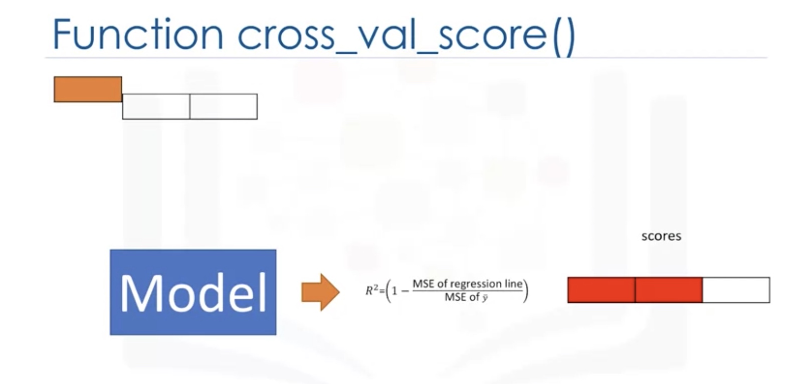
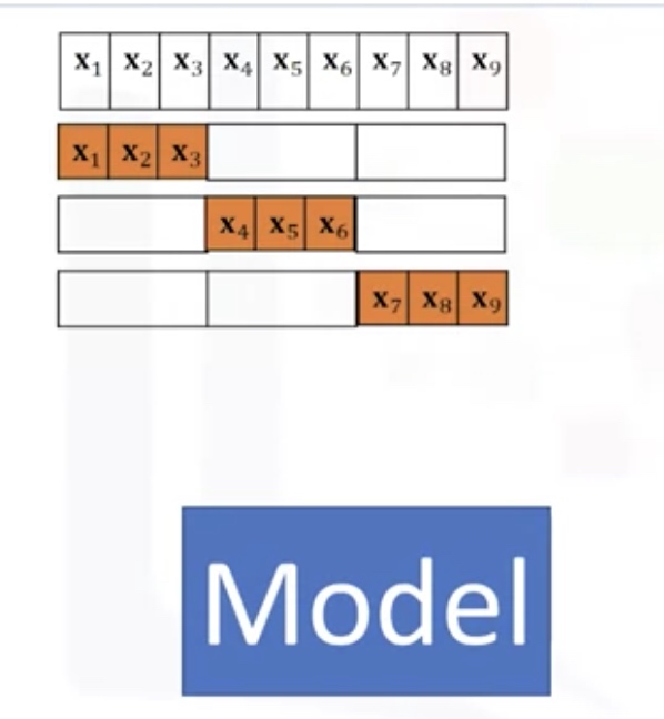
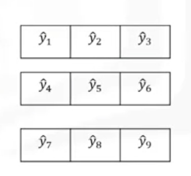
Cross Validation
In this method, the dataset is split into K equal groups. Each group is referred to as a fold. Some of the folds can be used as a training set which we use to train the model and the remaining parts are used as a test set, which we use to test the model. This is repeated until each partition is used for both training and testing. At the end, we use the average results as the estimate of out-of-sample error.
1
2
3
4
from sklearn.model_selection import cross_val_score
scores=cross_val_score(lr,x_data,y_data,cv=3)
np.mean(scores)
# the scores is for the test sets!
- lr: the type of model we are using
- cv: number of equal partitions/folds
1
2
3
4
# to return the predictions for the cross validation
from sklearn.model_selection import cross_val_predict
yhat=cross_val_predict(lr2e,x_data,y_data,cv=3)
# the y_hat is for the test set
Overfitting and Underfitting
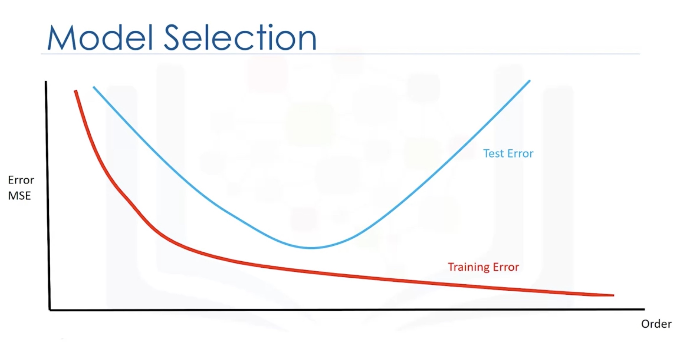
Check the cross-validation score for the test sets.

Use the test sets

Ridge Regression
1
2
3
4
from sklearn.linear_model import Ridge
RR=Ridge(alpha=0.1)
RR.fit(x_train,y_train)
RR.score(x_test,y_test)
Add penalty function to reduce the overfitting problem.
In order to give preference to a particular solution with desirable properties, a regularization term can be included in this minimization:
\[{ \| A \mathbf {x} -\mathbf {b} \|_{2}^{2}+\|\Gamma \mathbf {x} \|_{2}^{2}}\]for some suitably chosen Tikhonov matrix ${ \Gamma }$ . In many cases, this matrix is chosen as a multiple of the identity matrix (${ \Gamma =\alpha I}$), giving preference to solutions with smaller norms; this is known as L2 regularization.
In other cases, high-pass operators (e.g., a difference operator or a weighted Fourier operator) may be used to enforce smoothness if the underlying vector is believed to be mostly continuous. This regularization improves the conditioning of the problem, thus enabling a direct numerical solution. An explicit solution, denoted by ${ {\hat {x}}}$, is given by ${ {\hat {x}}=(A^{\top }A+\Gamma ^{\top }\Gamma )^{-1}A^{\top }\mathbf {b} .}$
The effect of regularization may be varied by the scale of matrix ${ \Gamma }$ . For ${ \Gamma =0}$ this reduces to the unregularized least-squares solution, provided that (ATA)−1 exists.
L2 regularization is used in many contexts aside from linear regression, such as classification with logistic regression or support vector machines,[14] and matrix factorization.
1
2
3
4
5
6
7
8
9
10
11
12
13
14
15
16
17
18
19
20
21
22
23
24
25
26
27
28
29
30
31
32
33
34
35
36
37
38
39
40
41
42
43
44
45
46
47
print(__doc__)

from sklearn.model_selection import train_test_split
import matplotlib.pyplot as plt
import numpy as np
from sklearn.linear_model import Ridge,RidgeCV

import matplotlib.font_manager as fm
myfont = fm.FontProperties(fname='C:\Windows\Fonts\simsun.ttc')
data=[
    [0.607492, 3.965162], [0.358622, 3.514900], [0.147846, 3.125947], [0.637820, 4.094115], [0.230372, 3.476039],
    [0.070237, 3.210610], [0.067154, 3.190612], [0.925577, 4.631504], [0.717733, 4.295890], [0.015371, 3.085028],
    [0.067732, 3.176513], [0.427810, 3.816464], [0.995731, 4.550095], [0.738336, 4.256571], [0.981083, 4.560815],
    [0.247809, 3.476346], [0.648270, 4.119688], [0.731209, 4.282233], [0.236833, 3.486582], [0.969788, 4.655492],
    [0.335070, 3.448080], [0.040486, 3.167440], [0.212575, 3.364266], [0.617218, 3.993482], [0.541196, 3.891471],
    [0.526171, 3.929515], [0.378887, 3.526170], [0.033859, 3.156393], [0.132791, 3.110301], [0.138306, 3.149813]
]

#生成X和y矩阵
dataMat = np.array(data)

# X = dataMat[:,0:1]   # 变量x
X = dataMat[:,0:1]   # 变量x
y = dataMat[:,1]   #变量y
X_train,X_test,y_train,y_test = train_test_split(X,y ,train_size=0.8)
# model = Ridge(alpha=0.5)
model = RidgeCV(alphas=[0.1, 1.0, 10.0])  # 通过RidgeCV可以设置多个参数值,算法使用交叉验证获取最佳参数值
model.fit(X_train, y_train)   # 线性回归建模
# print('系数矩阵:\n',model.coef_)
# print('线性回归模型:\n',model)
# print('交叉验证最佳alpha值',model.alpha_)  # 只有在使用RidgeCV算法时才有效
# 使用模型预测
y_predicted = model.predict(X_test)
plt.scatter(X_train, y_train, marker='o',color='green',label='训练数据')

# 绘制散点图 参数:x横轴 y纵轴
plt.scatter(X_test, y_predicted, marker='*',color='blue',label='测试数据')
plt.legend(loc=2,prop=myfont)
plt.plot(X_test, y_predicted,c='r')

# 绘制x轴和y轴坐标
plt.xlabel("x")
plt.ylabel("y")

# 显示图形
plt.show()
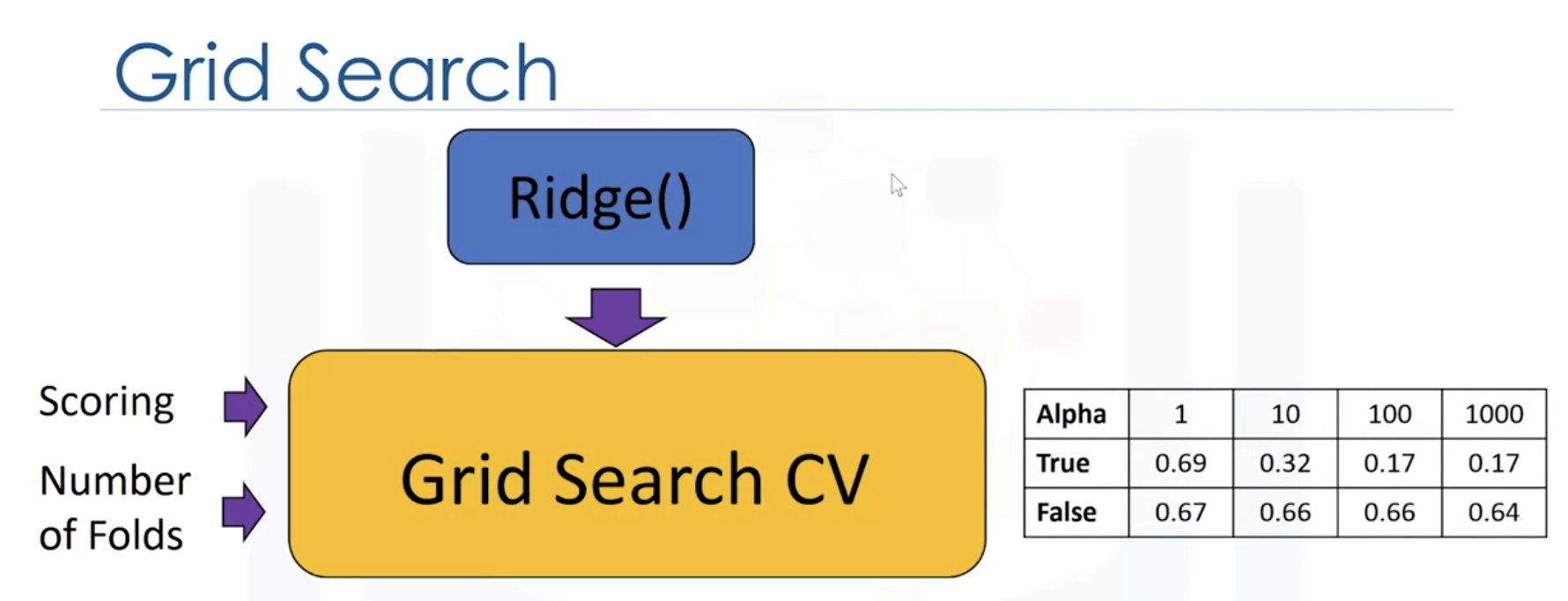
Grid Search
Search on the grid of hyperparameters.

We split the data into 3 sets. We use the validation set to find the optimal heperparameter.

1
2
3
4
5
6
7
8
9
10
11
12
13
14
15
from sklearn.linear_model import Ridge
from sklearn.model_selection import GridSearchCV
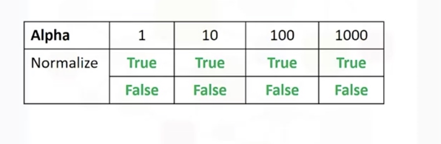
parameters1=[{'alpha':[0.1,1,10,100,1000],'normalize':[True,False]}]
RR=Ridge() # the model object
Grid1=GridSearchCV(RR,parameters1,cv=4) # hyperparameters
Grid1.fit(x_data,y_data)
Grid1.best_estimator_
#check the cross_validation results
scores=Grid1.cv_results_
#we can print out the scores for different parameters
for param,mean_test,mean_train in zip(scores['params'],scores['mean_test_score'],scores['mean_train_score']]:
print(param,"R^2 on test data:",mean_test,"R^2 on train data:",mean_train)
Result:
Final Assignment
House Sales in King County, USA
This dataset contains house sale prices for King County, which includes Seattle. It includes homes sold between May 2014 and May 2015.
id :a notation for a house
date: Date house was sold
price: Price is prediction target
bedrooms: Number of Bedrooms/House
bathrooms: Number of bathrooms/bedrooms
sqft_living: square footage of the home
sqft_lot: square footage of the lot
floors :Total floors (levels) in house
waterfront :House which has a view to a waterfront
view: Has been viewed
condition :How good the condition is Overall
grade: overall grade given to the housing unit, based on King County grading system
sqft_above :square footage of house apart from basement
sqft_basement: square footage of the basement
yr_built :Built Year
yr_renovated :Year when house was renovated
zipcode:zip code
lat: Latitude coordinate
long: Longitude coordinate
sqft_living15 :Living room area in 2015(implies– some renovations) This might or might not have affected the lotsize area
sqft_lot15 :lotSize area in 2015(implies– some renovations)
You will require the following libraries
1
2
3
4
5
6
7
import pandas as pd
import matplotlib.pyplot as plt
import numpy as np
import seaborn as sns
from sklearn.pipeline import Pipeline
from sklearn.preprocessing import StandardScaler,PolynomialFeatures
%matplotlib inline
Import Data
1
2
3
4
5
6
file_name='https://s3-api.us-geo.objectstorage.softlayer.net/cf-courses-data/CognitiveClass/DA0101EN/coursera/project/kc_house_data_NaN.csv'
df=pd.read_csv(file_name)

df.head()
df.dtypes
df.describe()
Data Cleaning
1
2
3
4
5
6
7
8
9
10
11
12
13
14
15
df.drop(['id','Unnamed: 0'],axis=1,inplace=True)
df.describe()

print("number of NaN values for the column bedrooms :", df['bedrooms'].isnull().sum())
print("number of NaN values for the column bathrooms :", df['bathrooms'].isnull().sum())


mean=df['bedrooms'].mean()
df['bedrooms'].replace(np.nan,mean, inplace=True)

mean=df['bathrooms'].mean()
df['bathrooms'].replace(np.nan,mean, inplace=True)

print("number of NaN values for the column bedrooms :", df['bedrooms'].isnull().sum())
print("number of NaN values for the column bathrooms :", df['bathrooms'].isnull().sum())
Exploratory Data Analysis
1
2
3
4
5
6
7
8
9
df['floors'].value_counts().to_frame()

mydf=df[['waterfront','price']]
sns.boxplot(x='waterfront',y='price',data=mydf)


sns.regplot(x='sqft_above',y='price',data=df[['sqft_above','price']])

df.corr()['price'].sort_values()
Model Development
1
2
3
4
5
6
7
8
9
10
11
12
13
14
15
16
17
18
19
20
21
22
23
24
25
26
27
import matplotlib.pyplot as plt
from sklearn.linear_model import LinearRegression

#  Fit a linear regression model
X = df[['long']]
Y = df['price']
lm = LinearRegression()
lm
lm.fit(X,Y)
lm.score(X, Y)

# Fit a MLR

features =["floors", "waterfront","lat" ,"bedrooms" ,"sqft_basement" ,"view" ,"bathrooms","sqft_living15","sqft_above","grade","sqft_living"]

Z=df[features]
lm.fit(Z,Y)
lm.score(Z, Y)

# Pipeline

Input=[('scale',StandardScaler()),('polynomial', PolynomialFeatures(include_bias=False)),('model',LinearRegression())]

pipe=Pipeline(Input)
pipe.fit(X,Y)
pipe.score(X,Y)
Model Evaluation and refinement
1
2
3
4
5
6
7
8
9
10
11
12
13
14
15
16
17
18
19
20
21
22
23
24
25
26
27
28
29
30
31
32
from sklearn.model_selection import cross_val_score
from sklearn.model_selection import train_test_split
print("done")


# train_test_split
features =["floors", "waterfront","lat" ,"bedrooms" ,"sqft_basement" ,"view" ,"bathrooms","sqft_living15","sqft_above","grade","sqft_living"]
X = df[features ]
Y = df['price']

x_train, x_test, y_train, y_test = train_test_split(X, Y, test_size=0.15, random_state=1)


print("number of test samples :", x_test.shape[0])
print("number of training samples:",x_train.shape[0])

# Ridge regression
from sklearn.linear_model import Ridge
RR=Ridge(alpha=0.1)
RR.fit(x_train,y_train)
RR.score(x_test,y_test)

# Use polynomial transform
from sklearn.preprocessing import PolynomialFeatures
pr=PolynomialFeatures(degree=2)
x_train_pr=pr.fit_transform(x_train) # by default, it will include bias
x_test_pr=pr.fit_transform(x_test)

RR2=Ridge(alpha=0.1)
RR2.fit(x_train_pr,y_train)
RR2.score(x_test_pr,y_test)
Comments