This series of Data Science posts are my notes for the IBM Data Science Professional Certificate.
Syllabus
Week 1 - Introduction to Data Visualization Tools
- Introduction to Data Visualization
- Introduction to Matplotlib
- Basic Plotting with Matplotlib
- Dataset on Immigration to Canada
- Line Plots
- Lab: Introduction to Matplotlib and Line Plots
- Quiz: Introduction to Data Visualization Tools
Week 2 - Basic and Specialized Visualization Tools
- Area Plots
- Histograms
- Bar Charts
- Pie Charts
- Box Plots
- Scatter Plots
- Bubble Plots
- Lab: Basic Visualization Tools
- Lab: Specialized Visualization Tools
- Quiz: Basic Visualization Tools
- Quiz: Specialized Visualization Tools
Week 3 - Advanced Visualizations and Geospatial Data
- Waffle Charts
- Word Clouds
- Seaborn and Regression Plots
- Introduction to Folium and Map Styles
- Maps with Markers
- Choropleth Maps
- Lab: Advanced Visualization Tools
- Lab: Creating Maps and Visualizing Geospatial Data
- Quiz: Advanced Visualization Tools
- Quiz: Visualizing Geospatial Data
- Peer-review Assignment
Introduction to Data Visualization Tools
Why build visuals?
- For exploratory data analysis.
- Communicate data clearly.
- Share unbiased representation of data.
- Use them to support recommendations to different stakeholders.
Best Practices:
- Less is more effective
- Less is more attractive
- Less is more impactive
More examples: www.darkhorseanalytics.com
Documentation of Matplotlib
Created by John Hunter.
3 Layers
- Backend layer
- Artist Layer
- Scripting layer
Further Reading: www.aosabook.org/en/matplotlib.html
John Hunter and Michael Droettboom
matplotlib is a Python-based plotting library with full support for 2D and limited support for 3D graphics, widely used in the Python scientific computing community. The library targets a broad range of use cases. It can embed graphics in the user interface toolkit of your choice, and currently supports interactive graphics on all major desktop operating systems using the GTK+, Qt, Tk, FLTK, wxWidgets and Cocoa toolkits. It can be called interactively from the interactive Python shell to produce graphics with simple, procedural commands, much like Mathematica, IDL or MATLAB. matplotlib can also be embedded in a headless webserver to provide hardcopy in both raster-based formats like Portable Network Graphics (PNG) and vector formats like PostScript, Portable Document Format (PDF) and Scalable Vector Graphics (SVG) that look great on paper.
11.1. The Dongle Problem
matplotlib’s origin dates to an attempt by one of us (John Hunter) to free himself and his fellow epilepsy researchers from a proprietary software package for doing electrocorticography (ECoG) analysis. The laboratory in which he worked had only one license for the software, and the various graduate students, medical students, postdocs, interns, and investigators took turns sharing the hardware key dongle. MATLAB is widely used in the biomedical community for data analysis and visualization, so Hunter set out, with some success, to replace the proprietary software with a MATLAB-based version that could be utilized and extended by multiple investigators. MATLAB, however, naturally views the world as an array of floating point numbers, and the complexities of real-world hospital records for epilepsy surgery patients with multiple data modalities (CT, MRI, ECoG, EEG) warehoused on different servers pushed MATLAB to its limits as a data management system. Unsatisfied with the suitability of MATLAB for this task, Hunter began working on a new Python application built on top of the user interface toolkit GTK+, which was at the time the leading desktop windowing system for Linux.
matplotlib was thus originally developed as an EEG/ECoG visualization tool for this GTK+ application, and this use case directed its original architecture. matplotlib was originally designed to serve a second purpose as well: as a replacement for interactive command-driven graphics generation, something that MATLAB does very well. The MATLAB design makes the simple task of loading a data file and plotting very straightforward, where a full object-oriented API would be too syntactically heavy. So matplotlib also provides a stateful scripting interface for quick and easy generation of graphics similar to MATLAB’s. Because matplotlib is a library, users have access to all of the rich built-in Python data structures such as lists, dictionaries, sets and more.
11.2. Overview of matplotlib Architecture
The top-level matplotlib object that contains and manages all of the elements in a given graphic is called the Figure. One of the core architectural tasks matplotlib must solve is implementing a framework for representing and manipulating the Figure that is segregated from the act of rendering the Figure to a user interface window or hardcopy. This enables us to build increasingly sophisticated features and logic into the Figures, while keeping the “backends”, or output devices, relatively simple. matplotlib encapsulates not just the drawing interfaces to allow rendering to multiple devices, but also the basic event handling and windowing of most popular user interface toolkits. Because of this, users can create fairly rich interactive graphics and toolkits incorporating mouse and keyboard input that can be plugged without modification into the six user interface toolkits we support.
The architecture to accomplish this is logically separated into three layers, which can be viewed as a stack. Each layer that sits above another layer knows how to talk to the layer below it, but the lower layer is not aware of the layers above it. The three layers from bottom to top are: backend, artist, and scripting.
Backend Layer
At the bottom of the stack is the backend layer, which provides concrete implementations of the abstract interface classes:
FigureCanvasencapsulates the concept of a surface to draw onto (e.g. “the paper”).Rendererdoes the drawing (e.g. “the paintbrush”).Eventhandles user inputs such as keyboard and mouse events.
The matplotlib Event framework maps underlying UI events like key-press-event or mouse-motion-event to the matplotlib classes KeyEvent or MouseEvent. Users can connect to these events to callback functions and interact with their figure and data; for example, to pick a data point or group of points, or manipulate some aspect of the figure or its constituents. The following code sample illustrates how to toggle all of the lines in an Axes window when the user types `t’.
1
2
3
4
5
6
7
8
9
10
11
12
13
14
15
16
17
18
import numpy as np
import matplotlib.pyplot as plt

def on_press(event):
    if event.inaxes is None: return
    for line in event.inaxes.lines:
        if event.key=='t':
            visible = line.get_visible()
            line.set_visible(not visible)
    event.inaxes.figure.canvas.draw()

fig, ax = plt.subplots(1)

fig.canvas.mpl_connect('key_press_event', on_press)

ax.plot(np.random.rand(2, 20))

plt.show()
The abstraction of the underlying UI toolkit’s event framework allows both matplotlib developers and end-users to write UI event-handling code in a “write once run everywhere” fashion. For example, the interactive panning and zooming of matplotlib figures that works across all user interface toolkits is implemented in the matplotlib event framework.
Artist Layer
The Artist hierarchy is the middle layer of the matplotlib stack, and is the place where much of the heavy lifting happens. Continuing with the analogy that the FigureCanvas from the backend is the paper, the Artist is the object that knows how to take the Renderer (the paintbrush) and put ink on the canvas. Everything you see in a matplotlib Figure is an Artist instance; the title, the lines, the tick labels, the images, and so on all correspond to individual Artist instances (see Figure 11.3). The base class is matplotlib.artist.Artist, which contains attributes that every Artist shares: the transformation which translates the artist coordinate system to the canvas coordinate system (discussed in more detail below), the visibility, the clip box which defines the region the artist can paint into, the label, and the interface to handle user interaction such as “picking”; that is, detecting when a mouse click happens over the artist.
Figure 11.2: A figure
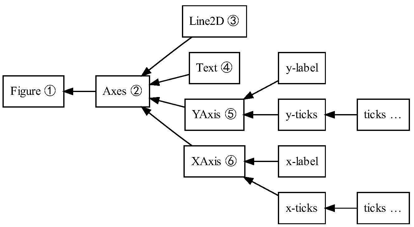
Figure 11.3: The hierarchy of artist instances used to draw Figure 11.2.
The coupling between the Artist hierarchy and the backend happens in the draw method. For example, in the mockup class below where we create SomeArtist which subclasses Artist, the essential method that SomeArtist must implement is draw, which is passed a renderer from the backend. The Artist doesn’t know what kind of backend the renderer is going to draw onto (PDF, SVG, GTK+ DrawingArea, etc.) but it does know the Renderer API and will call the appropriate method (draw_text or draw_path). Since the Renderer has a pointer to its canvas and knows how to paint onto it, the draw method transforms the abstract representation of the Artist to colors in a pixel buffer, paths in an SVG file, or any other concrete representation.
1
2
3
4
5
6
7
8
9
class SomeArtist(Artist):
    'An example Artist that implements the draw method'

    def draw(self, renderer):
        """Call the appropriate renderer methods to paint self onto canvas"""
        if not self.get_visible():  return

        # create some objects and use renderer to draw self here
        renderer.draw_path(graphics_context, path, transform)
There are two types of Artists in the hierarchy. Primitive artists represent the kinds of objects you see in a plot: Line2D, Rectangle, Circle, and Text. Composite artists are collections of Artists such as the Axis, Tick, Axes, and Figure. Each composite artist may contain other composite artists as well as primitive artists. For example, the Figure contains one or more composite Axes and the background of the Figure is a primitive Rectangle.
The most important composite artist is the Axes, which is where most of the matplotlib API plotting methods are defined. Not only does the Axes contain most of the graphical elements that make up the background of the plot—the ticks, the axis lines, the grid, the patch of color which is the plot background—it contains numerous helper methods that create primitive artists and add them to the Axes instance. For example, Table 11.1 shows a small sampling of Axes methods that create plot objects and store them in the Axes instance.
Table 11.1: Sampling of Axes methods and the Artist instances they create
| method | creates | stored in |
|---|---|---|
Axes.imshow |
one or more matplotlib.image.AxesImages |
Axes.images |
Axes.hist |
many matplotlib.patch.Rectangles |
Axes.patches |
Axes.plot |
one or more matplotlib.lines.Line2Ds |
Axes.lines |
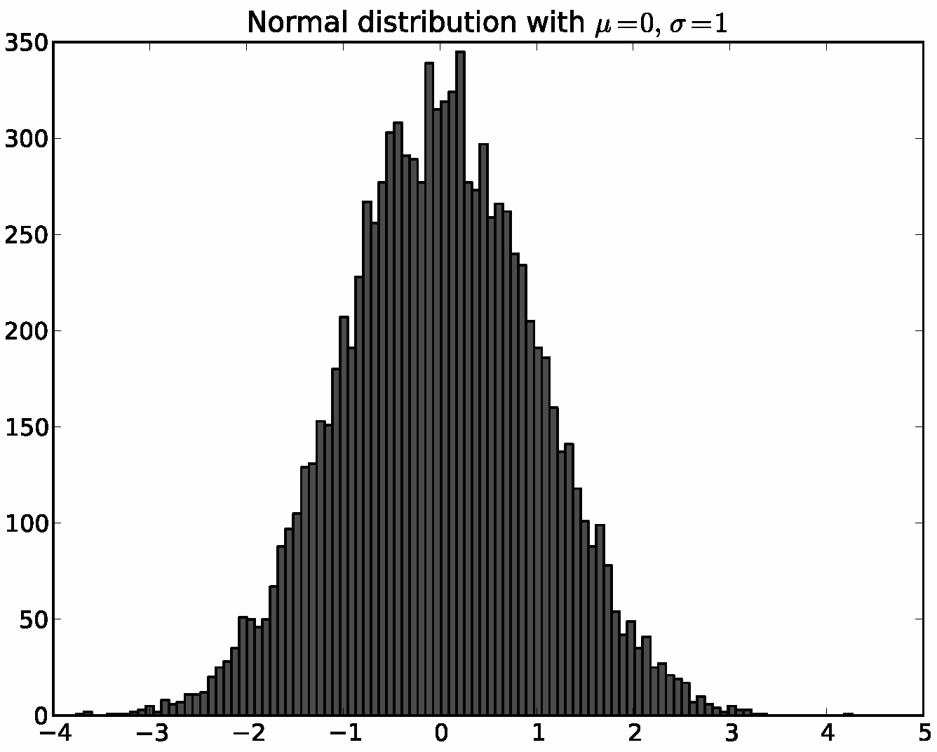
Below is a simple Python script illustrating the architecture above. It defines the backend, connects a Figure to it, uses the array library numpy to create 10,000 normally distributed random numbers, and plots a histogram of these.
1
2
3
4
5
6
7
8
9
10
11
12
13
14
15
16
17
18
19
20
21
22
23
24
25
26
# Import the FigureCanvas from the backend of your choice
#  and attach the Figure artist to it.
from matplotlib.backends.backend_agg import FigureCanvasAgg as FigureCanvas
from matplotlib.figure import Figure
fig = Figure()
canvas = FigureCanvas(fig)

# Import the numpy library to generate the random numbers.
import numpy as np
x = np.random.randn(10000)

# Now use a figure method to create an Axes artist; the Axes artist is
#  added automatically to the figure container fig.axes.
# Here "111" is from the MATLAB convention: create a grid with 1 row and 1
#  column, and use the first cell in that grid for the location of the new
#  Axes.
ax = fig.add_subplot(111)

# Call the Axes method hist to generate the histogram; hist creates a
#  sequence of Rectangle artists for each histogram bar and adds them
#  to the Axes container.  Here "100" means create 100 bins.
ax.hist(x, 100)

# Decorate the figure with a title and save it.
ax.set_title('Normal distribution with $\mu=0, \sigma=1$')
fig.savefig('matplotlib_histogram.png')
Scripting Layer (pyplot)
The script using the API above works very well, especially for programmers, and is usually the appropriate programming paradigm when writing a web application server, a UI application, or perhaps a script to be shared with other developers. For everyday purposes, particularly for interactive exploratory work by bench scientists who are not professional programmers, it is a bit syntactically heavy. Most special-purpose languages for data analysis and visualization provide a lighter scripting interface to simplify common tasks, and matplotlib does so as well in its matplotlib.pyplot interface. The same code above, using pyplot, reads
1
2
3
4
5
6
7
8
import matplotlib.pyplot as plt
import numpy as np

x = np.random.randn(10000)
plt.hist(x, 100)
plt.title(r'Normal distribution with $\mu=0, \sigma=1$')
plt.savefig('matplotlib_histogram.png')
plt.show()
pyplot is a stateful interface that handles much of the boilerplate for creating figures and axes and connecting them to the backend of your choice, and maintains module-level internal data structures representing the current figure and axes to which to direct plotting commands.
Let’s dissect the important lines in the script to see how this internal state is managed.
import matplotlib.pyplot as plt: When thepyplotmodule is loaded, it parses a local configuration file in which the user states, among many other things, their preference for a default backend. This might be a user interface backend likeQtAgg, in which case the script above will import the GUI framework and launch a Qt window with the plot embedded, or it might be a pure image backend likeAgg, in which case the script will generate the hard-copy output and exit.plt.hist(x, 100): This is the first plotting command in the script.pyplotwill check its internal data structures to see if there is a currentFigureinstance. If so, it will extract the currentAxesand direct plotting to theAxes.histAPI call. In this case there is none, so it will create aFigureandAxes, set these as current, and direct the plotting toAxes.hist.plt.title(r'Normal distribution with $\mu=0, \sigma=1$'): As above, pyplot will look to see if there is a currentFigureandAxes. Finding that there is, it will not create new instances but will direct the call to the existingAxesinstance methodAxes.set_title.plt.show(): This will force theFigureto render, and if the user has indicated a default GUI backend in their configuration file, will start the GUI mainloop and raise any figures created to the screen.
A somewhat stripped-down and simplified version of pyplot’s frequently used line plotting function matplotlib.pyplot.plot is shown below to illustrate how a pyplot function wraps functionality in matplotlib’s object-oriented core. All other pyplot scripting interface functions follow the same design.
1
2
3
4
5
6
7
8
@autogen_docstring(Axes.plot)
def plot(*args, **kwargs):
    ax = gca()

    ret = ax.plot(*args, **kwargs)
    draw_if_interactive()

    return ret
Basic Plotting with Matplotlib
Plot Function
1
2
3
4
5
%matplotlib inline
import matplotlib.pyplot as plt
plt.plot(5,5,'o')
plot.show()
But After we plot.show(), we cannot make adjustment to the figure. We can solve this limitation by adding a magic function:
1
2
3
4
5
6
7
8
%matplotlib notebook
import matplotlib.pyplot as plt
plt.plot(5,5,'o')
plt.show()


# new block
plt.xlabel("hah")
Pandas
Pandas also has a built-in implementation of it. Therefore, plotting in pandas is as simple as calling the plot function on a given pandas series or dataframe.
1
2
3
4
%matplotlib notebook
df.plot(kind='line')

df['col1'].plot(kind='hist')
Lab
1
2
3
4
5
6
7
8
9
10
11
12
13
14
15
16
17
18
19
20
21
22
23
24
25
26
27
28
29
30
31
32
33
34
35
36
37
38
39
40
41
42
43
44
45
46
47
48
49
50
51
52
53
54
55
56
57
58
59
60
61
62
63
64
65
66
67
68
69
70
71
72
73
74
75
76
77
78
79
80
81
82
83
84
df_can = pd.read_excel('https://s3-api.us-geo.objectstorage.softlayer.net/cf-courses-data/CognitiveClass/DV0101EN/labs/Data_Files/Canada.xlsx',
                       sheet_name='Canada by Citizenship',
                       skiprows=range(20),
                       skipfooter=2)


# Note: The default type of index and columns is NOT list.
print(type(df_can.columns))
print(type(df_can.index))
#<class 'pandas.core.indexes.base.Index'>
#<class 'pandas.core.indexes.range.RangeIndex'>

# To get the index and columns as lists, we can use the tolist() method.

df_can.columns.tolist()
df_can.index.tolist()

print (type(df_can.columns.tolist()))
print (type(df_can.index.tolist()))

# view the shape
df_can.shape

df_can.drop(['AREA','REG','DEV','Type','Coverage'], axis=1, inplace=True)
df_can.head(2)

# rename
df_can.rename(columns={'OdName':'Country', 'AreaName':'Continent', 'RegName':'Region'}, inplace=True)
df_can.columns

# add a total column
df_can['Total'] = df_can.sum(axis=1)


# set_index
df_can.set_index('Country', inplace=True)
# remove the index name
df_can.index.name = None
# transpose
df.T
# convert the type of columns
df_can.columns = list(map(str, df_can.columns))
[print (type(x)) for x in df_can.columns.values]


# matplotlib
# we are using the inline backend
%matplotlib inline

import matplotlib as mpl
import matplotlib.pyplot as plt
print ('Matplotlib version: ', mpl.__version__)

print(plt.style.available)
# optional: apply a style to Matplotlib.
mpl.style.use(['ggplot']) # optional: for ggplot-like style

# line plots
haiti = df_can.loc['Haiti', years]
haiti.head()
haiti.plot()

# add label
haiti.index = haiti.index.map(int) # let's change the index values of Haiti to type integer for plotting
haiti.plot(kind='line')

plt.title('Immigration from Haiti')
plt.ylabel('Number of immigrants')
plt.xlabel('Years')

plt.show() # need this line to show the updates made to the figure

# add text at specified position
haiti.plot(kind='line')

plt.title('Immigration from Haiti')
plt.ylabel('Number of Immigrants')
plt.xlabel('Years')

# annotate the 2010 Earthquake.
# syntax: plt.text(x, y, label)
plt.text(2000, 6000, '2010 Earthquake') # see note below

plt.show()
Other Plots
barfor vertical bar plotsbarhfor horizontal bar plotshistfor histogramboxfor boxplotkdeordensityfor density plotsareafor area plotspiefor pie plotsscatterfor scatter plotshexbinfor hexbin plot
Basic Visualization Tools
1
2
3
4
5
6
7
8
9
10
11
12
13
14
15
16
17
18
19
20
21
22
23
24
25
26
27
28
29
# Area plot
df.plot(kind='area')
plt.title('ddd')
plt.ylabel('dddf')
plt.xlabel('xxx')


# Histgram
## A histogram is a way of representing the frequency distribution of a variable.

import matplotlib as mpl
import matplotlib.pyplot as plt
import numpy as np

## Manually ajust the xticks
count,bin_edges=np.histogram(df['col'])
df['col'].plot(kind='hist',xticks=bin_edges)

plt.title
plt.ylabel
plt.xlabel
plt.show()

# Bar Charts
years=list(map(str,range(1980,2014)))

df_2land=df.loc[['iceland','finland'],years]
df_2land.plot(kind='bar')
plt.show()
Lab-1
1
2
3
4
5
6
7
8
9
10
11
12
13
14
15
16
17
18
19
20
21
22
23
24
25
26
27
28
29
30
31
32
33
34
# let's examine the types of the column labels
all(isinstance(column, str) for column in df_can.columns)

df_can.columns = list(map(str, df_can.columns))

# let's check the column labels types now
all(isinstance(column, str) for column in df_can.columns)

#set the country name as index
df_can.set_index('Country', inplace=True)

# add total column
df_can['Total'] = df_can.sum(axis=1)

# finally, let's create a list of years from 1980 - 2013
years = list(map(str, range(1980, 2014)))

# Area Plots
df_can.sort_values(['Total'], ascending=False, axis=0, inplace=True)

df_top5 = df_top5[years].transpose()

df_top5.index = df_top5.index.map(int) # let's change the index values of df_top5 to type integer for plotting
df_top5.plot(kind='area',
             stacked=False,
             alpha=0.25, # 0-1, default value a= 0.5
             figsize=(20, 10), # pass a tuple (x, y) size
             )

plt.title('Immigration Trend of Top 5 Countries')
plt.ylabel('Number of Immigrants')
plt.xlabel('Years')

plt.show()
Two types of plotting
As we discussed in the video lectures, there are two styles/options of ploting with matplotlib. Plotting using the Artist layer and plotting using the scripting layer.
Option 1: Scripting layer (procedural method) - using matplotlib.pyplot as ‘plt’
You can use plt i.e. matplotlib.pyplot and add more elements by calling different methods procedurally; for example, plt.title(...) to add title or plt.xlabel(...) to add label to the x-axis.
1
2
3
4
5
    # Option 1: This is what we have been using so far
    df_top5.plot(kind='area', alpha=0.35, figsize=(20, 10))
    plt.title('Immigration trend of top 5 countries')
    plt.ylabel('Number of immigrants')
    plt.xlabel('Years')
Option 2: Artist layer (Object oriented method) - using an Axes instance from Matplotlib (preferred)
You can use an Axes instance of your current plot and store it in a variable (eg. ax). You can add more elements by calling methods with a little change in syntax (by adding “set_” to the previous methods). For example, use ax.set_title() instead of plt.title() to add title, or ax.set_xlabel() instead of plt.xlabel() to add label to the x-axis.
This option sometimes is more transparent and flexible to use for advanced plots (in particular when having multiple plots, as you will see later).
In this course, we will stick to the scripting layer, except for some advanced visualizations where we will need to use the artist layer to manipulate advanced aspects of the plots.
1
2
3
4
5
6
7
# option 2: preferred option with more flexibility
ax = df_top5.plot(kind='area', alpha=0.35, figsize=(20, 10))

ax.set_title('Immigration Trend of Top 5 Countries')
ax.set_ylabel('Number of Immigrants')
ax.set_xlabel('Years')
Note:
- By default, the area plot is stacked, i.e
stacked=True - The plot will plot each column as a line. If necessary, we might need to transpose the dataframe by df.T or df.transpose().
Histograme
1
2
3
4
5
6
7
8
9
10
11
12
13
# np.histogram returns 2 values
count, bin_edges = np.histogram(df_can['2013'])

print(count) # frequency count
print(bin_edges) # bin ranges, default = 10 bins

df_can['2013'].plot(kind='hist', figsize=(8, 5))

plt.title('Histogram of Immigration from 195 Countries in 2013') # add a title to the histogram
plt.ylabel('Number of Countries') # add y-label
plt.xlabel('Number of Immigrants') # add x-label

plt.show()

In the above plot, the x-axis represents the population range of immigrants in intervals of 3412.9. The y-axis represents the number of countries that contributed to the aforementioned population.
Notice that the x-axis labels do not match with the bin size. This can be fixed by passing in a xticks keyword that contains the list of the bin sizes, as follows:
1
2
3
4
5
6
7
8
9
10
11
# 'bin_edges' is a list of bin intervals
count, bin_edges = np.histogram(df_can['2013'])

# by defualt bins=10
df_can['2013'].plot(kind='hist', figsize=(8, 5), xticks=bin_edges)

plt.title('Histogram of Immigration from 195 countries in 2013') # add a title to the histogram
plt.ylabel('Number of Countries') # add y-label
plt.xlabel('Number of Immigrants') # add x-label

plt.show()
What if we have more than one column and bins>10? Let’s make a few modifications to improve the impact and aesthetics of the previous plot:
- increase the bin size to 15 by passing in bins parameter
- set transparency to 60% by passing in alpha paramemter
- label the x-axis by passing in x-label paramater
- change the colors of the plots by passing in color paramete
1
2
3
4
5
6
7
8
9
10
11
12
13
14
15
16
17
18
19
20
# transpose dataframe
df_t = df_can.loc[['Denmark', 'Norway', 'Sweden'], years].transpose()
df_t.head()
# let's get the x-tick values
count, bin_edges = np.histogram(df_t, 15)

# un-stacked histogram
df_t.plot(kind ='hist',
          figsize=(10, 6),
          bins=15,
          alpha=0.6,
          xticks=bin_edges,
          color=['coral', 'darkslateblue', 'mediumseagreen']
         )

plt.title('Histogram of Immigration from Denmark, Norway, and Sweden from 1980 - 2013')
plt.ylabel('Number of Years')
plt.xlabel('Number of Immigrants')

plt.show()
If we do no want the plots to overlap each other, we can stack them using the stacked paramemter. Let’s also adjust the min and max x-axis labels to remove the extra gap on the edges of the plot. We can pass a tuple (min,max) using the xlim paramater, as show below
1
2
3
4
5
6
7
8
9
10
11
12
13
14
15
16
17
18
19
count, bin_edges = np.histogram(df_t, 15)
xmin = bin_edges[0] - 10   #  first bin value is 31.0, adding buffer of 10 for aesthetic purposes
xmax = bin_edges[-1] + 10  #  last bin value is 308.0, adding buffer of 10 for aesthetic purposes

# stacked Histogram
df_t.plot(kind='hist',
          figsize=(10, 6),
          bins=15,
          xticks=bin_edges,
          color=['coral', 'darkslateblue', 'mediumseagreen'],
          stacked=True,
          xlim=(xmin, xmax)
         )

plt.title('Histogram of Immigration from Denmark, Norway, and Sweden from 1980 - 2013')
plt.ylabel('Number of Years')
plt.xlabel('Number of Immigrants')

plt.show()
Bar Charts
A bar plot is a way of representing data where the length of the bars represents the magnitude/size of the feature/variable. Bar graphs usually represent numerical and categorical variables grouped in intervals.
To create a bar plot, we can pass one of two arguments via kind parameter in plot():
kind=barcreates a vertical bar plotkind=barhcreates a horizontal bar plot
1
2
3
4
5
6
7
8
9
10
11
12
# step 1: get the data
df_iceland = df_can.loc['Iceland', years]
df_iceland.head()

# step 2: plot data
df_iceland.plot(kind='bar', figsize=(10, 6))

plt.xlabel('Year') # add to x-label to the plot
plt.ylabel('Number of immigrants') # add y-label to the plot
plt.title('Icelandic immigrants to Canada from 1980 to 2013') # add title to the plot

plt.show()
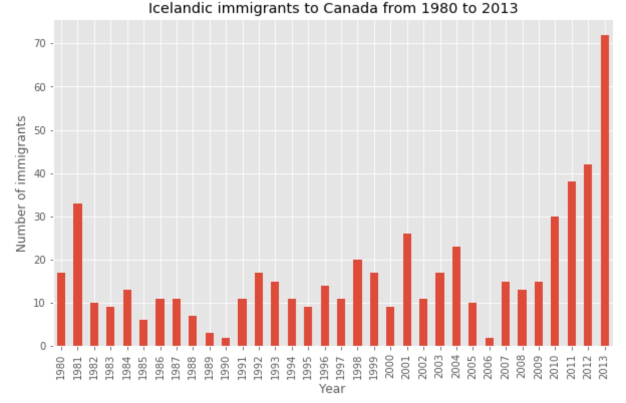
The bar plot above shows the total number of immigrants broken down by each year. We can clearly see the impact of the financial crisis; the number of immigrants to Canada started increasing rapidly after 2008.
Let’s annotate this on the plot using the annotate method of the scripting layer or the pyplot interface. We will pass in the following parameters:
s: str, the text of annotation.xy: Tuple specifying the (x,y) point to annotate (in this case, end point of arrow).xytext: Tuple specifying the (x,y) point to place the text (in this case, start point of arrow).xycoords: The coordinate system that xy is given in - ‘data’ uses the coordinate system of the object being annotated (default).arrowprops: Takes a dictionary of properties to draw the arrow:arrowstyle: Specifies the arrow style,'->'is standard arrow.connectionstyle: Specifies the connection type.arc3is a straight line.color: Specifes color of arror.lw: Specifies the line width.
Let’s also annotate a text to go over the arrow. We will pass in the following additional parameters:
rotation: rotation angle of text in degrees (counter clockwise)-
va: vertical alignment of text [‘center’‘top’ ‘bottom’ ‘baseline’] -
ha: horizontal alignment of text [‘center’‘right’ ‘left’]
I encourage you to read the Matplotlib documentation for more details on annotations: http://matplotlib.org/api/pyplot_api.html#matplotlib.pyplot.annotate.
1
2
3
4
5
6
7
8
9
10
11
12
13
14
15
16
17
18
19
20
21
22
23
df_iceland.plot(kind='bar', figsize=(10, 6), rot=90)

plt.xlabel('Year')
plt.ylabel('Number of Immigrants')
plt.title('Icelandic Immigrants to Canada from 1980 to 2013')

# Annotate arrow
plt.annotate('',                      # s: str. will leave it blank for no text
             xy=(32, 70),             # place head of the arrow at point (year 2012 , pop 70)
             xytext=(28, 20),         # place base of the arrow at point (year 2008 , pop 20)
             xycoords='data',         # will use the coordinate system of the object being annotated
             arrowprops=dict(arrowstyle='->', connectionstyle='arc3', color='blue', lw=2)
            )

# Annotate Text
plt.annotate('2008 - 2011 Financial Crisis', # text to display
             xy=(28, 30),                    # start the text at at point (year 2008 , pop 30)
             rotation=72.5,                  # based on trial and error to match the arrow
             va='bottom',                    # want the text to be vertically 'bottom' aligned
             ha='left',                      # want the text to be horizontally 'left' algned.
            )

plt.show()
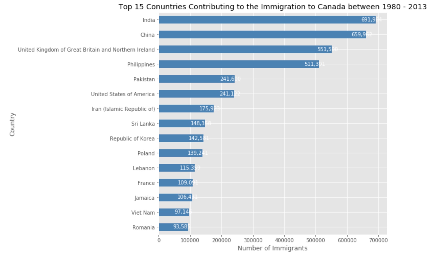
Horizontal Bar Plot
Sometimes it is more practical to represent the data horizontally, especially if you need more room for labelling the bars. In horizontal bar graphs, the y-axis is used for labelling, and the length of bars on the x-axis corresponds to the magnitude of the variable being measured. As you will see, there is more room on the y-axis to label categetorical variables.
1
2
3
4
5
6
7
df_can.sort_values(by='Total', ascending=True, inplace=True)
df_top15 = df_can['Total'].tail(15)

df_top15.plot(kind='barh', figsize=(12, 12), color='steelblue')
plt.xlabel('Number of Immigrants')
plt.title('Top 15 Conuntries Contributing to the Immigration to Canada between 1980 - 2013')

Add label
1
2
3
4
5
6
# annotate value labels to each country
for index, value in enumerate(df_top15):
    label = format(int(value), ',') # format int with commas

# place text at the end of bar (subtracting 47000 from x, and 0.1 from y to make it fit within the bar)
    plt.annotate(label, xy=(value - 47000, index - 0.10), color='white')
Lab-2
1
2
3
4
5
6
7
8
9
10
import numpy as np  # useful for many scientific computing in Python
import pandas as pd # primary data structure library

df_can = pd.read_excel('https://s3-api.us-geo.objectstorage.softlayer.net/cf-courses-data/CognitiveClass/DV0101EN/labs/Data_Files/Canada.xlsx',
                       sheet_name='Canada by Citizenship',
                       skiprows=range(20),
                       skipfooter=2
                      )

print('Data downloaded and read into a dataframe!')
Clean Data
1
2
3
4
5
6
7
8
9
10
11
12
13
14
15
16
17
18
# clean up the dataset to remove unnecessary columns (eg. REG)
df_can.drop(['AREA', 'REG', 'DEV', 'Type', 'Coverage'], axis=1, inplace=True)

# let's rename the columns so that they make sense
df_can.rename(columns={'OdName':'Country', 'AreaName':'Continent','RegName':'Region'}, inplace=True)

# for sake of consistency, let's also make all column labels of type string
df_can.columns = list(map(str, df_can.columns))

# set the country name as index - useful for quickly looking up countries using .loc method
df_can.set_index('Country', inplace=True)

# add total column
df_can['Total'] = df_can.sum(axis=1)

# years that we will be using in this lesson - useful for plotting later on
years = list(map(str, range(1980, 2014)))
print('data dimensions:', df_can.shape)
Visualization
1
2
3
4
5
6
7
8
9
%matplotlib inline

import matplotlib as mpl
import matplotlib.pyplot as plt

mpl.style.use('ggplot') # optional: for ggplot-like style

# check for latest version of Matplotlib
print('Matplotlib version: ', mpl.__version__) # >= 2.0.0
Pie Charts
1
2
3
4
5
6
7
# group countries by continents and apply sum() function
df_continents = df_can.groupby('Continent', axis=0).sum()

# note: the output of the groupby method is a `groupby' object.
# we can not use it further until we apply a function (eg .sum())
print(type(df_can.groupby('Continent', axis=0)))
df_continents.head()
Step 2: Plot the data. We will pass in kind = 'pie' keyword, along with the following additional parameters:
autopct- is a string or function used to label the wedges with their numeric value. The label will be placed inside the wedge. If it is a format string, the label will befmt%pct.startangle- rotates the start of the pie chart by angle degrees counterclockwise from the x-axis.shadow- Draws a shadow beneath the pie (to give a 3D feel).
1
2
3
4
5
6
7
8
9
10
11
12
# autopct create %, start angle represent starting point
df_continents['Total'].plot(kind='pie',
                            figsize=(5, 6),
                            autopct='%1.1f%%', # add in percentages
                            startangle=90,     # start angle 90° (Africa)
                            shadow=True,       # add shadow
                            )

plt.title('Immigration to Canada by Continent [1980 - 2013]')
plt.axis('equal') # Sets the pie chart to look like a circle.

plt.show()

The above visual is not very clear, the numbers and text overlap in some instances. Let’s make a few modifications to improve the visuals:
- Remove the text labels on the pie chart by passing in
legendand add it as a seperate legend usingplt.legend(). - Push out the percentages to sit just outside the pie chart by passing in
pctdistanceparameter. - Pass in a custom set of colors for continents by passing in
colorsparameter. - Explode the pie chart to emphasize the lowest three continents (Africa, North America, and Latin America and Carribbean) by pasing in
explodeparameter.
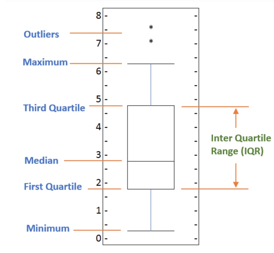
Box Plots
A box plot is a way of statistically representing the distribution of the data through five main dimensions:
- Minimun: Smallest number in the dataset.
- First quartile: Middle number between the
minimumand themedian. - Second quartile (Median): Middle number of the (sorted) dataset.
- Third quartile: Middle number between
medianandmaximum. - Maximum: Highest number in the dataset.
1
2
3
4
5
6
7
8
9
10
# to get a dataframe, place extra square brackets around 'Japan'.
df_japan = df_can.loc[['Japan,China'], years].transpose()
df_japan.head()
df_japan.plot(kind='box', figsize=(8, 6))

plt.title('Box plot of Japanese Immigrants from 1980 - 2013')
plt.ylabel('Number of Immigrants')

plt.show()
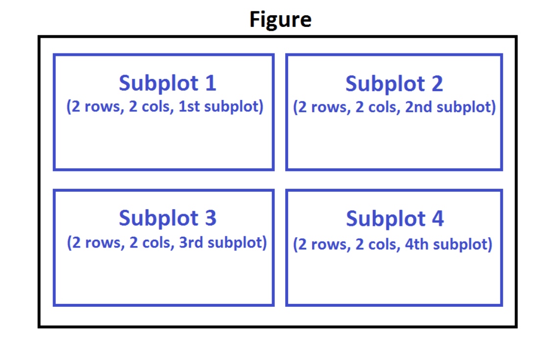
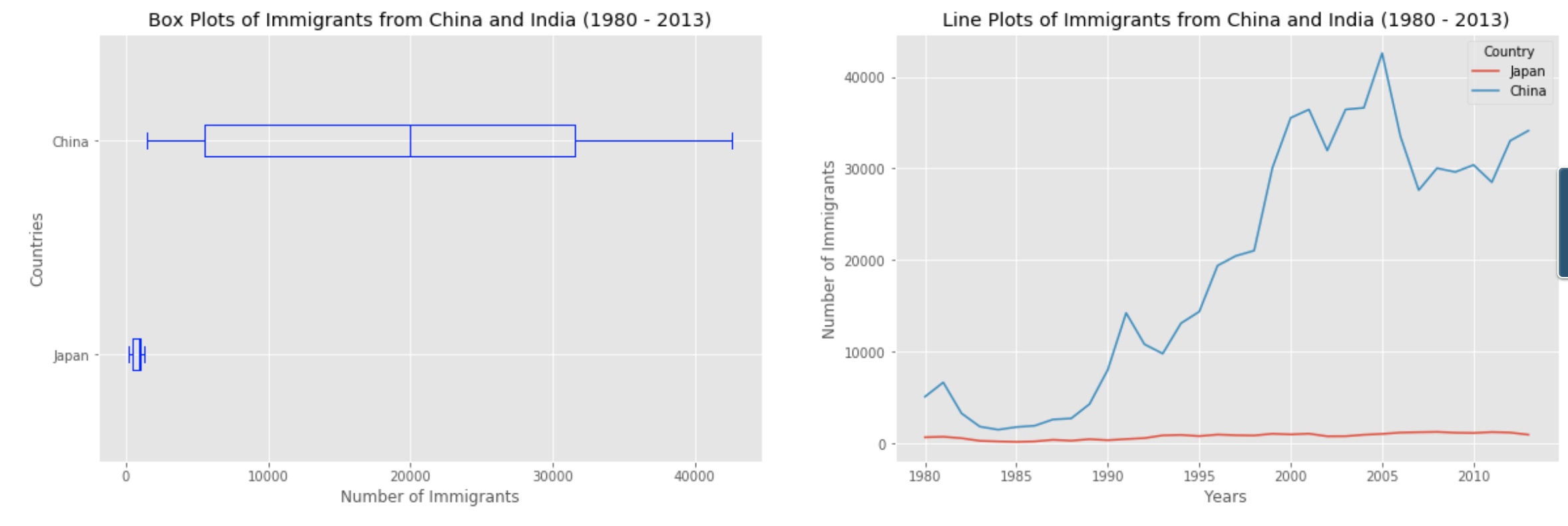
Subplots
Often times we might want to plot multiple plots within the same figure. For example, we might want to perform a side by side comparison of the box plot with the line plot of China and India’s immigration.
To visualize multiple plots together, we can create a figure (overall canvas) and divide it into subplots, each containing a plot. With subplots, we usually work with the artist layer instead of the scripting layer.
Typical syntax is :
1
2
    fig = plt.figure() # create figure
    ax = fig.add_subplot(nrows, ncols, plot_number) # create subplots
Where
nrowsandncolsare used to notionally split the figure into (nrows*ncols) sub-axes,plot_numberis used to identify the particular subplot that this function is to create within the notional grid.plot_numberstarts at 1, increments across rows first and has a maximum ofnrows*ncolsas shown below.
1
2
3
4
5
6
7
8
9
10
11
12
13
14
15
16
17
18
fig = plt.figure() # create figure

ax0 = fig.add_subplot(1, 2, 1) # add subplot 1 (1 row, 2 columns, first plot)
ax1 = fig.add_subplot(1, 2, 2) # add subplot 2 (1 row, 2 columns, second plot). See tip below**

# Subplot 1: Box plot
df_CI.plot(kind='box', color='blue', vert=False, figsize=(20, 6), ax=ax0) # add to subplot 1
ax0.set_title('Box Plots of Immigrants from China and India (1980 - 2013)')
ax0.set_xlabel('Number of Immigrants')
ax0.set_ylabel('Countries')

# Subplot 2: Line plot
df_CI.plot(kind='line', figsize=(20, 6), ax=ax1) # add to subplot 2
ax1.set_title ('Line Plots of Immigrants from China and India (1980 - 2013)')
ax1.set_ylabel('Number of Immigrants')
ax1.set_xlabel('Years')

plt.show()
In the case when nrows, ncols, and plot_number are all less than 10, a convenience exists such that the a 3 digit number can be given instead, where the hundreds represent nrows, the tens represent ncols and the units represent plot_number. For instance,
subplot(211) == subplot(2, 1, 1)
produces a subaxes in a figure which represents the top plot (i.e. the first) in a 2 rows by 1 column notional grid (no grid actually exists, but conceptually this is how the returned subplot has been positioned).
1
2
3
4
5
6
7
8
9
10
11
12
13
df_top15=df_can.sort_values(['Total'],ascending=False,axis=0).head(15)
df_top15

years_80s = list(map(str, range(1980, 1990)))
years_90s = list(map(str, range(1990, 2000)))
years_00s = list(map(str, range(2000, 2010)))

df_80s=df_can.loc[:,years_80s].sum(axis=1)
df_90s=df_can.loc[:,years_90s].sum(axis=1)
df_00s=df_can.loc[:,years_00s].sum(axis=1)
new_df = pd.DataFrame({'1980s': df_80s, '1990s': df_90s, '2000s':df_00s})

new_df.plot(kind='box',figsize=(10,6))
Scatter Plot and Regression
1
2
3
4
5
6
7
8
9
10
11
12
13
14
15
16
17
18
19
20
21
22
23
24
25
26
27
28
29
30
31
32
33
34
35
36
37
38
39
40
41
42
43
44
45
46
# we can use the sum() method to get the total population per year
df_tot = pd.DataFrame(df_can[years].sum(axis=0))

# change the years to type int (useful for regression later on)
df_tot.index = map(int, df_tot.index)

# reset the index to put in back in as a column in the df_tot dataframe
df_tot.reset_index(inplace = True)

# rename columns
df_tot.columns = ['year', 'total']

# view the final dataframe
df_tot.head()

df_tot.plot(kind='scatter', x='year', y='total', figsize=(10, 6), color='darkblue')

plt.title('Total Immigration to Canada from 1980 - 2013')
plt.xlabel('Year')
plt.ylabel('Number of Immigrants')

plt.show()

# regression
x = df_tot['year']      # year on x-axis
y = df_tot['total']     # total on y-axis
fit = np.polyfit(x, y, deg=1)

p=np.poly1d(fit)
print(p)

# plot the regression
df_tot.plot(kind='scatter', x='year', y='total', figsize=(10, 6), color='darkblue')

plt.title('Total Immigration to Canada from 1980 - 2013')
plt.xlabel('Year')
plt.ylabel('Number of Immigrants')

# plot line of best fit
plt.plot(x, p(x), color='red') # recall that x is the Years
plt.annotate('y={0:.0f} x + {1:.0f}'.format(fit[0], fit[1]), xy=(2000, 150000))

plt.show()

# print out the line of best fit
'No. Immigrants = {0:.0f} * Year + {1:.0f}'.format(fit[0], fit[1])
Bubble Plots
A bubble plot is a variation of the scatter plot that displays three dimensions of data (x, y, z). The datapoints are replaced with bubbles, and the size of the bubble is determined by the third variable ‘z’, also known as the weight. In maplotlib, we can pass in an array or scalar to the keyword s to plot(), that contains the weight of each point.
Let’s start by analyzing the effect of Argentina’s great depression.
Argentina suffered a great depression from 1998 - 2002, which caused widespread unemployment, riots, the fall of the government, and a default on the country’s foreign debt. In terms of income, over 50% of Argentines were poor, and seven out of ten Argentine children were poor at the depth of the crisis in 2002.
Let’s analyze the effect of this crisis, and compare Argentina’s immigration to that of it’s neighbour Brazil. Let’s do that using a bubble plot of immigration from Brazil and Argentina for the years 1980 - 2013. We will set the weights for the bubble as the normalized value of the population for each year.
1
2
3
4
5
6
7
8
9
10
11
12
13
14
15
16
17
18
19
20
21
22
23
24
25
26
27
28
29
30
31
32
33
34
35
36
37
38
39
40
41
42
43
44
df_can_t = df_can[years].transpose() # transposed dataframe

# cast the Years (the index) to type int
df_can_t.index = map(int, df_can_t.index)

# let's label the index. This will automatically be the column name when we reset the index
df_can_t.index.name = 'Year'

# reset index to bring the Year in as a column
df_can_t.reset_index(inplace=True)

# view the changes
df_can_t.head()

# normalize Brazil data
norm_brazil = (df_can_t['Brazil'] - df_can_t['Brazil'].min()) / (df_can_t['Brazil'].max() - df_can_t['Brazil'].min())

# normalize Argentina data
norm_argentina = (df_can_t['Argentina'] - df_can_t['Argentina'].min()) / (df_can_t['Argentina'].max() - df_can_t['Argentina'].min())

# Brazil
ax0 = df_can_t.plot(kind='scatter',
                    x='Year',
                    y='Brazil',
                    figsize=(14, 8),
                    alpha=0.5,                  # transparency
                    color='green',
                    s=norm_brazil * 2000 + 10,  # pass in weights
                    xlim=(1975, 2015)
                   )

# Argentina
ax1 = df_can_t.plot(kind='scatter',
                    x='Year',
                    y='Argentina',
                    alpha=0.5,
                    color="blue",
                    s=norm_argentina * 2000 + 10,
                    ax = ax0
                   )

ax0.set_ylabel('Number of Immigrants')
ax0.set_title('Immigration from Brazil and Argentina from 1980 - 2013')
ax0.legend(['Brazil', 'Argentina'], loc='upper left', fontsize='x-large')

Advanced Visualization
1
2
3
4
5
6
7
8
9
10
11
12
13
14
15
16
17
18
19
20
21
22
23
24
25
26
27
28
29
30
31
32
33
34
35
36
37
38
39
40
41
42
import numpy as np  # useful for many scientific computing in Python
import pandas as pd # primary data structure library
from PIL import Image # converting images into arrays


df_can = pd.read_excel('https://s3-api.us-geo.objectstorage.softlayer.net/cf-courses-data/CognitiveClass/DV0101EN/labs/Data_Files/Canada.xlsx',
                       sheet_name='Canada by Citizenship',
                       skiprows=range(20),
                       skipfooter=2)

print('Data downloaded and read into a dataframe!')

# Data Cleaning
# clean up the dataset to remove unnecessary columns (eg. REG)
df_can.drop(['AREA','REG','DEV','Type','Coverage'], axis = 1, inplace = True)

# let's rename the columns so that they make sense
df_can.rename (columns = {'OdName':'Country', 'AreaName':'Continent','RegName':'Region'}, inplace = True)

# for sake of consistency, let's also make all column labels of type string
df_can.columns = list(map(str, df_can.columns))

# set the country name as index - useful for quickly looking up countries using .loc method
df_can.set_index('Country', inplace = True)

# add total column
df_can['Total'] =  df_can.sum (axis = 1)

# years that we will be using in this lesson - useful for plotting later on
years = list(map(str, range(1980, 2014)))
print ('data dimensions:', df_can.shape)

%matplotlib inline

import matplotlib as mpl
import matplotlib.pyplot as plt
import matplotlib.patches as mpatches # needed for waffle Charts

mpl.style.use('ggplot') # optional: for ggplot-like style

# check for latest version of Matplotlib
print ('Matplotlib version: ', mpl.__version__) # >= 2.0.0
Waffel Charts
The easiest way to create a waffle chart in Python is using the Python package, PyWaffle.
Step 1. The first step into creating a waffle chart is determing the proportion of each category with respect to the total.
1
2
3
4
5
6
7
8
# compute the proportion of each category with respect to the total
total_values = sum(df_dsn['Total'])
category_proportions = [(float(value) / total_values) for value in df_dsn['Total']]

# print out proportions
for i, proportion in enumerate(category_proportions):
    print (df_dsn.index.values[i] + ': ' + str(proportion))
Step 2. The second step is defining the overall size of the waffle chart.
1
2
3
4
5
6
width = 40 # width of chart
height = 10 # height of chart

total_num_tiles = width * height # total number of tiles

print ('Total number of tiles is ', total_num_tiles)
Step 3. The third step is using the proportion of each category to determe it respective number of tiles
1
2
3
4
5
6
# compute the number of tiles for each catagory
tiles_per_category = [round(proportion * total_num_tiles) for proportion in category_proportions]

# print out number of tiles per category
for i, tiles in enumerate(tiles_per_category):
    print (df_dsn.index.values[i] + ': ' + str(tiles))
Step 4. The fourth step is creating a matrix that resembles the waffle chart and populating it.
1
2
3
4
5
6
7
8
9
10
11
12
13
14
15
16
17
18
19
20
21
# initialize the waffle chart as an empty matrix
waffle_chart = np.zeros((height, width))

# define indices to loop through waffle chart
category_index = 0
tile_index = 0

# populate the waffle chart
for col in range(width):
    for row in range(height):
        tile_index += 1

        # if the number of tiles populated for the current category is equal to its corresponding allocated tiles...
        if tile_index > sum(tiles_per_category[0:category_index]):
            # ...proceed to the next category
            category_index += 1

        # set the class value to an integer, which increases with class
        waffle_chart[row, col] = category_index

print ('Waffle chart populated!')
1
2
3
4
5
6
7
8
9
10
11
12
13
14
15
16
17
18
19
20
21
22
23
24
25
26
27
28
29
30
31
32
33
34
35
36
37
38
39
40
41
42
43
44
45
46
47
48
49
50
51
52
53
54
55
56
57
58
59
60
61
62
63
64
65
66
67
68
# instantiate a new figure object
fig = plt.figure()

# use matshow to display the waffle chart
colormap = plt.cm.coolwarm
plt.matshow(waffle_chart, cmap=colormap)
plt.colorbar()

# instantiate a new figure object
fig = plt.figure()

# use matshow to display the waffle chart
colormap = plt.cm.coolwarm
plt.matshow(waffle_chart, cmap=colormap)
plt.colorbar()

# get the axis
ax = plt.gca()

# set minor ticks
ax.set_xticks(np.arange(-.5, (width), 1), minor=True)
ax.set_yticks(np.arange(-.5, (height), 1), minor=True)

# add gridlines based on minor ticks
ax.grid(which='minor', color='w', linestyle='-', linewidth=2)

plt.xticks([])
plt.yticks([])

# compute cumulative sum of individual categories to match color schemes between chart and legend
values_cumsum = np.cumsum(df_dsn['Total'])
total_values = values_cumsum[len(values_cumsum) - 1]

# create legend
legend_handles = []
for i, category in enumerate(df_dsn.index.values):
    label_str = category + ' (' + str(df_dsn['Total'][i]) + ')'
    color_val = colormap(float(values_cumsum[i])/total_values)
    legend_handles.append(mpatches.Patch(color=color_val, label=label_str))

# add legend to chart
plt.legend(handles=legend_handles,
           loc='lower center',
           ncol=len(df_dsn.index.values),
           bbox_to_anchor=(0., -0.2, 0.95, .1)
          )
Now it would very inefficient to repeat these seven steps every time we wish to create a waffle chart. So let’s combine all seven steps into one function called create_waffle_chart. This function would take the following parameters as input:
- categories: Unique categories or classes in dataframe.
- values: Values corresponding to categories or classes.
- height: Defined height of waffle chart.
- width: Defined width of waffle chart.
- colormap: Colormap class
- value_sign: In order to make our function more generalizable, we will add this parameter to address signs that could be associated with a value such as %, $, and so on. value_sign has a default value of empty string.
1
2
3
4
5
6
7
8
9
10
11
12
13
14
15
16
17
18
19
20
21
22
23
24
25
26
27
28
29
30
31
32
33
34
35
36
37
38
39
40
41
42
43
44
45
46
47
48
49
50
51
52
53
54
55
56
57
58
59
60
61
62
63
64
65
66
67
68
69
70
71
72
73
74
75
76
77
78
79
80
81
def create_waffle_chart(categories, values, height, width, colormap, value_sign=''):

    # compute the proportion of each category with respect to the total
    total_values = sum(values)
    category_proportions = [(float(value) / total_values) for value in values]

    # compute the total number of tiles
    total_num_tiles = width * height # total number of tiles
    print ('Total number of tiles is', total_num_tiles)

    # compute the number of tiles for each catagory
    tiles_per_category = [round(proportion * total_num_tiles) for proportion in category_proportions]

    # print out number of tiles per category
    for i, tiles in enumerate(tiles_per_category):
        print (df_dsn.index.values[i] + ': ' + str(tiles))

    # initialize the waffle chart as an empty matrix
    waffle_chart = np.zeros((height, width))

    # define indices to loop through waffle chart
    category_index = 0
    tile_index = 0

    # populate the waffle chart
    for col in range(width):
        for row in range(height):
            tile_index += 1

            # if the number of tiles populated for the current category
            # is equal to its corresponding allocated tiles...
            if tile_index > sum(tiles_per_category[0:category_index]):
                # ...proceed to the next category
                category_index += 1

            # set the class value to an integer, which increases with class
            waffle_chart[row, col] = category_index

    # instantiate a new figure object
    fig = plt.figure()

    # use matshow to display the waffle chart
    colormap = plt.cm.coolwarm
    plt.matshow(waffle_chart, cmap=colormap)
    plt.colorbar()

    # get the axis
    ax = plt.gca()

    # set minor ticks
    ax.set_xticks(np.arange(-.5, (width), 1), minor=True)
    ax.set_yticks(np.arange(-.5, (height), 1), minor=True)

    # add dridlines based on minor ticks
    ax.grid(which='minor', color='w', linestyle='-', linewidth=2)

    plt.xticks([])
    plt.yticks([])

    # compute cumulative sum of individual categories to match color schemes between chart and legend
    values_cumsum = np.cumsum(values)
    total_values = values_cumsum[len(values_cumsum) - 1]

    # create legend
    legend_handles = []
    for i, category in enumerate(categories):
        if value_sign == '%':
            label_str = category + ' (' + str(values[i]) + value_sign + ')'
        else:
            label_str = category + ' (' + value_sign + str(values[i]) + ')'

        color_val = colormap(float(values_cumsum[i])/total_values)
        legend_handles.append(mpatches.Patch(color=color_val, label=label_str))

    # add legend to chart
    plt.legend(
        handles=legend_handles,
        loc='lower center',
        ncol=len(categories),
        bbox_to_anchor=(0., -0.2, 0.95, .1)
    )
Now to create a waffle chart:
1
2
3
4
5
6
7
8
9
width = 40 # width of chart
height = 10 # height of chart

categories = df_dsn.index.values # categories
values = df_dsn['Total'] # correponding values of categories

colormap = plt.cm.coolwarm # color map class

create_waffle_chart(categories, values, height, width, colormap)
Word Clouds
Seaborn and Regressin Plots
1
2
3
4
5
6
7
8
9
10
11
12
13
14
15
16
17
18
19
20
21
22
23
24
25
26
27
28
29
30
31
32
33
34
35
36
37
38
39
40
41
42
43
44
45
46
47
48
49
50
# install seaborn
# !conda install -c anaconda seaborn --yes

# import library
import seaborn as sns
print('Seaborn installed and imported!')

# we can use the sum() method to get the total population per year
df_tot = pd.DataFrame(df_can[years].sum(axis=0))

# change the years to type float (useful for regression later on)
df_tot.index = map(float, df_tot.index)

# reset the index to put in back in as a column in the df_tot dataframe
df_tot.reset_index(inplace=True)

# rename columns
df_tot.columns = ['year', 'total']

# view the final dataframe
df_tot.head()

import seaborn as sns
ax = sns.regplot(x='year', y='total', data=df_tot)

import seaborn as sns
ax = sns.regplot(x='year', y='total', data=df_tot, color='green')

import seaborn as sns
ax = sns.regplot(x='year', y='total', data=df_tot, color='green', marker='+')

plt.figure(figsize=(15, 10))
ax = sns.regplot(x='year', y='total', data=df_tot, color='green', marker='+', scatter_kws={'s': 200})

ax.set(xlabel='Year', ylabel='Total Immigration') # add x- and y-labels
ax.set_title('Total Immigration to Canada from 1980 - 2013') # add title


# And finally increase the font size of the tickmark labels, the title, and the x- and y-labels so they don't feel left out!
plt.figure(figsize=(15, 10))

sns.set(font_scale=1.5)

ax = sns.regplot(x='year', y='total', data=df_tot, color='green', marker='+', scatter_kws={'s': 200})
ax.set(xlabel='Year', ylabel='Total Immigration')
ax.set_title('Total Immigration to Canada from 1980 - 2013')

# can change the background
sns.set_style('ticks') # change background to white background
sns.set_style('whitegrid') # Or to a white background with gridlines.
Visualizing Geospatial Data
In this lab, we will learn how to create maps for different objectives. To do that, we will part ways with Matplotlib and work with another Python visualization library, namely Folium. What is nice about Folium is that it was developed for the sole purpose of visualizing geospatial data. While other libraries are available to visualize geospatial data, such as plotly, they might have a cap on how many API calls you can make within a defined time frame. Folium, on the other hand, is completely free.
Folium
Folium is a powerful Python library that helps you create several types of Leaflet maps. The fact that the Folium results are interactive makes this library very useful for dashboard building.
From the official Folium documentation page:
Folium builds on the data wrangling strengths of the Python ecosystem and the mapping strengths of the Leaflet.js library. Manipulate your data in Python, then visualize it in on a Leaflet map via Folium.
Folium makes it easy to visualize data that’s been manipulated in Python on an interactive Leaflet map. It enables both the binding of data to a map for choropleth visualizations as well as passing Vincent/Vega visualizations as markers on the map.
The library has a number of built-in tilesets from OpenStreetMap, Mapbox, and Stamen, and supports custom tilesets with Mapbox or Cloudmade API keys. Folium supports both GeoJSON and TopoJSON overlays, as well as the binding of data to those overlays to create choropleth maps with color-brewer color schemes.
1
2
3
4
5
6
7
8
9
10
11
12
13
14
15
16
17
18
19
20
21
# define the world map
world_map = folium.Map()

# display world map
world_map

# define the world map centered around Canada with a low zoom level
world_map = folium.Map(location=[56.130, -106.35], zoom_start=4)

# display world map
world_map

# Create a map of Mexico with a zoom level of 4.

mexico_latitude = 23.6345
mexico_longitude = -102.5528


mexico_map = folium.Map(location=[mexico_latitude, mexico_longitude], zoom_start=4)
mexico_map
A. Stamen Toner Maps
These are high-contrast B+W (black and white) maps. They are perfect for data mashups and exploring river meanders and coastal zones.
1
2
3
4
5
# create a Stamen Toner map of the world centered around Canada
world_map = folium.Map(location=[56.130, -106.35], zoom_start=4, tiles='Stamen Toner')

# display map
world_map
B. Stamen Terrain Maps
These are maps that feature hill shading and natural vegetation colors. They showcase advanced labeling and linework generalization of dual-carriageway roads.
1
2
3
4
5
# create a Stamen Toner map of the world centered around Canada
world_map = folium.Map(location=[56.130, -106.35], zoom_start=4, tiles='Stamen Terrain')

# display map
world_map
C. Mapbox Bright Maps
These are maps that quite similar to the default style, except that the borders are not visible with a low zoom level. Furthermore, unlike the default style where country names are displayed in each country’s native language, Mapbox Bright style displays all country names in English.
1
2
3
4
5
# create a world map with a Mapbox Bright style.
world_map = folium.Map(tiles='Mapbox Bright')

# display the map
world_map
Maps with Markers
1
2
3
4
5
6
7
8
9
10
11
12
13
14
15
16
17
18
19
20
21
22
23
24
25
26
27
28
29
30
31
32
33
34
35
36
37
38
39
40
41
42
df_incidents = pd.read_csv('https://s3-api.us-geo.objectstorage.softlayer.net/cf-courses-data/CognitiveClass/DV0101EN/labs/Data_Files/Police_Department_Incidents_-_Previous_Year__2016_.csv')

print('Dataset downloaded and read into a pandas dataframe!')


# San Francisco latitude and longitude values
latitude = 37.77
longitude = -122.42

# create map and display it
sanfran_map = folium.Map(location=[latitude, longitude], zoom_start=12)

# display the map of San Francisco
sanfran_map

# instantiate a feature group for the incidents in the dataframe
incidents = folium.map.FeatureGroup()

# loop through the 100 crimes and add each to the incidents feature group
for lat, lng, in zip(df_incidents.Y, df_incidents.X):
    incidents.add_child(
        folium.features.CircleMarker(
            [lat, lng],
            radius=5, # define how big you want the circle markers to be
            color='yellow',
            fill=True,
            fill_color='blue',
            fill_opacity=0.6
        )
    )

# add pop-up text to each marker on the map
latitudes = list(df_incidents.Y)
longitudes = list(df_incidents.X)
labels = list(df_incidents.Category)

for lat, lng, label in zip(latitudes, longitudes, labels):
    folium.Marker([lat, lng], popup=label).add_to(sanfran_map)

# add incidents to map
sanfran_map.add_child(incidents)
If you find the map to be so congested will all these markers, there are two remedies to this problem. The simpler solution is to remove these location markers and just add the text to the circle markers themselves as follows:
1
2
3
4
5
6
7
8
9
10
11
12
13
14
15
16
17
# create map and display it
sanfran_map = folium.Map(location=[latitude, longitude], zoom_start=12)

# loop through the 100 crimes and add each to the map
for lat, lng, label in zip(df_incidents.Y, df_incidents.X, df_incidents.Category):
    folium.features.CircleMarker(
        [lat, lng],
        radius=5, # define how big you want the circle markers to be
        color='yellow',
        fill=True,
        popup=label,
        fill_color='blue',
        fill_opacity=0.6
    ).add_to(sanfran_map)

# show map
sanfran_map
The other proper remedy is to group the markers into different clusters. Each cluster is then represented by the number of crimes in each neighborhood. These clusters can be thought of as pockets of San Francisco which you can then analyze separately.
To implement this, we start off by instantiating a MarkerCluster object and adding all the data points in the dataframe to this object.
1
2
3
4
5
6
7
8
9
10
11
12
13
14
15
16
17
18
from folium import plugins

# let's start again with a clean copy of the map of San Francisco
sanfran_map = folium.Map(location = [latitude, longitude], zoom_start = 12)

# instantiate a mark cluster object for the incidents in the dataframe
incidents = plugins.MarkerCluster().add_to(sanfran_map)

# loop through the dataframe and add each data point to the mark cluster
for lat, lng, label, in zip(df_incidents.Y, df_incidents.X, df_incidents.Category):
    folium.Marker(
        location=[lat, lng],
        icon=None,
        popup=label,
    ).add_to(incidents)

# display map
sanfran_map
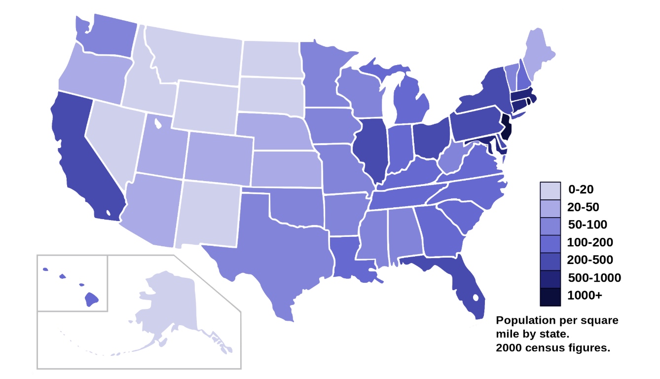
Choropleth Maps
A Choropleth map is a thematic map in which areas are shaded or patterned in proportion to the measurement of the statistical variable being displayed on the map, such as population density or per-capita income. The choropleth map provides an easy way to visualize how a measurement varies across a geographic area or it shows the level of variability within a region. Below is a Choropleth map of the US depicting the population by square mile per state.
1
2
3
4
5
6
df_can = pd.read_excel('https://s3-api.us-geo.objectstorage.softlayer.net/cf-courses-data/CognitiveClass/DV0101EN/labs/Data_Files/Canada.xlsx',
                     sheet_name='Canada by Citizenship',
                     skiprows=range(20),
                     skipfooter=2)

print('Data downloaded and read into a dataframe!')
In order to create a Choropleth map, we need a GeoJSON file that defines the areas/boundaries of the state, county, or country that we are interested in. In our case, since we are endeavoring to create a world map, we want a GeoJSON that defines the boundaries of all world countries. For your convenience, we will be providing you with this file, so let’s go ahead and download it. Let’s name it world_countries.json.
1
2
3
4
5
6
7
8
9
10
11
12
13
14
15
16
17
18
19
20
21
22
23
24
25
# download countries geojson file
!wget --quiet https://s3-api.us-geo.objectstorage.softlayer.net/cf-courses-data/CognitiveClass/DV0101EN/labs/Data_Files/world_countries.json -O world_countries.json

print('GeoJSON file downloaded!')

world_geo = r'world_countries.json' # geojson file

# create a plain world map
world_map = folium.Map(location=[0, 0], zoom_start=2, tiles='Mapbox Bright')


# generate choropleth map using the total immigration of each country to Canada from 1980 to 2013
world_map.choropleth(
    geo_data=world_geo,
    data=df_can,
    columns=['Country', 'Total'],
    key_on='feature.properties.name',
    fill_color='YlOrRd',
    fill_opacity=0.7,
    line_opacity=0.2,
    legend_name='Immigration to Canada'
)

# display map
world_map
Final Assignment
1
2
3
4
5
6
7
8
9
10
11
12
13
14
15
16
17
18
19
20
21
22
23
24
25
26
27
28
29
30
31
32
33
34
35
36
37
38
39
40
41
42
43
44
45
46
47
48
49
50
51
52
53
54
55
56
57
58
59
60
61
62
63
64
65
66
67
68
69
70
import matplotlib as mpl
import matplotlib.pyplot as plt
import pandas as pd
import numpy as np

# %matplotlib notebook
df=pd.read_csv('Topic_Survey_Assignment.csv',index_col = 0)
df_survey=df
df_survey
mpl.style.use('ggplot')


# 1. Sort the dataframe in descending order of Very interested.
df_survey.sort_values(['Very interested'], ascending=False, axis=0, inplace=True)

# 2. Convert the numbers into percentages of the total number of respondents.
#    Recall that 2,233 respondents completed the survey.
#    Round percentages to 2 decimal places.
df_survey_pct = ((df_survey / 2233) * 100).round(2)

ax = df_survey_pct.plot(kind='bar',
                       figsize = (20, 8),
                       width = 0.8,
                       color = ['#5cb85c', '#5bc0de', '#d9534f'],
                       fontsize = 14)

plt.title('Percentage of Respondents Interests\''' in Data Science Areas', fontsize=16) # add title to the plot


ax.set_facecolor((1.0, 1.0, 1.0))

y_axis = ax.axes.get_yaxis()
y_axis.set_visible(False)

# Solution inspired in https://stackoverflow.com/questions/25447700/annotate-bars-with-values-on-pandas-bar-plots
for p in ax.patches:
    ax.annotate(str(p.get_height()) + '%', (p.get_x() * 1.005, p.get_height() * 1.03))

plt.show()

df_sfcrime = pd.read_csv("https://cocl.us/sanfran_crime_dataset")

df_tmp = df_sfcrime.groupby(['PdDistrict']).count().reset_index()
df_tmp.drop(['Category','Descript','DayOfWeek','Date','Time', 'Resolution','Address','X','Y','Location','PdId'], axis=1, inplace=True)
df_tmp.rename(columns={'PdDistrict':'Neighborhood', 'IncidntNum':'Count'}, inplace=True)

#https://cocl.us/sanfran_geojson
!wget --quiet https://cocl.us/sanfran_geojson -O sanfrangeo.json
print('GeoJSON file downloaded!')

import folium
print('Folium installed and imported!')

sf_geo = r'sanfran_geo.json' # geojson file

# create a plain San Francisco map
sf_map = folium.Map(location=[37.773972, -122.431297], zoom_start=12) #, tiles='Mapbox Bright')
sf_map.choropleth(
    geo_data=sf_geo,
    data=df_tmp,
    columns=['Neighborhood','Count'],
    key_on='feature.properties.DISTRICT',
    fill_color='YlOrRd',
    fill_opacity=0.7,
    line_opacity=0.2,
    legend_name='San Francisco Crimes'
)

# display map
sf_map
Comments