Chapter 4: Bayesian Analysis
Bayes’ theorem is often described as a procedure for updating beliefs about the world when presented with new information.
Say our prior belief for the probability of event B is $P(B)$. After we observe another event A which has happened, e.g. new information, we want to update our estimation of the probability of event B.
\[P(B\|A)=\frac{P(A\|B)* P(B)}{P(A)}\]- The conditional probability \(P(A\|B)\) is called the likelihood or evidence.
- \(P(B)\) is the prior belief.
- \(P(B\|A)\) is the posterior belief.
Bayes versus Frequentists
Pretend that as an analyst you are given daily profit data for a fund, and that the fund has had positive returns for 560 of the past 1,000 trading days. What is the probability that the fund will generate a positive return tomorrow? Without any further instructions, it is tempting to say that the probability is 56%, (560/1,000 = 56%).
In the previous sample problem, though, we were presented with a portfolio manager who beat the market three years in a row. Shouldn’t we have concluded that the probability that the portfolio manager would beat the market the following year was 100% (3/3 = 100%), and not 60%?
The frequentist approach based only on the observed frequency of positive results.
The Bayesian approach also counts the number of positive results. The conclusion is different because the Bayesian approach starts with a prior belief about the probability.
Which approach is better?
Situations in which there is very little data, or in which the signal-to-noise ratio is extremely low, often lend themselves to Bayesian analysis.
When we have lots of data, the conclusions of frequentist analysis and Bayesian analysis are often very similar, and the frequentist results are often easier to calculate.
Continuous Distributions
\[f(A \mid B)=\frac{g(B \mid A) f(A)}{\int_{-\infty}^{+\infty} g(B \mid A) f(A) d A}\]Here f(A) is the prior probability density function, and f(A|B) is the posterior PDF. g(B|A) is the likelihood.
Conjugate Distribution
It is not always the case that the prior and posterior distributions are of the same type.
When both the prior and posterior distributions are of the same type, we say that they are conjugate distributions. As we just saw, the beta distribution is the conjugate distribution for the binomial likelihood distribution.
Here is another useful set of conjugates: The normal distribution is the conjugate distribution for the normal likelihood when we are trying to estimate the distribution of the mean, and the variance is known.
The real world is not obligated to make our statistical calculations easy. In practice, prior and posterior distributions may be nonparametric and require numerical methods to solve. While all of this makes Bayesian analysis involving continuous distributions more complex, these are problems that are easily solved by computers. One reason for the increasing popularity of Bayesian analysis has to do with the rapidly increasing power of computers in recent decades.
Bayesian Networks
A Bayesian network illustrates the causal relationship between different random variables.
Exhibit 6.4 shows a Bayesian network with two nodes that represent the economy go up, E, and a stock go up, S.
Exhibit 6.4 also shows three probabilities: the probability that E is up, $P[E]$; the probability that S is up given that E is up, $P[S | E]$; and the probability that S is up given that E is not up, $P[S | E]$.
 Using Bayes’ theorem, we can also calculate $P[E | S]$. This is the probability that E is up given that we have observed S being up:
Causal reasoning, $P[S | E]$, follows the cause-and-effect arrow of our Bayesian network. Diagnostic reasoning, $P[E | S]$, works in reverse.
For most people, causal reasoning is much more intuitive than diagnostic reasoning. Diagnostic reasoning is one reason why people often find Bayesian logic to be confusing. Bayesian networks do not eliminate this problem, but they do implicitly model cause and effect, allowing us to differentiate easily between causal and diagnostic relationships.
Bayesian networks are extremely flexible. Exhibit 6.5 shows a network with seven nodes. Nodes can have multiple inputs and multiple outputs. For example, node B influences both nodes D and E, and node F is influenced by both nodes C and D.
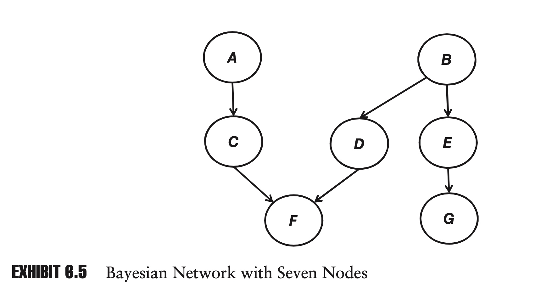
In a network with n nodes, where each node can be in one of two states (for example, up or down), there are a total of $2^n$ possible states for the network. As we will see, an advantage of Bayesian networks is that we will rarely have to specify $2^n$ probabilities in order to define the network.
For example, in Exhibit 6.4 with two nodes, there are four possible states for the network, but we only had to define three probabilities.
Bayesian networks versus Correlation matrices

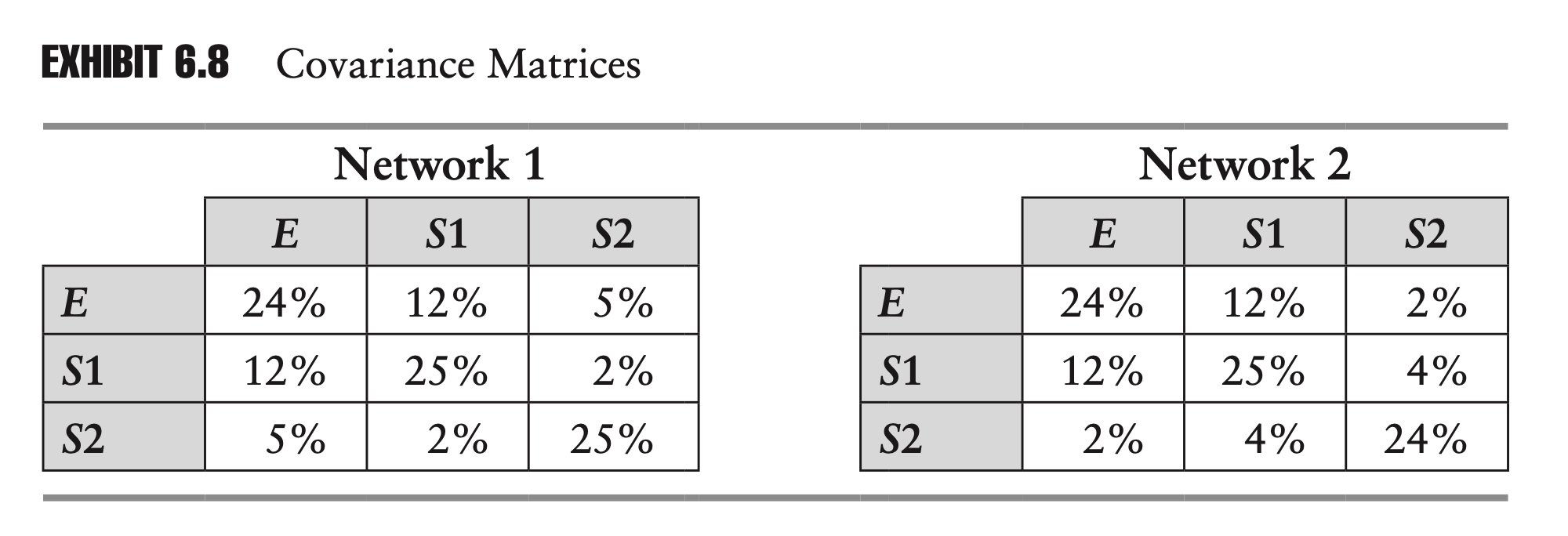
Exhibit 6.6 shows two networks, each with three nodes. In each network E is the economy and S1 and S2 are two stocks. In the first network, on the left, S1 and S2 are directly influenced by the economy. In the second network, on the right, S1 is still directly influenced by the economy, but S2 is only indirectly influenced by the economy, being directly influenced only by S1.
Exhibit 6.7 Probabilities of Networks
\[\begin{array}{ccccc} \hline E & S 1 & S 2 & \text { Network 1 } & \text { Network 2 } \\ \hline 0 & 0 & 0 & 19.20 \% & 20.80 \% \\ 0 & 0 & 1 & 12.80 \% & 11.20 \% \\ 0 & 1 & 0 & 4.80 \% & 4.00 \% \\ 0 & 1 & 1 & 3.20 \% & 4.00 \% \\ 1 & 0 & 0 & 7.20 \% & 11.70 \% \\ 1 & 0 & 1 & 10.80 \% & 6.30 \% \\ 1 & 1 & 0 & 16.80 \% & 21.00 \% \\ 1 & 1 & 1 & \frac{25.20 \%}{100.00 \%} & \frac{21.00 \%}{100.00 \%} \\ \hline \end{array}\]We can calculate the covariance matrix for these two networks:
Advantage 1: Fewer Parameters
One advantage of Bayesian networks is that they can be specified with very few parameters, relative to other approaches. In the preceding example, we were able to specify each network using only five probabilities, but each covariance matrix contains six nontrivial entries, and the joint probability table, Exhibit 6.7, contains eight entries for each network. As networks grow in size, this advantage tends to become even more dramatic.
Advantage 2: More Intuitive
Another advantage of Bayesian networks is that they are more intuitive. It is hard to have much intuition for entries in a covariance matrix or a joint probability table.
An equity analyst covering the two companies represented by S1 and S2 might be able to look at the Bayesian networks and say that the linkages and probabilities seem reasonable, but the analyst is unlikely to be able to say the same about the two covariance matrices.
Because Bayesian networks are more intuitive, they might be easier to update in the face of a structural change or regime change. In the second network, where we have described S2 as being a supplier to S1, suppose that S2 announces that it has signed a contract to supply another large firm, thereby making it less reliant on S1? With the help of our equity analyst, we might be able to update the Bayesian network im/mediately (for example, by decreasing the probabilities $P[S2 | S1]$ and $P[S2 | S1]$), but it is not as obvious how we would directly update the covariance matrices.
Chapter 5: Hypothesis testing and Confidence Intervals
In this chapter we explore two closely related topics, confidence intervals and hypothesis testing. At the end of the chapter, we explore applications, including value at risk (VaR).
Confidence Intervals
For the sample mean, we have \(t=\frac{\hat{\mu}-\mu}{\hat{\sigma} / \sqrt{n}}\) follows a Student’s t distribution with (n − 1) degrees of freedom.
By looking up the appropriate values for the t distribution, we can establish the probability that our t-statistic is contained within a certain range:
\[P\left[x_{L} \leq \frac{\hat{\mu}-\mu}{\hat{\sigma} / \sqrt{n}} \leq x_{U}\right]=\gamma\]where $x_L$ and $x_U$ are constants, which, respectively, define the lower and upper bounds of the range within the t distribution, and $\gamma$ is the probability that our t-statistic will be found within that range.
Typically $\gamma$ is referred to as the confidence level.
Rather than working directly with the confidence level, we often work with the quantity $1-\gamma$ , which is known as the significance level and is often denoted by $\alpha$.
In practice, the population mean, $\mu$, is often unknown. By rearranging the previous equation we come to an equation with a more interesting form:
\[P\left[\hat{\mu}-\frac{x_{U} \hat{\sigma}}{\sqrt{n}} \leq \mu \leq \hat{\mu}-\frac{x_{L} \hat{\sigma}}{\sqrt{n}}\right]=\gamma\]Looked at this way, we are now giving the probability that the population mean will be contained within the defined range.
Hypothesis testing
One problem with confidence intervals is that they require us to settle on an arbitrary confidence level.
Rather than saying there is an x% probability that the population mean is contained within a given interval, we may want to know what the probability is that the population mean is greater than y.
Traditionally the question is put in the form of a null hypothesis. If we are interested in knowing whether the expected return of a portfolio manager is greater than 10%, we would write:
\[H_0: u_r >10 \%\]where $H_0$ is known as the null hypothesis.
With our null hypothesis in hand, we gather our data, calculate the sample mean, and form the appropriate t-statistic. In this case, the appropriate t-statistic is:
\[t=\frac{\hat{\mu}-10 \%}{\hat{\sigma} / \sqrt{n}}\]We can then look up the corresponding probability from the t distribution.
In addition to the null hypothesis, we can offer an alternative hypothesis. In the previous example:
\[H_1: u_r \leq 10 \%\]One tail or two?
In many scientific fields where positive and negative deviations are equally important, two-tailed confidence levels are more prevalent. In risk management, more often than not we are more concerned with the probability of extreme negative outcomes, and this concern naturally leads to one-tailed tests.
A two-tailed null hypothesis could take the form:
\[H_0: u_r = 0 \\ H_1: u_r \neq 0 \%\]A one-tailed test could be of the form:
\[H_0: u_r > c \\ H_1: u_r \leq c\]Chebyshev’s Inequality
An easy way to estimate the probability of outliers:
\[P[|x-\mu |\geq n\sigma] \leq \frac{1}{n^2}\]Chebyshev’s inequality tells us that the probability of being greater than two standard deviations from the mean is less than or equal to 25%. The exact probability for a standard normal variable is closer to 5%, which is indeed less than 25%.
If a variable is normally distributed, the probability of a three standard deviation event is very small, 0.27%. If we assume normality, we will assume that three standard deviation events are very rare. For other distributions, though, Chebyshev’s inequality tells us that the probability could be as high as 1∕9, or approximately 11%.
Value at Risk
Value at risk (VaR) is one of the most widely used risk measures in finance. VaR was popularized by J.P. Morgan in the 1990s.
In order to formally define VaR, we begin by defining a random variable L, which represents the loss to our portfolio. L is simply the negative of the return to our portfolio. If the return of our portfolio is −600, then the loss, L, is +600. For a given confidence level, $\gamma$, then, we can define value at risk as Equation 7.15:
\[P[L\geq VaR_{\gamma}]=1-\gamma\]We can also define VaR directly in terms of returns. If we multiply both sides of the inequality in Equation 7.15 by −1, and replace −L with R, we come up with Equation 7.16:
\[P[R \leq -VaR_{\gamma}]=1-\gamma\]While Equations 7.15 and 7.16 are equivalent, you should know that some risk managers go one step further and drop the negative sign from Equation 7.16. What we have described as a VaR of 400 they would describe as a VaR of −400.
The convention we have described is more popular. It has the advantage that for reasonable confidence levels for most portfolios, VaR will almost always be a positive number.
In practice, rather than just saying that your VaR is 400, it is often best to resolve any ambiguity by stating that your VaR is a loss of 400 or that your VaR is a return of −400.
Backtesting
In the case of VaR, backtesting is easy. When assessing a VaR model, each period can be viewed as a Bernoulli trial. In the case of one-day 95% VaR, there is a 5% chance of an exceedance event each day, and a 95% chance that there is no exceedance.
Because exceedance events are independent, over the course of n days the distribution of exceedances follows a binomial distribution:
\[P[K=k]=\left(\begin{array}{l} n \\ k \end{array}\right) p^{k}(1-p)^{n-k}\]The probability of a VaR exceedance should be conditionally independent of all available information at the time the forecast is made. Importantly, the probability should not vary because there was an exceedance the previous day, or because risk levels are elevated.
99.9% VS 95%
It is tempting to believe that the risk manager using the 99.9% confidence level is concerned with more serious, riskier outcomes, and is therefore doing a better job.
The problem is that, as we go further and further out into the tail of the distribution, we become less and less certain of the shape of the distribution. In most cases, the assumed distribution of returns for our portfolio will be based on historical data. If we have 1,000 data points, then there are 50 data points to back up our 95% confidence level, but only one to back up our 99.9% confidence level. As with any distribution parameter, the variance of our estimate of the parameter decreases with the sample size. One data point is hardly a good sample size on which to base a parameter estimate.
We should also follow this rule in our backtesting.
Problem with VaR
A common problem with VaR models in practice is that exceedances often end up being serially correlated.
Another common problem with VaR models in practice is that exceedances tend to be correlated with the level of risk.
There is a reason VaR has become so popular in risk management. The appeal of VaR is its simplicity. Because VaR can be calculated for any portfolio, it allows us to easily compare the risk of different portfolios. Because it boils risk down to a single number, VaR provides us with a convenient way to track the risk of a portfolio over time. Finally, the concept of VaR is intuitive, even to those not versed in statistics.
Because it is so popular, VaR has come under a lot of criticism. The criticism generally falls into one of three categories.
At a very high level, financial institutions have been criticized for being overly reliant on VaR. This is not so much a criticism of VaR as it is a criticism of financial institutions for trying to make risk too simple.
At the other end of the spectrum, many experts have criticized how VaR is measured in practice. This is not so much a criticism of VaR as it is a criticism of specific implementations of VaR.
As computing power became cheaper and more widespread, this approach quickly fell out of favor. Today VaR models can be extremely complex, but many people outside of risk management still remember when delta-normal was the standard approach, and mistakenly believe that this is a fundamental shortcoming of VaR.
In between, there are more sophisticated criticisms. One such criticism is that VaR is not a subadditive risk measure. If we have two risky portfolios, X and Y, then f is said to be subadditive if:
\[f(X+Y)\leq f(X) + f(Y)\]In other words, the risk of the combined portfolio, X + Y, is less than or equal to the sum of the risks of the separate portfolios. Variance and standard deviation are subadditive risk measures.
For example: Imagine a portfolio with two bonds, each with a 4% probability of defaulting. Assume that default events are uncorrelated and that the recovery rate of both bonds is 0%. If a bond defaults, it is worth 0; if it does not, it is worth 100. What is the 95% VaR of each bond separately? What is the 95% VaR of the bond portfolio?
\[\begin{array}{cr} \hline P[x] & x \\ \hline 0.16 \% & -\$ 200 \\ 7.68 \% & -\$ 100 \\ 92.16 \% & \$ 0 \\ \hline \end{array}\]As we can easily see, there are no defaults in only 92.16% of the scenarios, (1 – 4%)2 = 92.16%. In the other 7.84% of scenarios, the loss is greater than or equal to 100. The 95% VaR of the portfolio is therefore 100. For this portfolio, VaR is not subadditive.
Expected Shortfall
Another criticism of VaR is that it does not tell us anything about the tail of the distribution.
Using the concept of conditional probability, we can define the expected value of a loss, given an exceedance, as follows:
\[E[L|L\geq VaR_{\gamma}]=S\]We refer to this conditional expected loss, S, as the expected shortfall.
Expected shortfall does answer an important question. What’s more, expected shortfall turns out to be subadditive, thereby avoiding one of the major criticisms of VaR.
As our discussion on backtesting suggests, though, because it is concerned with the tail of the distribution, the reliability of our expected shortfall measure may be difficult to gauge.
Chapter 6: Matrix Algebra
Cholesky Decomposition
In risk management, it is often useful to generate simulations in which we can specify the covariance between different variables.
Imagine that we have N random variables, X1, X2, . . ., XN, representing the returns of different stocks. In order to describe the relationships between each of the variables, we could form an N × N covariance matrix, where each element, $\sigma_{i,j}$ , corresponds to the covariance between the ith and jth random variables:
\[\boldsymbol{\Sigma}=\left[\begin{array}{cccc} \sigma_{1,1} & \sigma_{1,2} & \cdots & \sigma_{1, n} \\ \sigma_{2,1} & \sigma_{2,2} & \cdots & \sigma_{2, n} \\ \vdots & \vdots & \ddots & \vdots \\ \sigma_{n, 1} & \sigma_{n, 2} & \cdots & \sigma_{n, n} \end{array}\right] \text { s.t. } \sigma_{i, j}=E\left[\left(X_{i}-E\left[X_{i}\right]\right)\left(X_{j}-E\left[X_{j}\right]\right)\right]\]If the covariance matrix satisfies certain minimum requirements, we can decompose the covariance matrix, rewriting it in terms of a lower triangular matrix, L, and its transpose, L′, which is an upper triangular matrix:
\[\Sigma = LL'\]This is what is known as a Cholesky decomposition. We can create a random vector which has exactly the covariance matrix as $\Sigma$:
Designate an N × 1 vector of i.i.d. standard normal variables as $\Phi$, then $C=L\Phi$ is the random vector we are looking for.
Proof:
\[E( C ) =\vec{0} \\ Cov(C,C)=E(CC')=E(L\Phi \Phi'L')=LE(\Phi \Phi')L'=LL'=\Sigma\]Principle Component Analysis
Difference between linear regression and PCA
For the linear regression:
\[min ||Ax-y||^2\]since $Ax=(a1,a2,…,a_n)x$, the linear regression is essentially the projection of y onto the linear space of column vectors of A.
For the PCA, the first principle component is the one that:
\[\max ||A\mu||^2\]Mathematically, for the linear regression, it is a problem of project a point in $R^m $ into the linear space of ${x_0,x_1,…,x_n}$. In other words, the base is given.
for the PCA, however, it is a problem of find a sub-space for the data given, so that most of the information can be maintained. In other words, the task is to find the base of the sub-space.:
\[\mu_1, ..., \mu_k \in R^n\]Details in Mathematics
First Component In order to maximize variance, the first weight vector w(1) thus has to satisfy:
\[\mathbf{w}_{(1)}=\underset{\|\mathbf{w}\|=1}{\arg \max }\left\{\sum_{i}\left(t_{1}\right)_{(i)}^{2}\right\}=\underset{\|\mathbf{w}\|=1}{\arg \max }\left\{\sum_{i}\left(\mathbf{x}_{(i)} \cdot \mathbf{w}\right)^{2}\right\}\]Equivalently, writing this in matrix form gives
\[{\displaystyle \mathbf {w} _{(1)}={\underset {\Vert \mathbf {w} \Vert =1}{\operatorname {\arg \,max} }}\,\{\Vert \mathbf {Xw} \Vert ^{2}\}={\underset {\Vert \mathbf {w} \Vert =1}{\operatorname {\arg \,max} }}\,\left\{\mathbf {w} ^{T}\mathbf {X^{T}} \mathbf {Xw} \right\}}\]Since w(1) has been defined to be a unit vector, it equivalently also satisfies
\[\mathbf{w}_{(1)}=\arg \max \left\{\frac{\mathbf{w}^{T} \mathbf{X}^{\mathrm{T}} \mathbf{X} \mathbf{w}}{\mathbf{w}^{T} \mathbf{w}}\right\}\]The quantity to be maximised can be recognised as a Rayleigh quotient. A standard result for a positive semidefinite matrix such as $X^TX$ is that the quotient’s maximum possible value is the largest eigenvalue of the matrix, which occurs when w is the corresponding eigenvector.
With $w_{(1)}$ found, the first principal component of a data vector $x_{(i)}$ can then be given as a score $t_{1(i)} = x_{(i)} ⋅ w_{(1)}$ in the transformed co-ordinates, or as the corresponding vector in the original variables $t_{1(i)}w_{(1)} = <x_{(i)} * w_{(1)}>w_{(1)}$
Further Component
The k-th component can be found by subtracting the first k − 1 principal components from X:
\[\hat{\mathbf{X}}_{k}=\mathbf{X}-\sum_{s=1}^{k-1} \mathbf{X} \mathbf{w}_{(s)} \mathbf{w}_{(s)}^{\mathrm{T}}\]and then finding the weight vector which extracts the maximum variance from this new data matrix
\[\mathbf{w}_{(k)}=\underset{\|\mathbf{w}\|=1}{\arg \max }\left\{\left\|\hat{\mathbf{X}}_{k} \mathbf{w}\right\|^{2}\right\}=\arg \max \left\{\frac{\mathbf{w}^{T} \hat{\mathbf{X}}_{k}^{T} \hat{\mathbf{X}}_{k} \mathbf{w}}{\mathbf{w}^{T} \mathbf{w}}\right\}\]It turns out that this gives the remaining eigenvectors of $X^TX$, with the maximum values for the quantity in brackets given by their corresponding eigenvalues. Thus the weight vectors are eigenvectors of $X^TX$. The full principal components decomposition of X can therefore be given as
\[\mathbf{T} = \mathbf{X} \mathbf{W}\]where W is a p-by-p matrix of weights whose columns are the eigenvectors of $X^TX$. The transpose of W is sometimes called the whitening or sphering transformation. Columns of W multiplied by the square root of corresponding eigenvalues, i.e. eigenvectors scaled up by the variances, are called loadings in PCA or in Factor analysis.
PCA algorithm
Step 1: Data Preprocessing Mean Normalization, so that the features centers in the original point. Feature scaling is necessary;
\[X=\frac{[X-mean(X)]}{std(X)}\]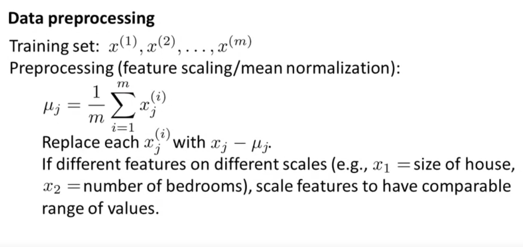

Vectorization:
Mean normalization and optionally feature scaling:
\[X= \text{bsxfun}(@minus, X, mean(X,1))\]In matlab, mean(X,1) returns a row vector.
\[\sum =\frac{1}{m} X^TX\]\([U,S,V]=svd(\sum )\) Then we have:
\[U=\left[\begin{array}{cccc}{|} & {|} & {} & {|} \\ {u^{(1)}} & {u^{(2)}} & {\ldots} & {u^{(n)}} \\ {|} & {|} & {} & {|}\end{array}\right] \in \mathbb{R}^{n \times n}\] \[X\in R^{m,n} \to Z\in R^{m,k}:\] \[\text{Ureduce}=U(~: ~, 1:k)\] \[Z=X*Ureduce\]Note 1: $x_0^{i} \neq 0$ for this convention. Note 2: $U$ is from \(USV^*=X^TX\), therefore U is \(R^{n\times n}\). It is the eigenvector of X.
Application 1: the dynamic term structure of Interest rates
A yield curve plots the relationship between yield to maturity and time to maturity for a given issuer or group of issuers. A typical yield curve is concave and upwardsloping.
Over time, as interest rates change, the shape of the yield curve will change, too. A shift in the yield curve occurs when all of the points along the curve increase or decrease by an equal amount. A tilt occurs when the yield curve either steepens (points further out on the curve increase relative to those closer in) or flattens (points further out decrease rela- tive to those closer in). The yield curve is said to twist when the points in the middle of the curve move up or down relative to the points on either end of the curve. Exhibits 9.13, 9.14, and 9.15 show examples of these dynamics.
These three prototypical patterns—shifting, tilting, and twisting—can often be seen in PCA.


The following is a principal component matrix obtained from daily U.S. government rates from March 2000 through August 2000.
For each day, there were six points on the curve representing maturities of 1, 2, 3, 5, 10, and 30 years. Before calculating the covariance matrix, all of the data were centered and standardized.
\[\frac{1}{N}X'X = \Sigma = PDP'\] \[\mathbf{P}=\left[\begin{array}{rrrrrr} 0.39104 & -0.53351 & -0.61017 & 0.33671 & 0.22609 & 0.16020 \\ 0.42206 & -0.26300 & 0.03012 & -0.30876 & -0.26758 & -0.76476 \\ 0.42685 & -0.16318 & 0.19812 & -0.35626 & -0.49491 & 0.61649 \\ 0.42853 & 0.01135 & 0.46043 & -0.17988 & 0.75388 & 0.05958 \\ 0.41861 & 0.29495 & 0.31521 & 0.75553 & -0.24862 & -0.07604 \\ 0.35761 & 0.72969 & -0.52554 & -0.24737 & 0.04696 & 0.00916 \end{array}\right]\]-
The first column is the first principle component. We can see this if we plot the elements in a chart, as in Exhibit 9.16. This flat, equal weighting represents the shift of the yield curve.
-
Similarly, the second principal component shows an upward trend. A movement in this component tends to tilt the yield curve.
-
Finally, if we plot the third principal component, it is bowed, high in the center and low on the ends. A shift in this component tends to twist the yield curve.
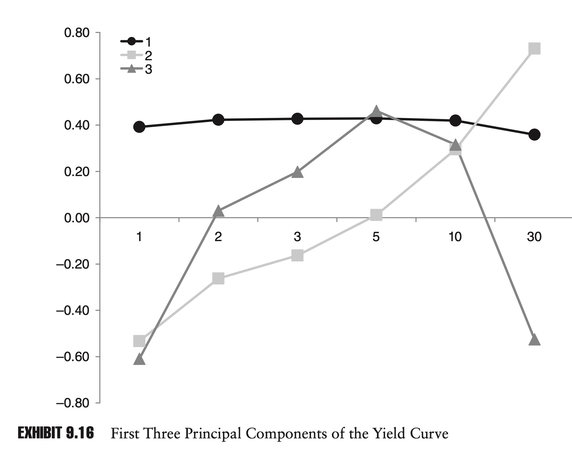
Not only can we see the shift, tilt, and twist in the principal components, but we can also see their relative importance in explaining the variability of interest rates.
In this example, the first principal component explains 90% of the variance in interest rates.
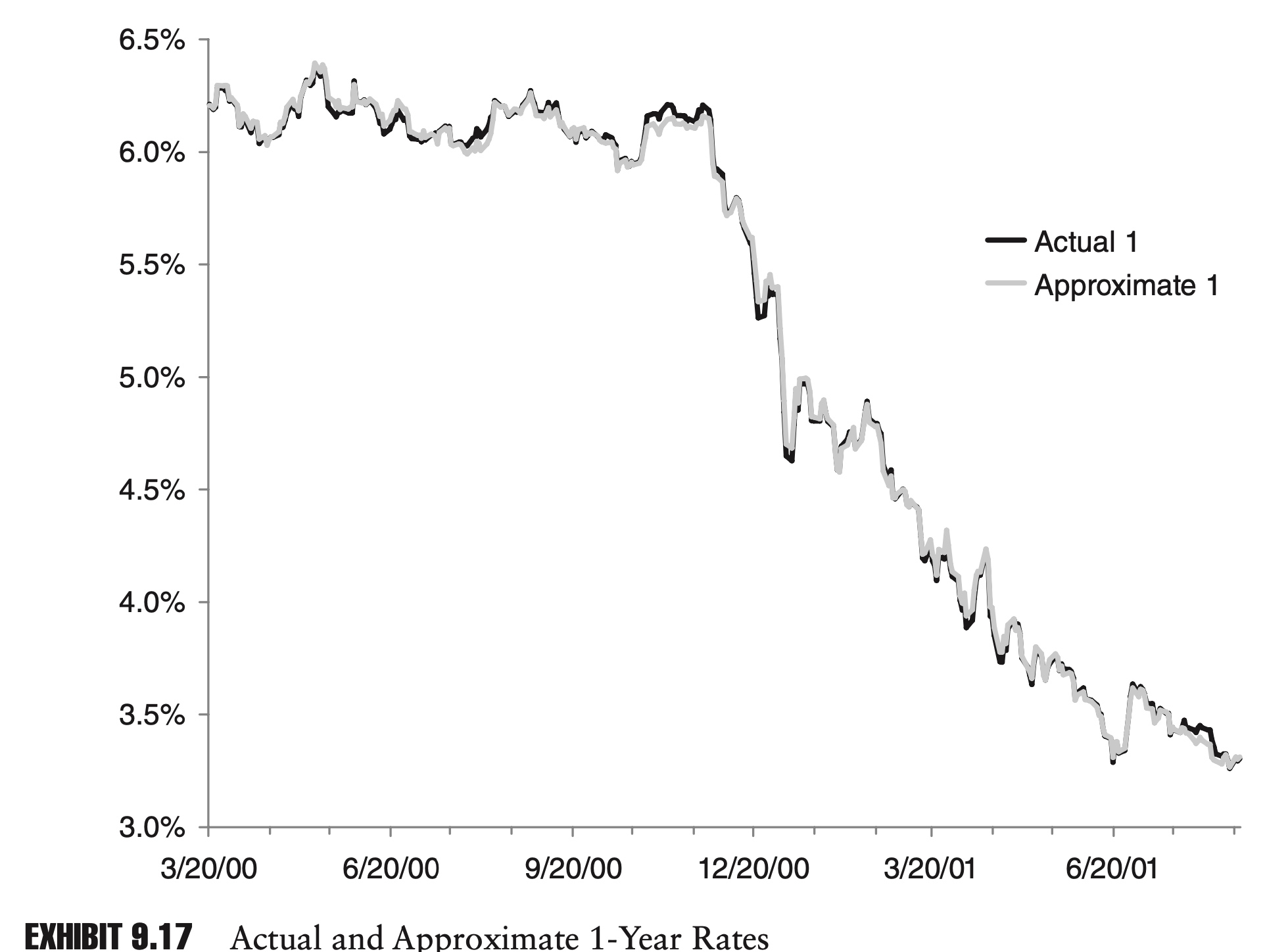
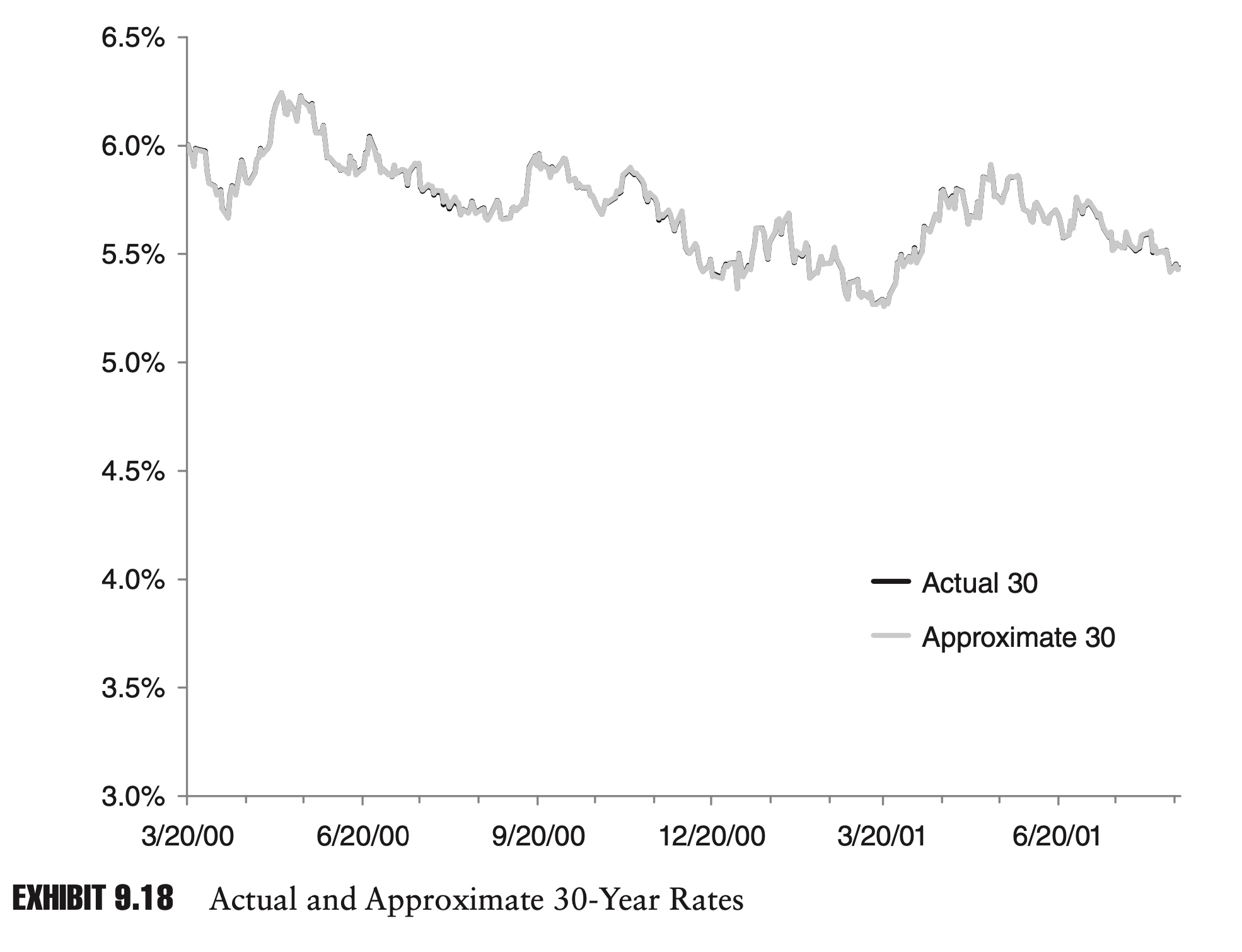
If we incorporate the second and third principal components, fully 99.9% of the variance is explained. The two charts in Exhibits 9.17 and 9.18 show approximations to the 1-year and 30-year rates, using just the first three principal components.
Because the first three principal components explain so much of the dynamics of the yield curve, they could serve as a basis for an interest rate model or as the basis for a risk report. A portfolio’s correlation with these principal components might also be a meaningful risk metric.
Application 2: the structure of global equity markets
Global equity markets are increasingly linked. Due to similarities in their economies or because of trade relationships, equity markets in different countries will be more or less correlated. PCA can highlight these relationships.
Within countries, PCA can be used to describe the relationships between groups of companies in industries or sectors. In a novel application of PCA, Kritzman, Li, Page, and Rigobon (2010) suggest that the amount of variance explained by the first principal components can be used to gauge systemic risk within an economy. The basic idea is that as more and more of the variance is explained by fewer and fewer principal com- ponents, the economy is becoming less robust and more susceptible to systemic shocks. In a similar vein, Meucci (2009) proposes a general measure of portfolio diversification based in part on principal component analysis. In this case, a portfolio can range from undiversified (all the variance is explained by the first principal component) to fully diversified (each of the principal components explains an equal amount of variance).
The following matrix is the principal component matrix formed from the analysis of nine broad equity market indexes, three each from North America, Europe, and Asia. The original data consisted of monthly log returns from January 2000 through April 2011. The returns were centered and standardized.
\[\mathbf{P}=\left[ \begin{array}{rrrrrrrr} 0.3604 & -0.1257 & 0.0716 & -0.1862 & 0.1158 & -0.1244 & 0.4159 & 0.7806 & 0.0579 \\ 0.3302 & -0.0197 & 0.4953 & -0.4909 & -2.1320 & 0.4577 & 0.2073 & -0.3189 & -0.0689 \\ 0.3323 & 0.2712 & 0.3359 & -0.2548 & 0.2298 & -0.5841 & -0.4897 & -0.0670 & -0.0095 \\ 0.3520 & -0.3821 & -0.2090 & 0.1022 & -0.1805 & 0.0014 & -0.2457 & 0.0339 & -0.7628 \\ 0.3472 & -0.2431 & -0.1883 & 0.1496 & 0.2024 & -0.3918 & 0.5264 & -0.5277 & 0.1120 \\ 0.3426 & -0.4185 & -0.1158 & 0.0804 & -0.3707 & 0.0675 & -0.3916 & 0.0322 & 0.6256 \\ 0.2844 & 0.6528 & -0.4863 & -0.1116 & -0.4782 & -0.0489 & 0.1138 & -0.0055 & -0.0013 \\ 0.3157 & 0.2887 & 0.4238 & 0.7781 & -0.0365 & 0.1590 & 0.0459 & 0.0548 & -0.0141 \\ 0.3290 & 0.1433 & -0.3581 & -0.0472 & 0.6688 & 0.4982 & -0.1964 & -0.0281 & 0.0765 \end{array}\right]\]As before, we can graph the first, second, and third principal components. In Exhibit 9.19, the different elements have been labeled with either N, E, or A for North America, Europe, and Asia, respectively.
As before, the first principal component appears to be composed of an approximately equal weighting of all the component time series. This suggests that these equity markets are highly integrated, and most of their movement is being driven by common factor. The first component explains just over 75% of the total variance in the data. Diversifying a portfolio across different countries might not prove as risk-reducing as one might hope.
The second factor could be described as long North America and Asia and short Europe.
By the time we get to the third principal component, it is difficult to posit any fundamental rationale for the component weights. Unlike our yield curve example, in which the first three components explained 99.9% of the variance in the series, in this example the first three components explain only 87% of the total variance. This is still a lot, but it suggests that these equity returns are much more distinct.
Trying to ascribe a fundamental explanation to the third and possibly even the second principal component highlights one potential pitfall of PCA analysis: identification.
When the principal components account for a large part of the variance and conform to our prior expectations, they likely correspond to real fundamental risk factors. When the principal components account for less variance and we can- not associate them with any known risk factors, they are more likely to be spurious. Unfortunately, it is these components, which do not correspond to any previously known risk factors, which we are often hoping that PCA will identify.
Another closely related problem is stability. If we are going to use PCA for risk analysis, we will likely want to update our principal component matrix on a regular basis. The changing weights of the components over time might be interesting, illuminating how the structure of a market is changing. If the weights are too unstable, tracking components over time can be difficult or impossible.
Comments