Introduction
The first step around any data related challenge is to start by exploring the data itself. This could be by looking at, for example, the distributions of certain variables or looking at potential correlations between variables.
The problem nowadays is that most datasets have a large number of variables. In other words, they have a high number of dimensions along which the data is distributed. Visually exploring the data can then become challenging and most of the time even practically impossible to do manually. However, such visual exploration is incredibly important in any data-related problem. Therefore it is key to understand how to visualize high-dimensional datasets. This can be achieved using techniques known as dimensionality reduction. This post will focus on two techniques that will allow us to do this: PCA and t-SNE.
Data Source
We use Twint to collect all the tweets which contain ‘SP500’ from 2017-01-01 to 2021-01-31.
To get a numerical dataset to work with, we apply the following steps:
- use
sklearn.feature_extraction.text.CountVectorizerto create a Bag-of-Words. - Fit and transform the original text corpus into a numerical matrix, which is in the DTM structure (Document-Term-Matrix).
1
2
3
4
5
6
7
8
9
10
11
12
13
14
15
16
17
18
19

# corpus of all tweets
cp = list(tw2017['tweet'][:].values)

# This code uses scikit-learn to calculate bag-of-words
# (BOW). `CountVectorizer` implements both tokenization and occurrence
# counting in a single class.
from sklearn.feature_extraction.text import CountVectorizer
v = CountVectorizer(stop_words='english')  # Vectorizer.
c = cp

# Learn the vocabulary dictionary and return the document-term
# matrix. Tokenize and count word occurrences.
bow = v.fit_transform©
bow.toarray()                   # Print the document-term matrix.
# bow.A                           # Same effect, shortcut command.
print("Shape:", bow.A.shape)
v.get_feature_names()           # Which term is in which column?
The shape of bow is (57054, 68220).
Add labels with K-Means
We need to clarify one thing first. The goal is to plot the structure of the data, especially for the case where we have some label with the trainning set. Since we have no human-made labels for all the tweets yet, we use K-means to get a artificial label for each twitter. It turns out the classification works pretty well, in the sense that it help us to identify 3 groups: useful web-robots on twitter, useless web-robots on twitter, real users on twitter.
1
2
3
4
5
6
7
8
9
10
11
12
13
14
15
16
17
18
19
20
21
22
23
24
25
26
27
28
29
30
31
32
33
34
35
36
37
38
39
40
41
42
43
44
# K-means
from sklearn.cluster import KMeans
X = bow
# Perform k-means clustering of the data into two clusters.
kmeans = KMeans(n_clusters=3, random_state=0).fit(X)
kmeans.cluster_centers_
# label infos
group_label = kmeans.labels_
# how many tweets for each group?
group_label = pd.Series(group_label)
group_label.value_counts()
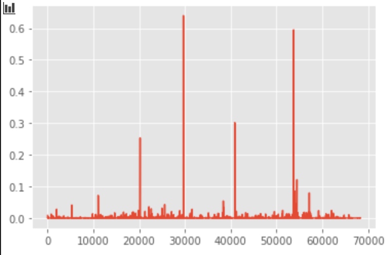
# What are these kmeans.cluster_centers_
# for cluster_center 1:
plt.plot(kmeans.cluster_centers_[0])
feature_names = v.get_feature_names()
center1 = [feature_names[i]
for i in np.where(kmeans.cluster_centers_[0] > 0.1)[0].tolist()]
center1
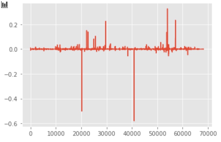
# What are these kmeans.cluster_centers_
# for cluster_center 2:
plt.plot(kmeans.cluster_centers_[1])
# feature_names=v.get_feature_names()
center2 = [feature_names[i]
for i in np.where(kmeans.cluster_centers_[1] > 0.4)[0].tolist()]
center2
# What are these kmeans.cluster_centers_
# for cluster_center 3:
plt.plot(kmeans.cluster_centers_[2])
# feature_names=v.get_feature_names()
center3 = [feature_names[i]
for i in np.where(kmeans.cluster_centers_[2] > 0.4)[0].tolist()]
center3
# add the kmeans-Center to the dataframe
tw2017['Kmeans-Center'] = group_label
Dimension Reduction with PCA or SVD
PCA
PCA is a technique for reducing the number of dimensions in a dataset whilst retaining most information. It is using the correlation between some dimensions and tries to provide a minimum number of variables that keeps the maximum amount of variation or information about how the original data is distributed. It does not do this using guesswork but using hard mathematics and it uses something known as the eigenvalues and eigenvectors of the data-matrix. These eigenvectors of the covariance matrix have the property that they point along the major directions of variation in the data. These are the directions of maximum variation in a dataset.
Firstly, we try to use PCA.
1
2
3
4
5
6
7
8
9
10
11

# PCA
from sklearn.decomposition import PCA
pca = PCA(n_components=3)
pca_result = pca.fit_transform(bow.A)
df['pca-one'] = pca_result[:, 0]
df['pca-two'] = pca_result[:, 1]
df['pca-three'] = pca_result[:, 2]
print('Explained variation per principal component: {}'.format(
    pca.explained_variance_ratio_))
Truncated SVD
However, the sparse matrix bow can not be processed with this package. Insetad, we use klearn.decomposition.TruncatedSVD:
1
2
3
4
5
6
7
8
9
10
11

# TruncatedSVD
from sklearn.decomposition import TruncatedSVD
svd = TruncatedSVD(n_components=50, n_iter=7, random_state=42)
svd_result = svd.fit_transform(bow)
print("Explained variation per principal component: \n {}".format(
    svd.explained_variance_ratio_))
print("Total Explained variation by the first {} components: \n{}".format(
    50, svd.explained_variance_ratio_.sum()))
We can plot the first 3 components:
1
2
3
4
5
6
7


# plot the first 3 component
plt.plot(svd.components_[0, :])
plt.plot(svd.components_[1, :])
plt.plot(svd.components_[2, :])

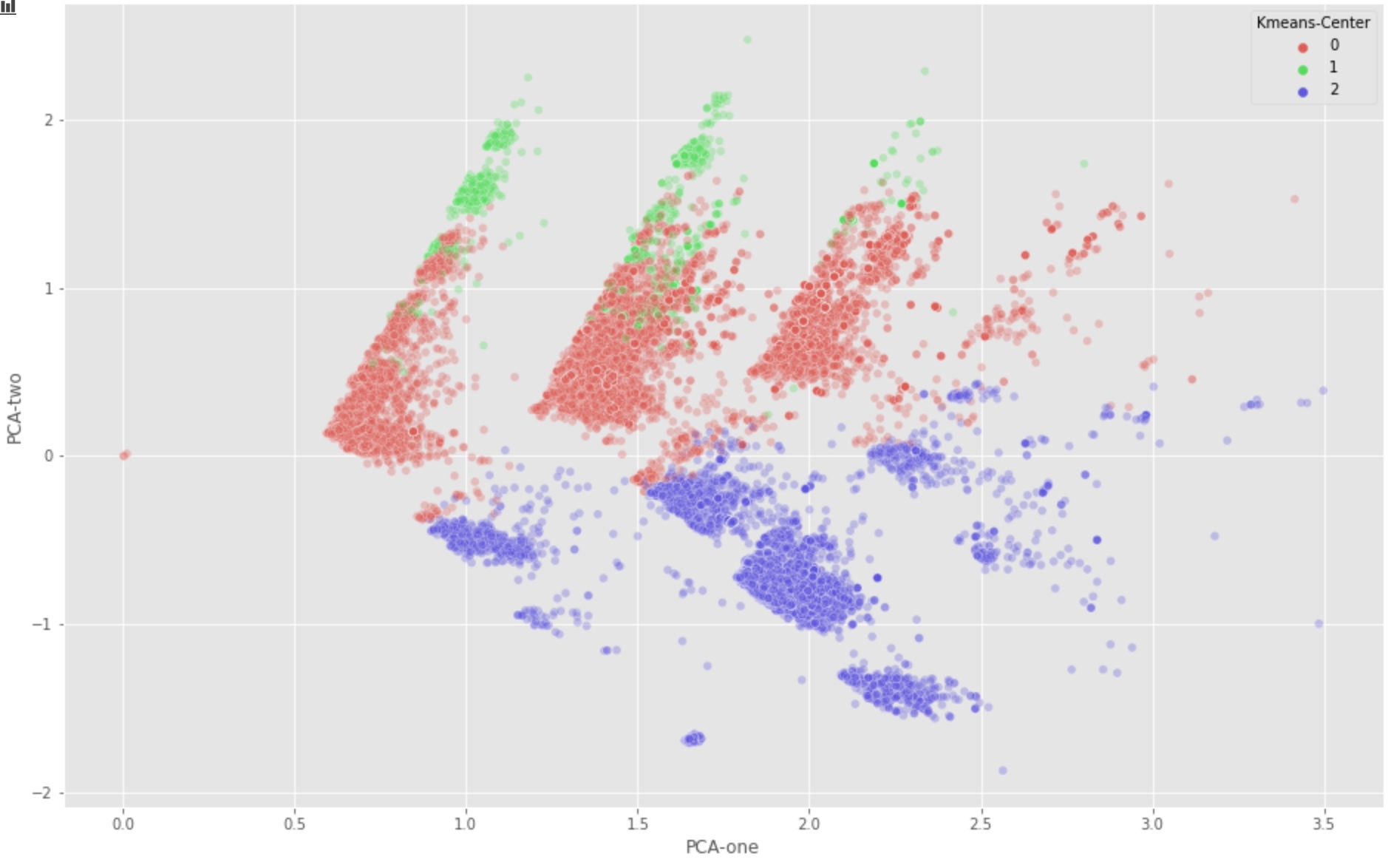
Plot with PCA/SVD components
With first 2 SVD components:
1
2
3
4
5
6
7
8
9
plt.figure(figsize=(16,10))
sns.scatterplot(
    x="PCA-one", y="PCA-two",
    hue="Kmeans-Center",
    palette=sns.color_palette("hls", 3),
    data=tw2017,
    legend="full",
    alpha=0.3
)
With first 3 SVD components:
1
2
3
4
5
6
7
8
9
10
11
12
13
# For a 3d-version of the same plot
ax = plt.figure(figsize=(16,10)).gca(projection='3d')
ax.scatter(
    xs=tw2017["PCA-one"],
    ys=tw2017["PCA-two"],
    zs=tw2017["PCA-three"],
    c=tw2017["Kmeans-Center"],
    cmap='tab10'
)
ax.set_xlabel('pca-one')
ax.set_ylabel('pca-two')
ax.set_zlabel('pca-three')
plt.show()

Further Dimension Reduction with T-SNE
As we can see, the first two PCA components (PCA-1, PCA-2) seem to imply the group 0 and group 1 should be combined. But this is in contradiction to our manual identification result.
This might be caused by the fact that many information are lost if we only keep the limited PCA components. However, with more components, we can not find a nice way to visualize the distribution of our samples.
The solution is T-SNE.
t-Distributed Stochastic Neighbor Embedding (t-SNE) is another technique for dimensionality reduction and is particularly well suited for the visualization of high-dimensional datasets. Contrary to PCA it is not a mathematical technique but a probablistic one. The original paper describes the working of t-SNE as:
“t-Distributed stochastic neighbor embedding (t-SNE) minimizes the divergence between two distributions: a distribution that measures pairwise similarities of the input objects and a distribution that measures pairwise similarities of the corresponding low-dimensional points in the embedding”.
Essentially what this means is that it looks at the original data that is entered into the algorithm and looks at how to best represent this data using less dimensions by matching both distributions. The way it does this is computationally quite heavy and therefore there are some (serious) limitations to the use of this technique.
For example one of the recommendations is that, in case of very high dimensional data, you may need to apply another dimensionality reduction technique before using t-SNE:
It is highly recommended to use another dimensionality reduction method (e.g. PCA for dense data or TruncatedSVD for sparse data) to reduce the number of dimensions to a reasonable amount (e.g. 50) if the number of features is very high.
The other key drawback is that it:
“Since t-SNE scales quadratically in the number of objects N, its applicability is limited to data sets with only a few thousand input objects; beyond that, learning becomes too slow to be practical (and the memory requirements become too large)”.
As a result, instead of running the algorithm on the actual dimensions of the data (Bow: 57054 * 68220), We’ll now take the recommendations to heart and actually reduce the number of dimensions before feeding the data into the t-SNE algorithm.
For this we’ll use PCA again. We will first create a new dataset containing the fifty dimensions generated by the PCA reduction algorithm. We can then use this dataset to perform the t-SNE on
1
2
3
4
5
6
7
8
from sklearn.decomposition import TruncatedSVD
svd=TruncatedSVD(n_components=50, n_iter=7, random_state=42)
svd_result=svd.fit_transform(bow)
print("Explained variation per principal component: \n {}".format(svd.explained_variance_ratio_))
print("Total Explained variation by the first {} components: \n{}".format(50,svd.explained_variance_ratio_.sum()))
# Output:
# Total Explained variation by the first 50 components:
0.37115116045019997
As a result, the first 50 components roughly hold around 37% of the total variation in the data.
Now lets try and feed this data into the t-SNE algorithm:
1
2
3
4
5
6
7
from sklearn.manifold import TSNE
import time
time_start = time.time()
tsne = TSNE(n_components=2, verbose=1, perplexity=40, n_iter=300)
tsne_results = tsne.fit_transform(svd_result)
print('t-SNE done! Time elapsed: {} seconds'.format(time.time()-time_start))
Now we plot the data with TSNE-1 and TSNE-2:
1
2
3
4
5
6
7
8
9
10
11
tw2017['tsne-pca-one'] = tsne_results[:,0]
tw2017['tsne-pca-two'] = tsne_results[:,1]
plt.figure(figsize=(16,10))
sns.scatterplot(
    x="tsne-pca-one", y="tsne-pca-two",
    hue="Kmeans-Center",
    palette=sns.color_palette("hls", 3),
    data=tw2017,
    legend="full",
    alpha=0.3
)

As we can see, the class 0 and class 1 now are properly differentiated.
Just to compare PCA & T-SNE
1
2
3
4
5
6
7
8
9
10
11
12
13
14
15
16
17
18
19
20
21
 plt.figure(figsize=(16,7))
ax1 = plt.subplot(1, 2, 1)
sns.scatterplot(
    x="PCA-one", y="PCA-two",
    hue="Kmeans-Center",
    palette=sns.color_palette("hls", 3),
    data=tw2017,
    legend="full",
    alpha=0.3,
    ax=ax1
)
ax2 = plt.subplot(1, 2, 2)
sns.scatterplot(
    x="tsne-pca-one", y="tsne-pca-two",
    hue="Kmeans-Center",
    palette=sns.color_palette("hls", 3),
    data=tw2017,
    legend="full",
    alpha=0.3,
    ax=ax2
)
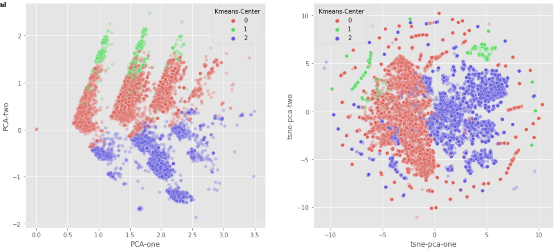
From the graph above:
- PCA graph seems to indicate that we should combine class 1 and class 0. But Class 0 tends to be nomal users, class 1 tends to be useless robot.
- Luckily, T-SNE algorithm detects that Class 1 should not be combined with Class 0.
- This is perhaps because the first two components can’t differentiate class 1 from class 0. More specificly, too much information is lost if we just use PCA-1 and PCA-2.
Comments